Community resources
Community resources
Community resources
Evolution of Jira Design - Part 1
A better navigation for Jira Cloud is coming soon! While we wait I thought it would be fun to dig up some old screenshots and take an unofficial and outsiders look at how the Jira interface has changed over the years.
When Jira was first released in 2002, it was purely for software development. But these days, all kinds of teams, like Legal, Marketing, HR, and IT, use Jira to track their work and their team’s “to do” list. Jira is useful for any industry and it’s not just for software development anymore!
The modern Jira experience is much different than what launched in 2002. Jira has evolved into different application types and different deployment methods. You can choose between Jira Core for business teams, Jira Software for development teams, and Jira Service Desk for support teams. You can also choose Jira Cloud (Atlassian hosted), Jira Server (hosted on-premises, in a data center with your other internal applications, or in a Cloud server environment like Amazon AWS), or Jira Data Center (also self-hosted but built for mission critical environments.)
It’s no surprise that the application’s design, look, and navigation has changed drastically over the years. Here are a few examples of the visual evolution.
In the Beginning
In 2002, Jira looked just like all the other web applications did at the time. As a web developer, I remember web application design closely mirrored desktop application design. It felt like developers were porting their applications to “web format” and wanting them to behave the same way as the PC versions did. User interface standards were just emerging. Websites were mostly grid based and layouts were in box or table format. In the Jira 2002 screenshot example you can see the familiar “logo in the top left header” standard that we all still expect today.
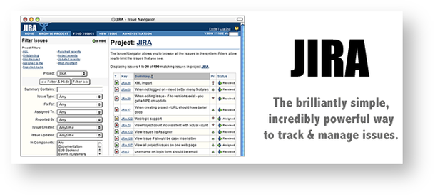
Jira circa 2002. Source: Happy Birthday to the Atlassian Community
In 2007 the logo and header changed slightly but the overall layout remained the same. The issue screen doesn’t yet have the right sidebar to display people and date fields. This design reminds me of what you see today when you export Jira filter results for printing.
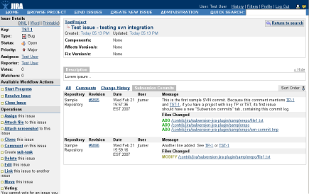
Jira circa 2007. Source: Atlassian Marketplace
In 2009 Atlassian acquired GreenHopper which added release planning, burn down charts, and many of the agile features we use today. I still remember installing GreenHopper as an app and when “Agile” was a link in the top nav.
Into the Cloud
In 2011, Atlassian created a cloud-based version of Jira. It looked and functioned just like the self-hosted version. It was originally named “JIRA OnDemand” and the on-prem version was called “JIRA Download.” The names were re-branded in 2014.
Also in 2011, the Jira admin interface received a new project-centric design. I’m very thankful for the quick nav and keyboard shortcuts. I use the “gg” shortcut daily to move around the admin area.
Originally named RapidBoards, Scrum Boards graduated from the labs sandbox and became a standard feature in 2012.
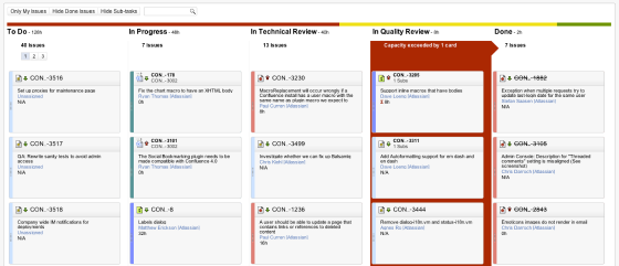
Boards circa 2012. Source: Jira Server 5.10 release notes
Just two years later, the board design looked more polished with assignee avatars, different placement for priority icons and estimates, and improved spacing.
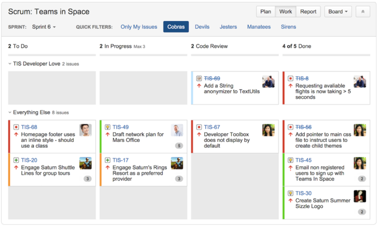
Boards circa 2014. Source: Form nimble agile teams
In 2012, the Atlassian Design Guidelines (ADG) were published to unify the customer experience across products. Hooray for consistency and standards! This meant the typography, spacing, and layout in Jira would be similar in Confluence. Jira 6, released in 2013, was the first “ADG compliant” version.
In 2013, the workflow designer was rebuilt in HTML 5. I remember when HTML 5 was the latest and greatest thing in web development! We all hoped it would replace Adobe Flash. Flash support officially ends in Dec 2020, but I haven’t seen a Flash-based website in years.
Back in 2013, all the workflow statuses were one color. We didn’t see different status categories, colors, or lozenges until version 6.2 in 2015. Different status colors helped end users understand whether they were in the beginning, middle, or end of an issue’s life cycle.
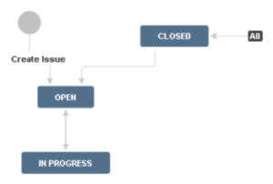
One Color Workflow Statuses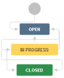
Multi-Color Workflow Statuses
Custom status icons were also eliminated in 2015. Anyone remember those? I don’t think anyone misses them.
![]()
Workflow Status Icons
New Designs for new Application Types
In 2015, Atlassian split Jira into two application types: Jira Core and Jira Software. Core featured a simplified interface aimed at business teams. Software retained development-specific features like versions, sprints, and dev tool integration. In the Jira Core screenshot below there are few links in the left nav.
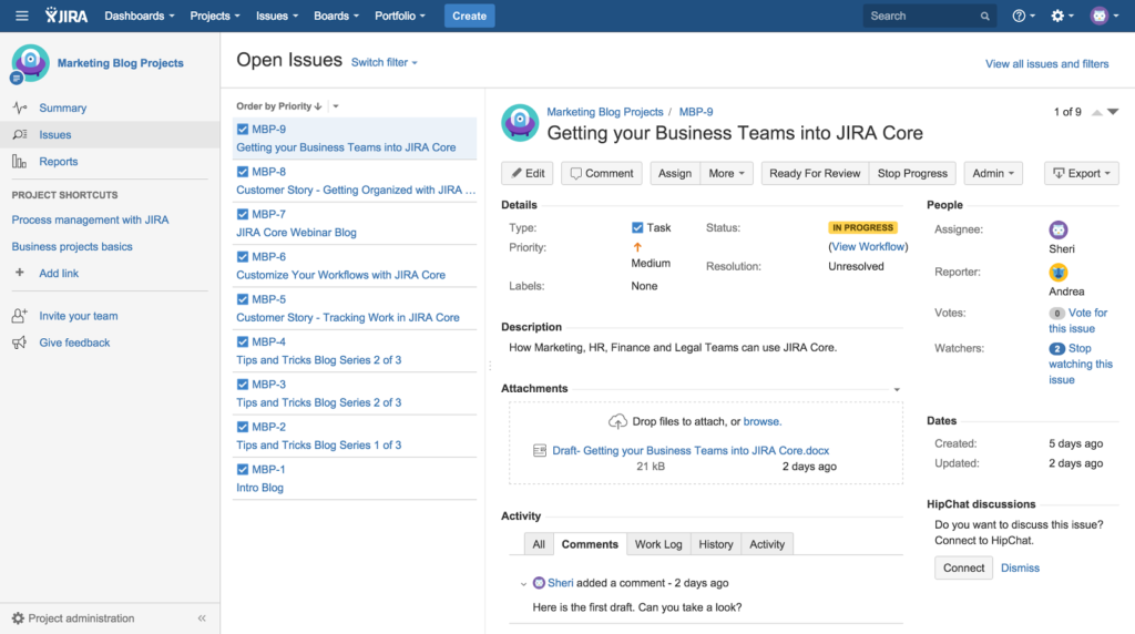
Jira Core circa 2015. Source: Say hello to Jira Core
As the applications diverged, sometimes new features were built in one type but not in the other. For example, Jira Cloud got a new visual roadmap feature and Jira Data Center got archive abilities. Design differences emerged and even some terminology changed. Cloud has a global permission called “Share dashboards and filters” but the same feature in Server is named “Create Shared Objects.” All these small differences are certainly challenging for me. It’s harder to use both application types at the same time and to keep training materials up to date. Even Atlassian has to maintain separate sets of documentation.
In 2016, the atlassian.design domain was registered to house their design principle documentation and brand information. Their style guide is a fabulous example for other organizations to follow. I especially like how easy their logos are to download and the “don’t do this” logo crime samples.
Also this year mobile Jira apps for IOs and Android were launched with their own platform-specific features and design.
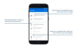
Jira Android App. Source: Jira Software for Android has landed
New Jira logo
In 2017, Atlassian re-branded their entire corporate identity introducing a new logo, individual product logos, and renaming “JIRA” to “Jira”. Branding modifications are inevitable as companies grow and change. This is the fifth Atlassian logo change in 15 years. There’s a great graphic showing the logo evolution here. The new logo symbols feel multi-dimensional, fresh, and modern. It will be a long time before I can update every instance of “JIRA” to “Jira” in my book and on my website though!
Continue to Part 2 of the Evolution of Jira Design
Was this helpful?
Thanks!
Rachel Wright
9 comments