Community resources
Community resources
Community resources
Evolution of Jira Design - Part 2
Continued from Part 1 of the Evolution of Jira Design
Jira Cloud UI Overhaul
Also in 2017, Atlassian departed from their previous interface strategy. They announced “Jira Cloud will get an updated look and feel, including a collapsible sidebar navigation and enhanced search, to help your teams get things done faster.” The new nav was completely different from the top horizontal navigation in Jira Server and in previous Cloud versions.
I had trouble finding my way around and noticed more clicks were needed to get to some areas. The large left side bar commanded a lot of visual space. It was collapsible but you’d need to expand it again to access certain links. Sometimes the navigation loaded after the page contents loaded. Most annoyingly, the nav’s vertical scroll bar made it hard to print or screenshot pages. This navigation reminded me of designing with HTML frames in early 2000.
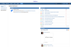
Jira Cloud “Before”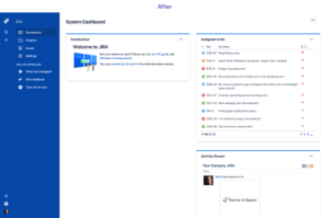
Jira Cloud “After” Source: Your teams are getting better navigation in Jira Cloud
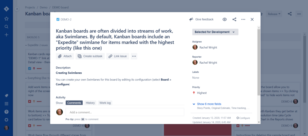
In 2018, Atlassian took inspiration from the Japanese, Taiwanese, and Chinese bento box to redesign the Jira Cloud issue view. This design divided and grouped key actions and information, much like how rice, meat, and vegetables are separated in individual portions.
Also In Jira Cloud:
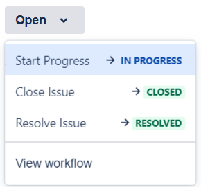
Workflow transitions were simplified. They ware displayed vertically and at the top of the right sidebar.
The separate “view” and “edit” screens were collapsed into a single screen. As such, there’s no “Edit” button and and all fields received inline edit capability.
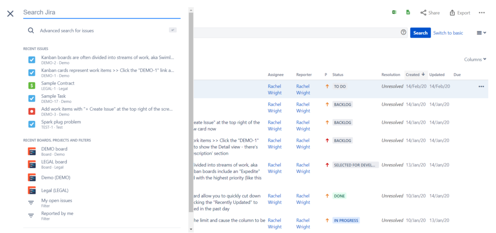
New search capabilities were added. A keyword search very quickly returned recent issues, boards, projects, and filters. I found myself wishing I could enter simple queries in this search bar.
Clicking an issue from a board opened it in an overlay. When you closed the issue, your board was still there in the background.
Joining the Next Generation
In 2018 Atlassian introduced the concept of next-gen projects for Jira Cloud. This special project type is scheme-less. Project settings aren’t shared and settings don’t impact other projects. The simple configuration interface lets end users quickly create new projects on their own. Read my thoughts on next-gen projects here. Another Cloud feature, Agility boards were also introduced.
The Next-gen interface for adding custom fields and organizing them on screens is simple and intuitive. (Left screenshot below.) But I find the issue screen itself unbalanced. (Right screenshot below.) Most of the fields are stacked on the right side. When there are a lot of fields, they are collapsed and you have to click around to find them. Without a long description, attachment, or comment list, there’s a lot of unused white space on the left.
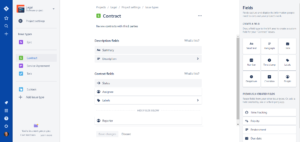
Jira Cloud Next-gen Project Configuration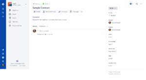
Jira Cloud Next-gen Issue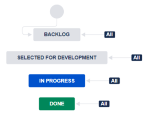
New Workflow Status Colors
Also in 2018, Atlassian split their design guidelines, creating one version for Cloud and one version for Server. The Atlassian Design Guidelines version 3 was published and workflow statuses received new colors.
2020 and Beyond
The new Jira Cloud horizontal navigation launches in March 2020! I’m looking forward to returning to Jira’s navigation roots and what I’m used to. As another user put it “What’s old is “new” again?” Yes, it appears so and I’m very happy about it. Since I use both Cloud and Server, I’m also glad that the nav will be similar again.
Change is the only thing that’s certain. We must all learn to work with it and retrain ourselves and our end users when necessary. I haven’t loved absolutely every change Atlassian has made, but every change is an opportunity (either for me or for them) to learn something new. I’m looking forward to the changes in 2020 and beyond.
While you’re waiting for the new Cloud nav to arrive in your instance, here are some early screenshots of the latest look and feel.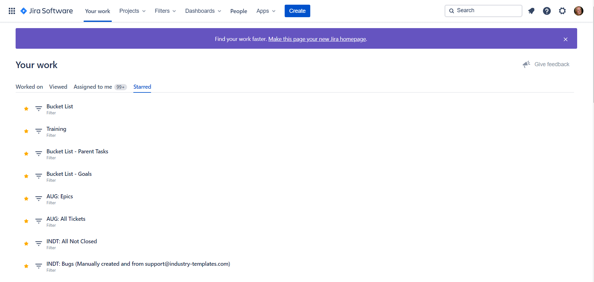
New “Your work” Page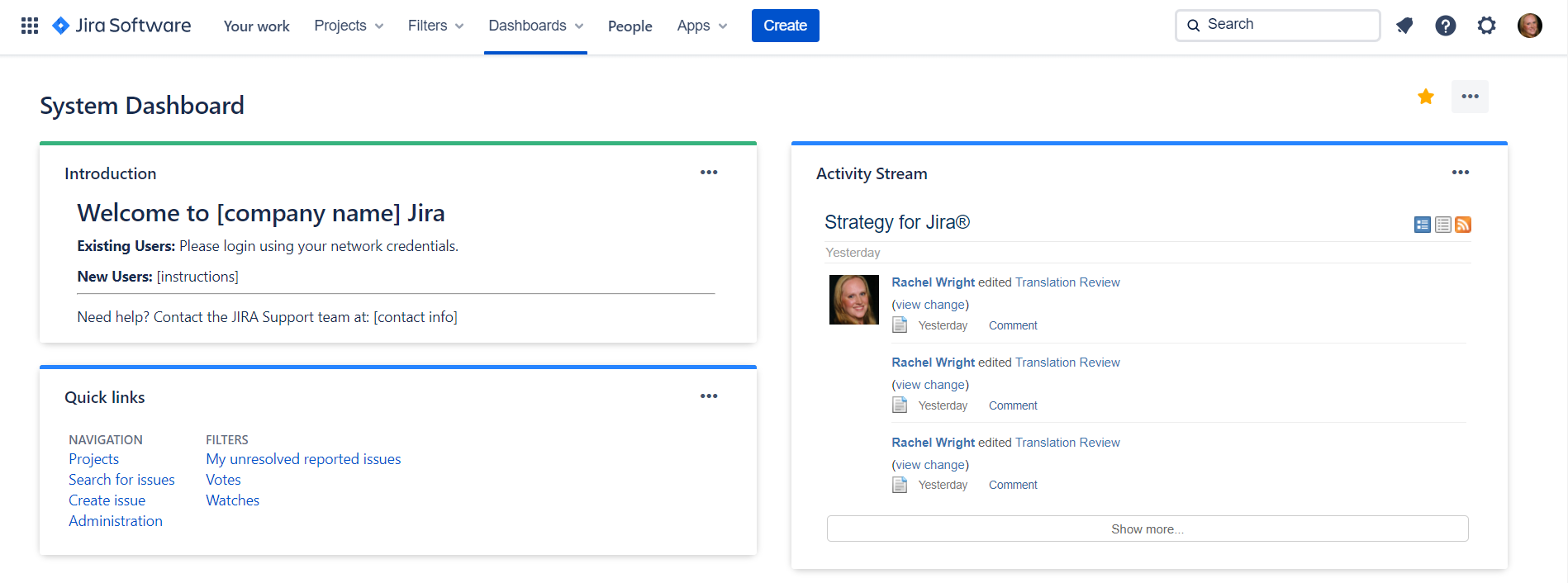
System Dashboard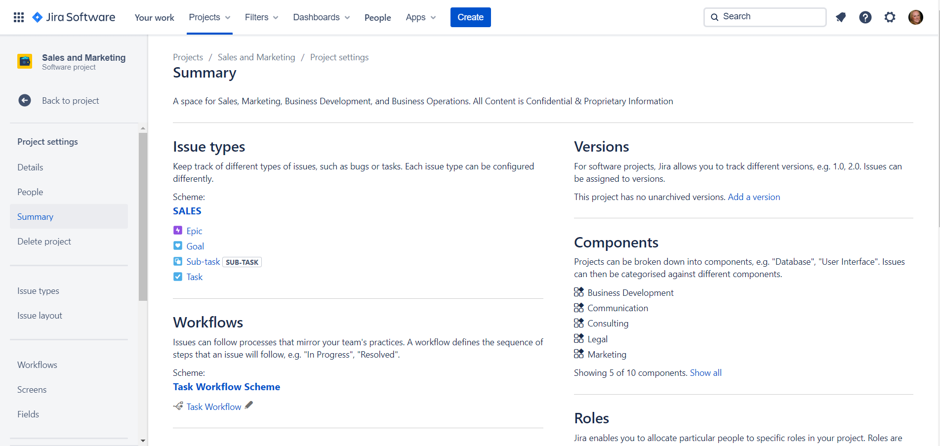
Project Settings
New Search Bar
Like Atlassian history? Also read: Summit Through the Years
Was this helpful?
Thanks!
Rachel Wright

5 comments