Community resources
Community resources
Community resources
Using cards in advanced Jira Service Desk themes
Jira Service Desk is one of the most popular ITSM tools on the market. Just like any other Atlassian tool, it’s prone to complaints about how unintuitive it can be even after configuration. Even though Atlassian works hard on extending native customization possibilities, which results we saw at Atlassian Summit in Las Vegas, it may not be enough for demanding users. Customer experience becomes essential for more and more companies, and that’s where apps enabling us to apply more sophisticated design to the Customer Portal come into play. So, how to take advantage of Jira Service Desk flexibility and create a simple and clear user interface, making it as user-friendly as possible?
Redesigning the Customer Portal
Following a brand style is the right solution when it comes to providing our users with consistent experience across our web properties, including Jira Service Desk. This way, they’ll know that they’re at the right company’s service desk, so there’s one problem out of the way. Unfortunately, that alone doesn’t make for a great customer experience. We also need to remember about the intuitiveness of the service desk, meaning that we should make it simple and clear. The result will be a Customer Portal where even a first-timer will know their way around.
For this specific reason, we’ve launched Theme Extension for Jira Service Desk, including first Theme based on six types of cards and a bunch of preset color schemes, which are a good starting point for customization. The app enables us to easily show request types as cards and edit their styles, adjust search bar and navigation bar, as well as set a bottom background that matches the banner. So, we can arrange the look and feel of the Customer Portal as a whole and create themed designs for them. Thanks to this, we can extend the implementation of Jira Service Desk far beyond the IT industry.
La isla bonita style
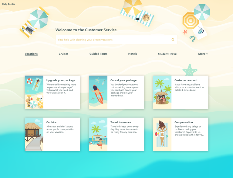
Summer is coming so travel agencies are bursting at the seams. It’s unusual for this kind of business to have a customer portal, but if they had, it would probably look like this. Sunny yellows and sea blues mix with greens, reds, whites, and browns, and we get a relaxing holiday layout. As a result, our Customer Portal is not only pleasing to the eye but also related to our business.
Smooth elegance of luxury cars
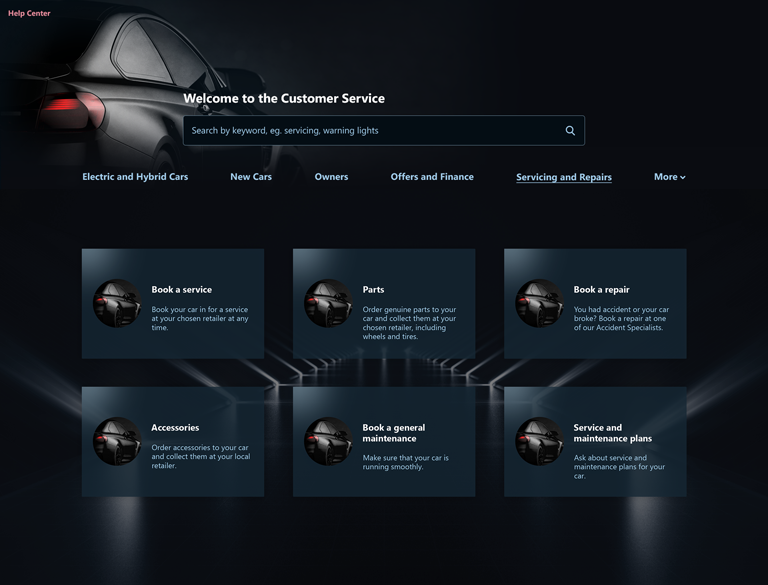
Not everyone wants to go for a Customer Portal popping with color and summer vibe though. If we want to look more elegant, then we should use neutral colors which still suit our brand style. It won’t make the Customer Portal gloomy or uninviting. Quite the opposite – it will rather make it smarter and stylish even. For example, a car brand could go for the Exomoon Card Theme and design a Customer Portal that suits the nature of their cars.
Gearing up like a pro
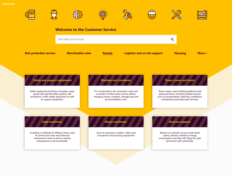
Even companies specializing in equipment rentals will be able to design a Customer Portal for themselves. Using a simple color palette and geometrical shapes, we can come up with quite professional looking design. Just like two previous themes, this one also is clear and pleasing.
Go for something different
There are also three more types of cards we can use when designing Customer Portal. We can change the graphics, format request type names and descriptions, reposition the cards on the grid by drag and drop, and adjust their size by simply dragging a slider.
HTML magic with custom cards
Moreover, we don’t have to limit ourselves to the default card styles. We can design our own special custom card using HTML. It comes in handy when we want to provide customers with some useful links, for example to our documentation, recent e-book, latest articles, our social media. It’s also a good way to share big news or invite the users to an event we host or attend.
Metamorphosis of Jira Service Desk themes
We should remember that Jira Service Desk isn’t only for IT industry. The possibility to adjust the look and feel for each Service Desk project separately makes it easier to extend it’s implementation to other businesses, like travel agencies, car dealers, etc. The best thing is that if the inspiration strikes us at night, then we don’t have to wake up the Jira admin for every change we want to make. With Theme Extension for Jira Service Desk, we can create and save our themes ourselves as Jira project admins. We should remember that even though Jira Service Desk is our way to provide support to our customers, it’s also a place that should reflect the brand style. This way, we’ll provide a consistent user experience across our channels.
If you’d like to learn more about Theme Extension for Jira Service Desk Server, read more about the app on the Community:
Was this helpful?
Thanks!
Karolina Lasoń [Deviniti]
About this author
Atlassian Apps Content Specialist
Deviniti
Wrocław, Poland
4 accepted answers
TAGS
Atlassian Community Events
- FAQ
- Community Guidelines
- About
- Privacy policy
- Notice at Collection
- Terms of use
- © 2025 Atlassian


0 comments