Community resources
Community resources
Community resources
Jira Tips and Tricks Collection: Top Three Jira Gadgets

Tip Relates To
| Application Type | Jira, Jira Service Management |
| Deployment Type | Cloud, Data Center |
| Audience | Application Administrators, Power Users, End Users |
| Category | Reporting, Dashboards |
Tip
Jira dashboards provide a great way to view a lot of statistical data in one place. But with ~50 gadgets to choose from, they can be intimidating to set up. Here are my top three most helpful gadgets to display work item stats on Jira dashboards or in Confluence pages:
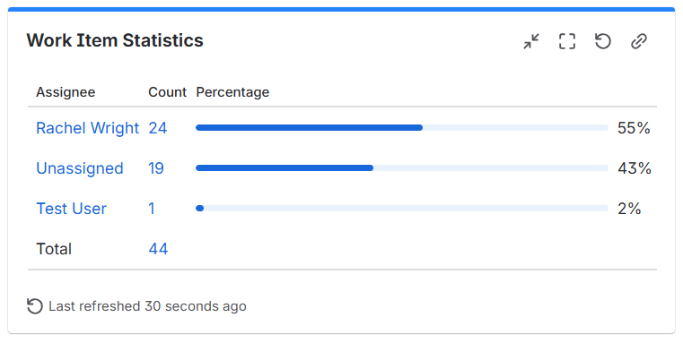
1. Work Item Statistics → Shows counts and percentages as visual horizontal bars.
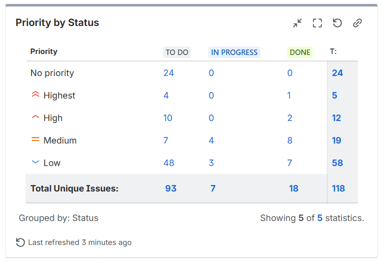
2. Two Dimensional Filter Statistics → The only gadget that let’s you see two data points in one view. For example: A table showing items by priority and status, items by type and assignee, etc.
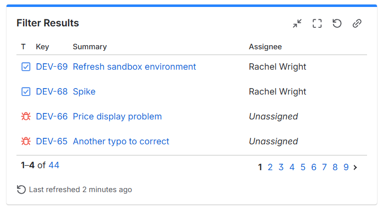
3. Filter Results → Shows Jira items in a paginated table format. Choose the columns to show and their order.
Explanation
A dashboard is a statistics-based view of items. Gadgets display dynamic content on Jira dashboards. There are many different types of gadgets like charts, graphs, and lists. You can also use macros in Confluence to display dynamic Jira data.
Bonus tip: Many of the gadgets display the same data in different ways. For example, the "Work Item Statistics" gadget shows the same information as the "Pie Chart" gadget, just in a different visual format. Try adding a few similar gadgets to your dashboard. Then compare the results and decide which to keep and remove.
Resources
- Create and edit dashboards – https://support.atlassian.com/jira-software-cloud/docs/create-and-edit-dashboards
- Dashboard gadgets – https://support.atlassian.com/jira-cloud-administration/docs/use-dashboard-gadgets
Was this helpful?
Thanks!
Rachel Wright
0 comments