Community resources
Community resources
Community resources
„Lead Time“ report and interpreting the scatter-plot chart
 „Lead Time“ report in Report Builder
When team members are working on multiple projects, stories and tickets, it is important to track how long a workflow took from start to finish. This will help project managers, team leads and other stakeholders to get a better understanding of how long specific workflows take, to spot variations in efficiency, check if processes should be optimized and if teams need more resources.
Our Report Builder “Lead Time” report is extremely useful to teams, as it indicates how long it takes for work to flow through the pipeline. The report measures the total time elapsed from the creation of work items until their completion. The lower the lead, the faster the throughput of your team.
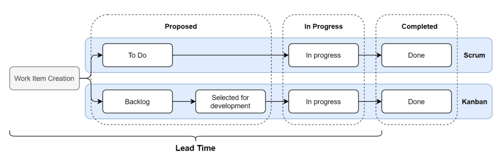
The following diagram illustrates how Lead Time relates to Jira Scrum or Kanban ticket workflows. The Lead Time is calculated from work item creation to entering the completed state.
Interpreting the scatter-plot chart
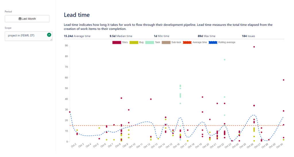
- The Lead Time is displayed as a scatter-plot control chart. It displays a summary of information and provides several interactive elements with more details.
- The colored dots represent completed work items in general.
- Their position on the horizontal axis represents the date they were completed.
- Their position on the vertical axis represents the calculated Lead Time in days.
- The individual dot color corresponds to the work item type displayed in the legend (Issue Type = Story, Bug etc.).
- The blue trend line indicates the average Lead Time per day.
- The red line indicates the average Lead Time for a selected period.
Summary elements:
- Average time: Average days for the main work item type configured for the chart.
- Median time: Lead Time for the main work item type configured for the chart.
- Min. time & Max. time: Minimum and maximum Lead Time for work items.
- Issue number: The number of work items (issues) used in the chart calculation, for all types of work items.
Interactive elements:
- Hover over any dot to see which work items contributed to the data point and the Lead Time for those items.

Test Report Builder 30 days for free and discover your possibilities. Already available on the Marketplace
Was this helpful?
Thanks!
Andrei Pisklenov _Actonic_
About this author
Head of Development
Actonic
Germany
3 accepted answers
2 comments