Community resources
Community resources
Community resources
- Community
- Products
- Jira Service Management
- Questions
- Heat map on number of tickets by hour to identify service desk contention.
Heat map on number of tickets by hour to identify service desk contention.
Hello,
I've tried searching for this, and not come up with much to work on, so here I am, I don't know JSM and I'm not wanting to export CSV and work formulas in Excel (by gentle with me).
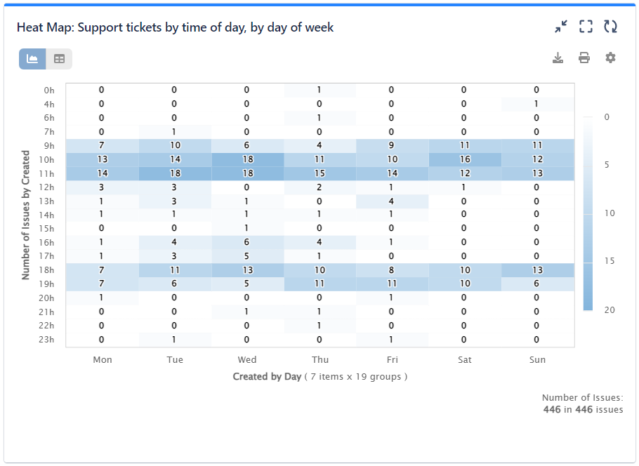
I'm hoping to cast a report that shows our busy periods of each day, preferably by intensity of colour. The days would be layered over the top of one another with hour by hour on one axis and number of tickets created on the other, then intensity of colour or shade showing the number of days.
If the third axis (colour) is too much, that's fine, but currently I can't find much in the way of hourly report, except the very limited 5day round up.
How do people use ITSM to plan their desk coverage agreements without this type of metric?
Thanks in advance for any help.
Tom
1 answer
I just came across your question.
You can easily create this type of report with Performance Objectives: Charts for Jira app, using the Heat Map gadget (by NaraSyst). The report would look like that:


Note that this is a paid 3rd party app developed by our team.
Please let me know if I can be of further assistance.
Best regards,

Was this helpful?
Thanks!
DEPLOYMENT TYPE
CLOUDPRODUCT PLAN
STANDARDPERMISSIONS LEVEL
Product AdminAtlassian Community Events
- FAQ
- Community Guidelines
- About
- Privacy policy
- Notice at Collection
- Terms of use
- © 2025 Atlassian


You must be a registered user to add a comment. If you've already registered, sign in. Otherwise, register and sign in.