Community resources
Community resources
Community resources
How to turn off or revert back to old JIRA interface, the new one is horrendous for usability.
151 answers
To get old issue view, please follow below steps for cloud mode.
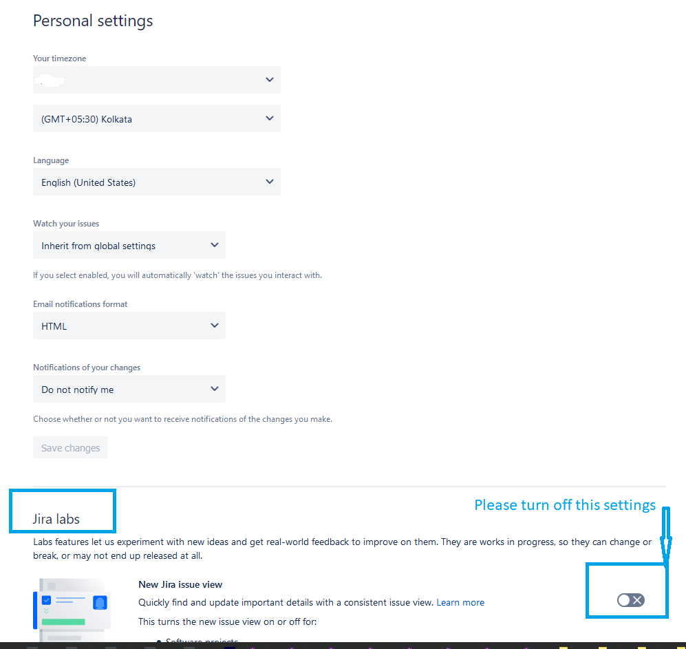
Your Profile Settings[at Left-bottom corner]->right click -> Account Settings -> Click on "Products" in left menu -> Click on Jira Settings -> it will open new page as Personal Settings Page and at Jira Lab turn off "New Jira Issue View"
This may help you. Thanks.

I just found the way to turn the new UI Off
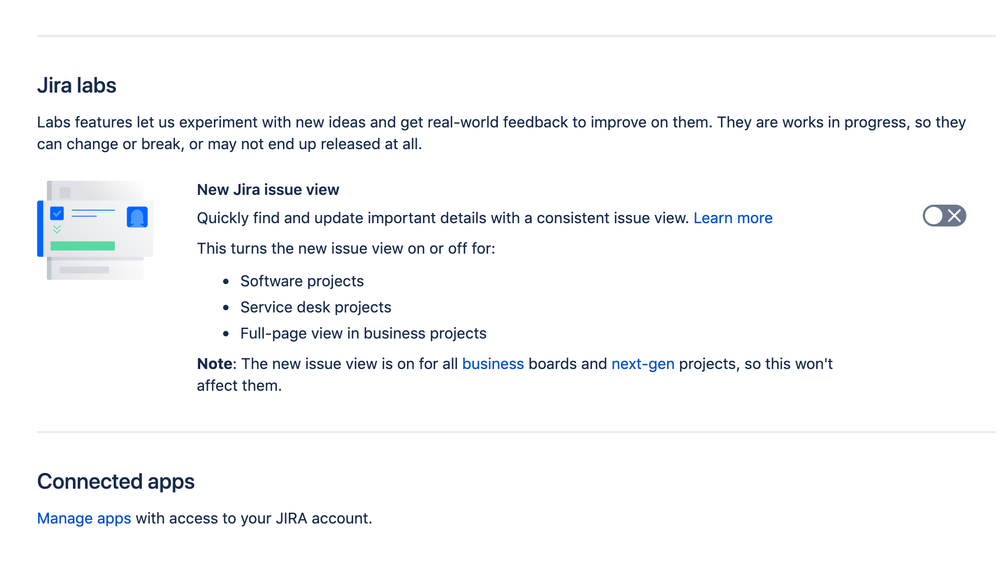
Profile icon > Personal Settings > Jira Labs
You must be a registered user to add a comment. If you've already registered, sign in. Otherwise, register and sign in.
My custom fields i.e. Cascading multi-selector and other custom fields are not reading on the new screen. Also, my developers are complaining that they can't understand the new screen. Also some of the paid for apps are not compatible with the new screen and won't show up. Please listen to your users and don't go this route or allow us to choose what is best for our teams. (Cloud user)
You must be a registered user to add a comment. If you've already registered, sign in. Otherwise, register and sign in.
Thanks Dip, I suppose the issue will be harder to solve if/when Atlassian will -God Forbid!- decide to deprecate the old view completely ...
You must be a registered user to add a comment. If you've already registered, sign in. Otherwise, register and sign in.

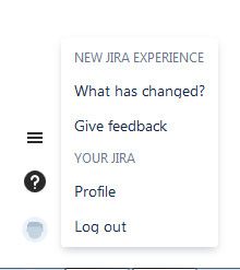
- Find your avatar at bottom left section
- Select Personal Settings
- disable jira labs checkbox
- Problem Solved
You must be a registered user to add a comment. If you've already registered, sign in. Otherwise, register and sign in.

The way I revert to the old view in Jira Server is going into your personal settings(bottom left image icon) and disabling "Jira Labs" . This keeps it permanently in the old view.
You must be a registered user to add a comment. If you've already registered, sign in. Otherwise, register and sign in.
We just "upgraded" to jira 7.13 (from 7.4.5). The UI changes are universally despised by everyone I've talked to. Now, if your Issue ticket has attachments, you are forced to page down (6 lines for each attachment, compared to one per line in the old UI,) just to get to the actual content of the ticket.
And this is in the "List" view!
Who would choose this?
Similarly for Issue links (four lines each, compared to one per line in the old UI.)
Atlassian, fire your misguided screen layout designers. Hire some people who understand workflow and productivity. You seem to have forgotten that you are in the business of selling productivity tools.
You must be a registered user to add a comment. If you've already registered, sign in. Otherwise, register and sign in.

I had the chance to have a conversation with a Jira Product Manager recently. I expressed concerns with performance, usability and functionality. We had a very nice conversation. He listened very clearly to what I had to say and did state that they have some changes in mind for the somewhat near future.
So, good news is that Atlassian is listening and more importantly is 'hearing us'!
You must be a registered user to add a comment. If you've already registered, sign in. Otherwise, register and sign in.

That is a very provocative, and potentially loaded, question.
And an excellent one.
I am an Atlassian fan-boy, and hence biased towards them, but "what problem did you solve?" is an impossible question for them. Because the answer is "nothing". The old UI was not great, but the new one is almost unusable.
You must be a registered user to add a comment. If you've already registered, sign in. Otherwise, register and sign in.

I spend half our day dealing with users who can't figure out how to do stuff in the new UI. I have the old one and will cling to it until you fix it!
You must be a registered user to add a comment. If you've already registered, sign in. Otherwise, register and sign in.

You can't. Your only option is to migrate to server (or hope that Atlassian give up and re-build a different interface)
You must be a registered user to add a comment. If you've already registered, sign in. Otherwise, register and sign in.

New JIRA layout ****** me off so much. I'm not a power user, or interested in customising my layouts, but now a lot of the damn ticket fields are line wrapped and I have two huge white space columns either side of this stupid centralised layout. Maybe 60% of the screen real estate is entirely wasted. Did anyone try and view this on a 39" screen? Mobile first can **** ***.
And thanks for forcing it on everyone.
You must be a registered user to add a comment. If you've already registered, sign in. Otherwise, register and sign in.
Interesting thing... If you go to Atlassian's own Jira version to log a case, it is the old UI still. They force us to use the new while they are still able to use the old layout!
You must be a registered user to add a comment. If you've already registered, sign in. Otherwise, register and sign in.

Honestly, what were they thinking! These changes make it almost unusable from a Jira admin perspective!!
You must be a registered user to add a comment. If you've already registered, sign in. Otherwise, register and sign in.
You must be a registered user to add a comment. If you've already registered, sign in. Otherwise, register and sign in.
THank you @Callum Hepburn This is a pain but a lot less of a pain than using the new view. At least I can get work done. Again, Thank you!!!!
You must be a registered user to add a comment. If you've already registered, sign in. Otherwise, register and sign in.

Forced "new view" is totally disgusting.
Give people the options!!!
You must be a registered user to add a comment. If you've already registered, sign in. Otherwise, register and sign in.

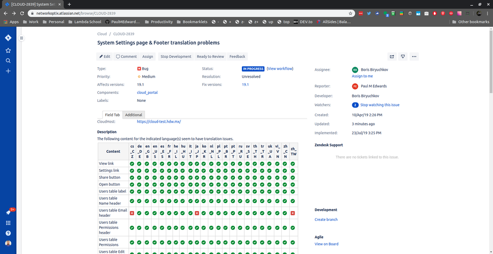
You need to apply "?oldIssueView=true" to the end of every ticket URL. If you navigate to another ticket, or another tab, welcome back to the "new and improved" UI which is really so much worse in terms of actual readability and useability.
You must be a registered user to add a comment. If you've already registered, sign in. Otherwise, register and sign in.
I remember when the new UI came out. I did not like it and I said so when JIRA asked for my feedback. So I was a bit taken back too, when all of a sudden it was no longer optional. This thread is a walk down memory lane.
After months of using the UI, I like the new UI. Not only that, I like it better the old UI.
That is why I found this thread today. Tasks that we create in the new UI are randomly switching back to the old UI. I don't know why. And I am finding that I don't like it. So I am searching for a way to permanently disable the old UI.
Hmm. Curious how things change.
You must be a registered user to add a comment. If you've already registered, sign in. Otherwise, register and sign in.

This doesn't work for me!
You must be a registered user to add a comment. If you've already registered, sign in. Otherwise, register and sign in.
Paul, my comment below may help you. If not sorry for inconvenience.
Your Profile Settings[at Left-bottom corner]->right click -> Account Settings -> Click on "Products" in left menu -> Click on Jira Settings -> it will open new page as Personal Settings Page and turn off "New Jira Issue View"
You must be a registered user to add a comment. If you've already registered, sign in. Otherwise, register and sign in.
You must be a registered user to add a comment. If you've already registered, sign in. Otherwise, register and sign in.
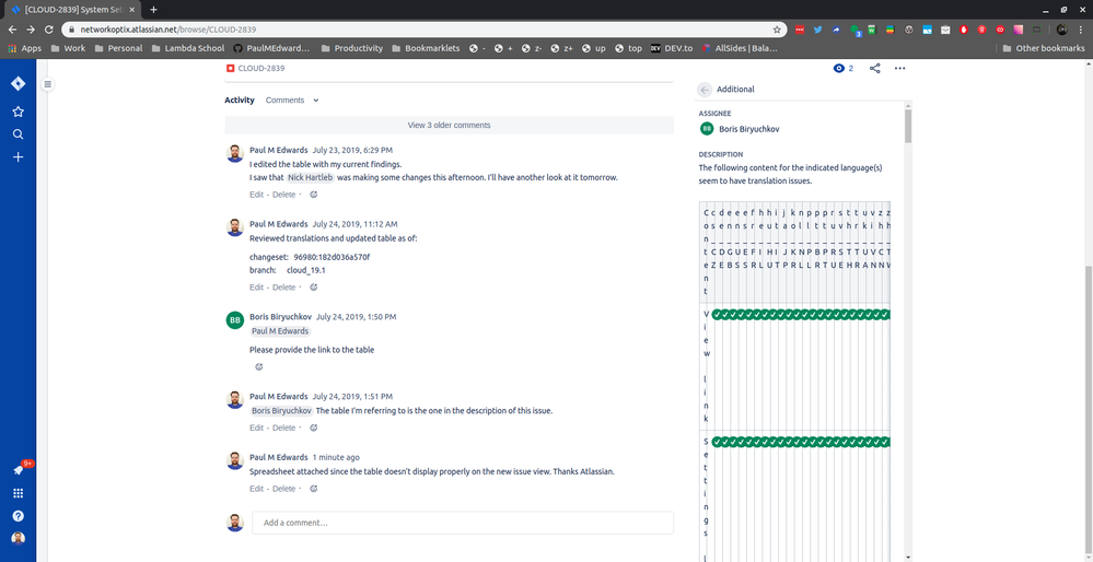
My beautiful table is horribly ugly and completely unusable in the new issue view.
Old:
New:
You must be a registered user to add a comment. If you've already registered, sign in. Otherwise, register and sign in.

The New Jira view is horrible
The person who designed it never use Jira on daily basis - the amount of UI components are overwhelming, the usability is horrible . Plz hire better designers who can actually design decent user's workflow
You must be a registered user to add a comment. If you've already registered, sign in. Otherwise, register and sign in.
Hi everyone,
Thank you for taking the time to share your feedback. My name's Matt and I work on the product management team for Jira Cloud.
My squad is currently looking into how we might improve the navigation UI. In fact, we have an exploration today that you can try if you use the Chrome browser. Please head on over to https://community.atlassian.com/t5/Jira-discussions/Calling-all-Jira-Cloud-users-Give-us-feedback-on-our-exploration/td-p/1126694 for more information.
As for the new UI regarding the issue view/layout, my colleague @Yousef Abusamak will be the best point of contact.
Cheers,
Matt
You must be a registered user to add a comment. If you've already registered, sign in. Otherwise, register and sign in.

Was this helpful?
Thanks!
Community showcase
Atlassian Community Events
- FAQ
- Community Guidelines
- About
- Privacy policy
- Notice at Collection
- Terms of use
- © 2025 Atlassian



You must be a registered user to add a comment. If you've already registered, sign in. Otherwise, register and sign in.