Missed Team ’24? Catch up on announcements here.
×Community resources
Community resources
Community resources
Is Total Age Chart possible instead of Average Age Chart?
Let's say that I have 1 ticket that has been open 30 days: the average age chart will show '30 days'
If 10 more tickets open, the average age on the chart will plummet, while in reality the responsibility for my team will have INCREASED. This chart almost incentivizes leaving new tickets open a bit to get the average age down
I'm not saying average age can't have its uses, but I feel that Total Age is much more representative of the actual scope of work for a team, and am wondering if there is a way to get that in chart format?
Thank you
Daniel
3 answers
Hi @Daniel Satnic ,
You can try Status Time app developed by our team. It provides reports on how much time passed in each status as well as status entry dates and status transition count.
Once you enter your working calendar into the app, it takes your working schedule into account too. That is, "In Progress" time of an issue opened on Friday at 5 PM and closed on Monday at 9 AM, will be a few hours rather than 3 days. It has various other reports like assignee time, status entry dates, average/sum reports(eg. average in progress time per project). And all these are available as gadgets on the dashboard too.
Here is the online demo link, you can see it in action and try.
If you are looking for a free solution, you can try the limited version Status Time Free. Hope it helps.
Hello @Daniel Satnic
That is one of the problems with the built-in Average Age Report or Resolution Time Report. Both reports also are very high level. They just show daily average data. Average Age Report excludes resolved issues and Resolution Time report excludes non-resolved issues. Resolving an issue dramatically affects the averages shown by those reports.
If you are interested in a very flexible custom solution, our team at OBSS built Time in Status app for this exact need. It is available for Jira Server, Cloud, and Data Center.
Time in Status allows you to see how much time each issue spent on each status or assigned to each assignee. You can also combine statuses into consolidated columns to see metrics like Ticket Age, Resolution Time, Cycle Time, or Lead Time. For example, you can add a column to the report that includes all statuses in your workflow (except resolved and closed) and see the total time between creation and resolution of the issue.
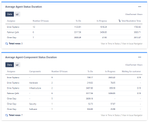
You can calculate averages and sums of those durations grouped by the issue fields you select. (For example, see the total InProgress time per Epic or average Resolution Time per issue type). I guess the "sum reports" mentioned here are what you are looking for. They can show you the total time for multiple tickets.
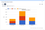
(The screenshots below show Average reports but you can get the same reports as SUM)
The app calculates its reports using already existing Jira issue histories so when you install the app, you don't need to add anything to your issue workflows and you can get reports on your past issues as well. Time in Status can display its reports and charts in its own reporting page, in dashboard gadgets, and in a tab on issue view screens.
Using Time in Status you can:
- See how much time each issue spent on each status, assignee, user group and also see dates of status transitions.
- Calculate averages and sums of those durations grouped by issue fields you select. (For example, see average InProgress time per project and per issue type.)
- Export your data as XLS, XLSX, or CSV.
- Access data via REST API. (for integrations)
- Visualize data with various chart types.
- See Time in Status reports on Jira Dashboard gadgets (released for cloud, server&DC gadget coming soon)
https://marketplace.atlassian.com/1211756
EmreT
You must be a registered user to add a comment. If you've already registered, sign in. Otherwise, register and sign in.

Hi @Daniel Satnic -- Welcome to the Atlassian Community!
I do not believe that is possible with out-of-the-box features. And, median age (or another percentile) might be a better measure than total. Or better still, show the histogram of ages.
You may want to look at the created/resolved chart, or marketplace addons, to get better visualization indicators for your use case.
Best regards,
Bill
You must be a registered user to add a comment. If you've already registered, sign in. Otherwise, register and sign in.

Was this helpful?
Thanks!
Community showcase
Atlassian Community Events
- FAQ
- Community Guidelines
- About
- Privacy policy
- Notice at Collection
- Terms of use
- © 2024 Atlassian


You must be a registered user to add a comment. If you've already registered, sign in. Otherwise, register and sign in.