Community resources
Community resources
Community resources
- Community
- Products
- Jira Service Management
- Questions
- Report that shows a list of all Affected Services and the Amount of Issues this week
Report that shows a list of all Affected Services and the Amount of Issues this week
Hi there,
I would like to have a report to see which "Affected Services" are most relevant and show me the amount of issues for each services.
That is not possible with the default reports right? I could just create a series (by hand) for each service to filter with.
Kind regards,
Constantin
2 answers

Hi Constantin,
If the Affected Services field is a pick list, you should be able to add an Issue Statistics gadget to a dashboard and use that field as the issue statistic. That will give you a count per service.
if you're open to solutions from the Atlassian Marketplace, I think you might like the app that my team and I working on, JXL for Jira.
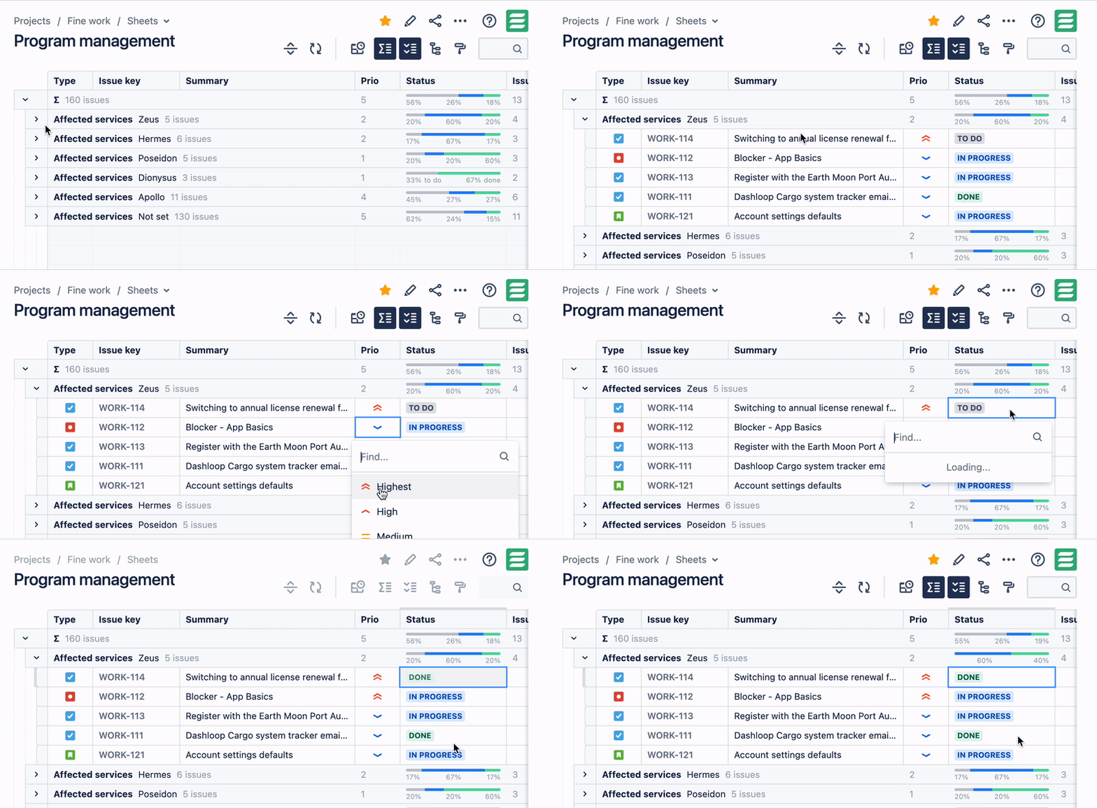
JXL is a full-fledged spreadsheet/table view for your issues that allows viewing, inline-editing, sorting, and filtering by all your issue fields, much like you’d do in e.g. Excel or Google Sheets. It also comes with a number of advanced features, including support for issue grouping by any issue field(s), and sum-ups. All these work with Affected services, too:
As you can see above, the view remains fully interactive - meaning that you can work on your issues straight away (but also trigger various operations in Jira, or export your data with just one click).
Any questions just let me know,
Best,
Hannes
You must be a registered user to add a comment. If you've already registered, sign in. Otherwise, register and sign in.

Was this helpful?
Thanks!
Atlassian Community Events
- FAQ
- Community Guidelines
- About
- Privacy policy
- Notice at Collection
- Terms of use
- © 2024 Atlassian


You must be a registered user to add a comment. If you've already registered, sign in. Otherwise, register and sign in.