Community resources
Community resources
Community resources
- Community
- Products
- Jira Service Management
- Questions
- Average Age Chart Appears to not correlate for our reporting
Average Age Chart Appears to not correlate for our reporting
Hi All,
I am using the average age chart to report on our service desk tickets.
The filter I am using has the following:
Project="Service Desk" and created >= -52w AND Resolved >= -52w AND assignee in ("service desk group")
So, nothing fancy (as far as I can tell)
For this filter, the average age chart shows a monthly average for January to be 20 days
So far so good.
However, when I tried to be more granular to see how the different types of the tickets age, this is where things are not adding up.
So, keep in mind that for ALL ticket in the filter above, the average is 20 days. Once I add another filter example:
Project="Service Desk" and created >= -52w AND Resolved >= -52w AND assignee in ("service desk group") AND Module=SOMETHING
the average age jumps to 30, 40 or 70 depending on the selected module.
I went through all MODULE groups as well as MODULE NOT IN (everything else selected) and all totals were significantly higher than 20 days.
I would have thought the law of averages means that some will be more than 20 and some less, but that's not the case.
Can anyone shed some light on this?
2 answers
1 accepted
Hi @George Abdo,
Perhaps one of the module has some issues with a much higher age. And taken in the context of a module where are less issues than in your global filter, this increases the average.
Be aware that there are alternatives to this gadget. Take a look over this article: https://community.atlassian.com/t5/App-Central/An-effective-dashboard-for-Service-Desk-and-Customer-Support/ba-p/2360369.
The Cycle Time Trend, Histogram, Control Chart or WIP Agin Chart gadgets offered by our Great Gadgets app are good options for determining the (average) age. You could try these and see if they show the same average or not.
Hope this helps.
Danut.
Thanks @Danut M _StonikByte_
I'll give them a try when I get a chance.
Still, an average of individual subgroup averages should equal to the average of the whole!
You must be a registered user to add a comment. If you've already registered, sign in. Otherwise, register and sign in.
Hi @George Abdo,
If in the whole you have these values:
10, 1, 1, 1, 2 the average will be 15 / 3 = 5
But if in a group you have:
10, 2 => average is 12/2 = 6
Danut.
You must be a registered user to add a comment. If you've already registered, sign in. Otherwise, register and sign in.
You are right in your calculations.
I revisited my old maths lessons from many years ago, and I realised my mistake.
The average of averages is not the same as the average of the whole unless all values are equal, which explains the discrepancies I am seeing.
You must be a registered user to add a comment. If you've already registered, sign in. Otherwise, register and sign in.
Hello @George Abdo
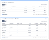
Jira's own Issue Age and Resolution Time charts/gadgets offer limited flexibility and details. For maximum flexibility and details, I suggest you use a marketplace app for this. Even if you don't plan to purchase the app, you can use it to cross-check its results with Jira's own charts.
Our team at OBSS built Time in Status exactly for this. It is available for Jira Server, Cloud, and Data Center.
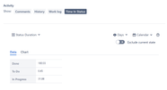
Time in Status mainly allows you to see how much time each issue spent on each status or each assignee.

You can combine the time for multiple statuses to get metrics like Issue Age, Cycle Time, Lead Time, Resolution Time etc.
For all numeric report types, you can calculate averages and sums of those durations grouped by the issue fields you select. For example total in-progress time per customer or average resolution time per sprint, week, month, issuetype, request type, etc. Grouping by parts of dates (year, month, week, day, hour) or sprints is particularly useful here since it allows you to compare different time periods or see the trend.
The app calculates its reports using already existing Jira issue histories so when you install the app, you don't need to add anything to your issue workflows and you can get reports on your past issues as well. It supports both Company Managed and Team Managed projects for Jira Cloud.
Time in Status reports can be accessed through its own reporting page, dashboard gadgets, and issue view screen tabs. All these options can provide both calculated data tables and charts.


https://marketplace.atlassian.com/apps/1211756/
EmreT
You must be a registered user to add a comment. If you've already registered, sign in. Otherwise, register and sign in.

Was this helpful?
Thanks!
DEPLOYMENT TYPE
CLOUDPRODUCT PLAN
PREMIUMPERMISSIONS LEVEL
Product AdminAtlassian Community Events
- FAQ
- Community Guidelines
- About
- Privacy policy
- Notice at Collection
- Terms of use
- © 2024 Atlassian


You must be a registered user to add a comment. If you've already registered, sign in. Otherwise, register and sign in.