Community resources
Community resources
- Community
- Products
- Jira Software
- Questions
- How do I write a yearly comparitative throughput report?
How do I write a yearly comparitative throughput report?
We'd like to have a report/gadget on our statistics dashboard that shows the total throughput from subsequent years to compare annual outputs. The Two Dimensional report has the format we want, but the stats don't let me consolidate years. Is there a way to pull the output of my yearly filters into a single gadget like maybe the pie chart and show the total for each year not broken down by sprint?
2 answers
1 accepted

Hi @Jeffrey Wolfe -- Welcome to the Atlassian Community!
First thing, if your team members, the work requests, or the technology used change over time, measuring back that far in time may not provide a lot of value. What problem are you trying to solve by doing so.
Next, the built-in gadgets cannot do what you ask for roll-up/grouping criteria. When customers need such features often they purchase marketplace addons or perform the reporting outside of Jira.
With the built-in features, you could create several queries using relative date ranges, and then they would not need updates. Then use each saved filter with different gadgets on the dashboard.
For example, filters for the completed work for the last n-years would be:
- project = myProjectName AND statusCategory = Done AND resolved >= startOfYear(-1) AND resolved <= endOfYear(-1)
- project = myProjectName AND statusCategory = Done AND resolved >= startOfYear(-2) AND resolved <= endOfYear(-2)
- ...
- project = myProjectName AND statusCategory = Done AND resolved >= startOfYear(-N) AND resolved <= endOfYear(-N)
Kind regards,
Bill
Thanks, Bill.
I was not aware of the startOfYear and endOfYear functions so this was very helpful. I was able to create some new filters and use a Two Dimension gadget for each year, then stacked the gadgets vertically in the dashboard. At least we have a quick, visual comparison for each year.
Take care,
Jeff
You must be a registered user to add a comment. If you've already registered, sign in. Otherwise, register and sign in.
Hi Jeffrey, could you send me a picture of what your graph looks like? I'm trying to do just that and can't seem to get it. (julianaleite@outlook.com.br)
You must be a registered user to add a comment. If you've already registered, sign in. Otherwise, register and sign in.

Hi Jeff,
For reporting, you may consider using eazyBI for Jira.
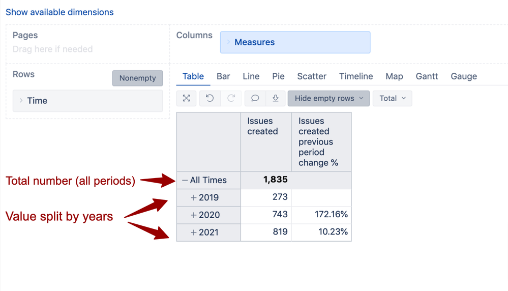
All issue data imported from Jira can be analyzed together for all past time periods or across several years; the information can be displayed as the total value, split by years (or months, weeks, days), and compared between time periods. In other words, there are no built-in limitations for the report time period.
The following report shows the number of issues (measure "Issues created"), created within each year; additionally, the change in % against each previous year is added. In such a way, any other metric can be analyzed (resolved or closed issues, logged time etc.).
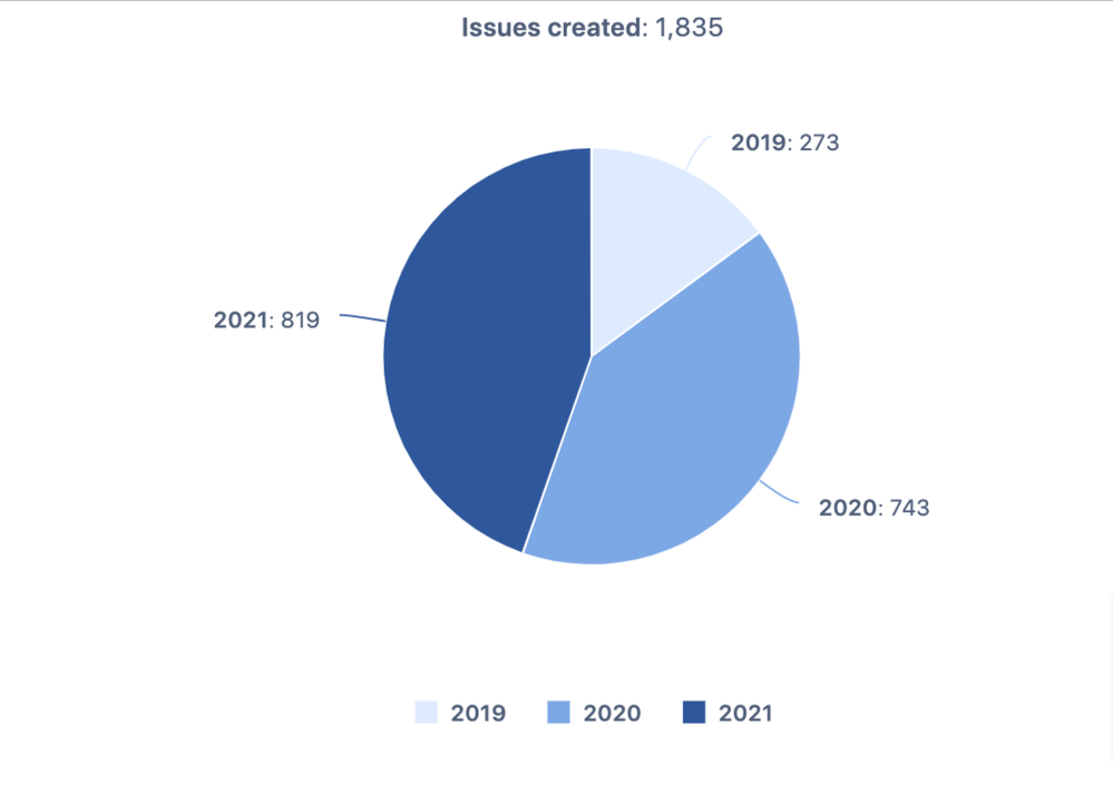
Those data can be also displayed in the report as a pie chart (only measure "Issues created" is used there):
You may check other eazyBI reports over time in the eazyBI Demo account, for instance,
Feel free to contact us at support@eazybi.com for any further questions!
Best,
Ilze, eazyBI Customer Support
You must be a registered user to add a comment. If you've already registered, sign in. Otherwise, register and sign in.
Hey Ilze,
Unfortunately I'm not in charge of procurement so I am not able to get the BI product. However, it looks like you've got a great tool for a much needed method of analysis.
Take care,
Jeff
You must be a registered user to add a comment. If you've already registered, sign in. Otherwise, register and sign in.

Was this helpful?
Thanks!
TAGS
Community showcase
Atlassian Community Events
- FAQ
- Community Guidelines
- About
- Privacy policy
- Notice at Collection
- Terms of use
- © 2024 Atlassian


You must be a registered user to add a comment. If you've already registered, sign in. Otherwise, register and sign in.