Community resources
Community resources
Community resources
Bar Chart showing total story points per resource?

Hi all. I am trying to create a bar chart on my dashboard where the X-axis shows different developers (resources) and the Y-axis shows the total story points for all non-resolved tasks per resource. This will be useful for me to manage the balance of story points across developers and determine if I need more resources to meet a schedule.
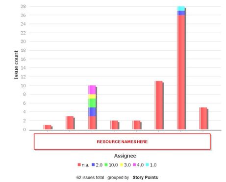
The best I have come up with is seen here...
I'd like to do 2 things here:
1) Remove the Issue Count data from the chart
2) Sum the story points instead of showing them in different colors. This summing may not be so important if I can get rid of the Issue Count and just see what all of the individual story point fields add up to for a developer.
I know there are plugins like sumUp but I m trying to avoid having to get IT/SCM to approve another plugin. I have also read about exporting a JQL to a spreadsheet then summing what I need there, but could I then import that back into JIRA to create the bar chart on my dashboard?
BTW, the filter this comes from is just a query for all open tasks in my project. Obviously I have not assigned story points to all tasks but I was just starting to test this and so far don't see the chart the way I'd like to.
If anybody has ideas of another direction to go in on the dashboard to show what I want (another gadget type?), I'm all ears.
Thanks!
1 answer
1 accepted

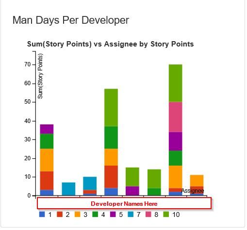
To add my own answer, I found a plugin we have here called mirrorlake that was able to create the following stacked bar chart...
I still would like to not have the separate colors for different story point values, but this at least gives me the sum per developer.

Was this helpful?
Thanks!
Community showcase
Atlassian Community Events
- FAQ
- Community Guidelines
- About
- Privacy policy
- Notice at Collection
- Terms of use
- © 2025 Atlassian


You must be a registered user to add a comment. If you've already registered, sign in. Otherwise, register and sign in.