Community resources
Community resources
Community resources
Opinion: New UI/View for Checkbox fields is BAD.

Opinion
In Jira, Checkboxes fields display (in View mode) exactly as Select List (multiple options). And in Edit mode they function identically.
This is bad.
(Also I realize now this is also the case on Server/DC, so this is not new. But it still super-annoying, resulting in hackery like this, which was a fun programming exercise, but I think it's due to a STUPID UI CHOICE.)
Discussion
So I get it. Checkboxes are Web 1.0. They're old. They take up tons of extra space.
But there's a pretty valuable point to always showing them: YOU CAN SEE WHAT WAS NOT CHECKED.
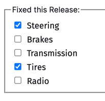
Here's how Checkboxes kind of used to look like LONG AGO in Jira, even if you were not editing the field. (I had to fake this because I do not have an old version of Jira nor do I want to spin one up):
Currently in both Jira Server/DC and Cloud, if you have a Checkbox field, the options only show up when editing the field. But once you are done editing, you ONLY see the options you have checked.
Functionally this is exactly the same as a multiple choice Select field.
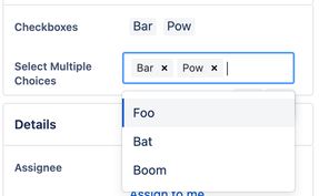
Here are the two types of fields while being edited:
When you complete editing of the fields, and are viewing the issue you cannot tell the difference:
This is bad. The point of checkboxes isn't just a different user interface (and in this case, the difference is negligible), the point is that UNCHECKED OPTIONS ARE IMPORTANT. They provide VALUABLE CONTEXT.
Conclusion
If you want to not show all the options, then you can do that with a Select List (multiple options) field.
A Checkboxes field should SHOW CHECKBOXES even in on View screens. THIS IS BROKEN.
Of course modern UX/UI designers will pooh-pooh this and say I'm old. And it's true, I am. But I'm also right.
6 comments

@Darryl Lee .. get your point ..but showing 50 options with your implementation will take up a lot of space 😃

Heh, yeah, 50 checkboxes is a bad example. :-}
I think it's actually going to be really interesting how this ends up looking in @Darrin Lillians final issues if he does in fact start out with all 50 options initially "checked" in the Scope field. I wonder if you might be able to share a screenshot?

For the display, it could handle dynamic rendering of the checklist options in a couple ways that I can think of that could work to satisfy creators, reporters, watchers, assignees
- Limit default to Display 5 or 10 options. If more than this, add an expand/collapse section control
- format the section to have two or three columns that allow 5 or 10 by default and add an expand/collapse section control

I don't want to rub it in and cause more drama but. This is bad.
Is there any way to fix this ?
And why is it different depending on how we show the same screen ?

Agreed. Why even have a checkboxes type if it behaves like a multi-select field? That's just dumb. The average person would assume that a checkboxes type would display a checklist for the very reasons that @Darryl Lee said, to see what's not checked. That's just common sense, and this design defies common sense.
Let's turn this into a bug request; it's certainly not a feature request. :)
It's been a minute since I've needed and new field so hadn't realized they'd mucked around checkboxes.. And yes, I beed check boxes because I need to see what's NOT checked as it's a simple 'to do' list and I don't want to have 10 sub tasks each time... And exactly, what is the difference between checkboxes and multi-select field?? Anyway. Carry on.

Hi everyone - I recommend voting for this issue to help get this fixed faster!
I can't agree with this post more. It's in the same bucket for me as being forced to click into a menu to see the available workflows instead of being presented with buttons.
Thank you Daryl. I'm glad I'm not alone.
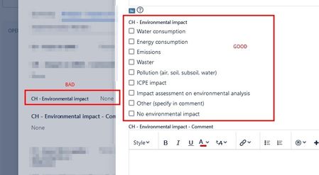
This is what the multiple choice checkboxes look like in Jira Server.
Recommended Learning For You
Level up your skills with Atlassian learning
Learning Path
Become an effective Jira admin
Manage global settings and shared configurations called schemes to achieve goals more quickly.
Streamline Jira administration with effective governance
Improve how you administer and maintain Jira and minimize clutter for users and administrators.
Learning Path
Become an effective Jira software project admin
Set up software projects and configure tools and agile boards to meet your team's needs.
Was this helpful?
Thanks!
- FAQ
- Community Guidelines
- About
- Privacy policy
- Notice at Collection
- Terms of use
- © 2025 Atlassian


