Community resources
Community resources
Community resources
- Community
- Products
- Confluence
- Articles
- Mapping the Knowledge: From a Blank Page to Successful User Guide
Mapping the Knowledge: From a Blank Page to Successful User Guide
The first rule of All-Knowledge-Bases-in-the-World: You can't make the user read.
We've all been there, and when it comes to documentation improvements and upgrades, the struggle is real. I will again start with my favorite song of Depeche Mode: "Let me take you on a trip...". Still, not around the world and back, but we made quite a mileage with our Knowledge Base enhancements.
From Confluence Server to Confluence Cloud, we are building our documentation portal with one purpose: to give each user enough information about the product essence, value, and usage. To guide them through the process of adopting, using, and customizing all Botron products. And from the beginning of time, 70% of the support requests exist only because the users are not using the portal (*shrug*).
After countless rises and falls, we reach a solid ground in the Knowledge Base making, and I will share with you the main pillars of this construct.
Keep it simple, keep it beautiful
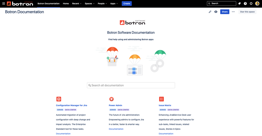
You may think that when it comes to a knowledge base, the design is not a big deal. I'll reveal the secret: the design is a big deal. It may be a small part of the whole process but never underestimate the first impression of your users. Give them clean, easy to navigate view and they will embrace it right away. At Botron, we stick with one homepage for all apps with not much but enough information to display, as well as clean navigation.
Divide
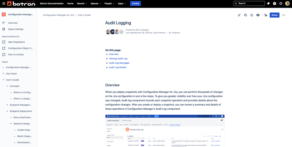
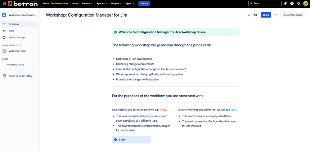
If one Confluence Space seems small for your content, divide! Having separate space for each product or service is crucial for the proper usage of your knowledge base. Having the same structure across spaces allows the users to quickly dig into the topics and find the right spots even in different product spaces.
If you want them to use it, show them how
Try to include as many product screenshots, graphs, images, or videos as you can fit in the description page (Well, not literally. You got the point.) Simple sentences, enough technical depth, and samples are the key to the right knowledge bank. We found that usage of short-length GIFs is handy for users without any knowledge or experience with our products.
Use the right Macros
Confluence is not just a blank space, waiting to be filled with images and bold text. Using the right Confluence Macros can save the users' time and efforts in searching for the desired information. Our documentation gurus highly recommend the use of Page trees, Information Panels, Statuses, and other visual enhancements, which keep the content well structured, easy to read, and much easier to follow.
A Path for your users is a Map for you
Even if you are the Brain in your company, you can't remember all the specifics of your company portfolio. Making a good knowledge base will support not just your potential customers but your team and your onboarding colleagues. Having private pages, drafts, or product tutorials is part of the benefits which you can hide into your Confluence and use in need.
If you want something explained in more detail, feel free to reach out!
And my long and hearty letter to everyone:
"Dear Users,
read the Docs.
Love 💙,
Teodora"
Was this helpful?
Thanks!
Teodora V _Fun Inc_

About this author
Putting Pieces Together @ Fun Inc
Fun Inc
Sofia, Bulgaria
46 accepted answers
Atlassian Community Events
- FAQ
- Community Guidelines
- About
- Privacy policy
- Notice at Collection
- Terms of use
- © 2025 Atlassian


6 comments