Community resources
Community resources
Community resources
How to Create Jira Gantt Chart: Tips, Alternatives and 1-Min Demo
With a clear visual timeline, the Gantt chart helps teams stay on track, manage dependencies, and hit deadlines with ease. In this guide, we’ll dive into the tools, tips, and best practices for building Jira Gantt charts, along with an alternative solution.
What is a Gantt chart and why use one in Jira?
A Gantt chart is a project management tool that displays tasks as bars on a timeline. It’s a fantastic way to visualize:
-
Task start and end dates.
-
Dependencies between tasks.
-
Progress across your entire project.
In Jira, integrating Gantt charts can bring clarity to complex workflows, especially in agile and hybrid teams that need to manage sprints and long-term milestones simultaneously.
How to Create a Gantt Chart in Jira
1. Jira built-in timeline
Jira Software comes with a Timeline feature. While it isn’t a classic Gantt chart, the roadmap provides a timeline view of tasks and their dependencies. Here's how to use it:

Steps to Create a Timeline:
-
Create Epics: start by creating epics, which represent larger initiatives or high-level tasks.
-
Add Issues and Dependencies: add issues under each epic and set their start and due dates. You can also link tasks to define dependencies.
-
View Timeline: go to the "Timeline" tab to view a timeline representation of your epics and tasks.
2. Jira plugins
To create a more feature-rich Gantt chart, Jira’s ecosystem offers a variety of plugins. Here are some popular options:
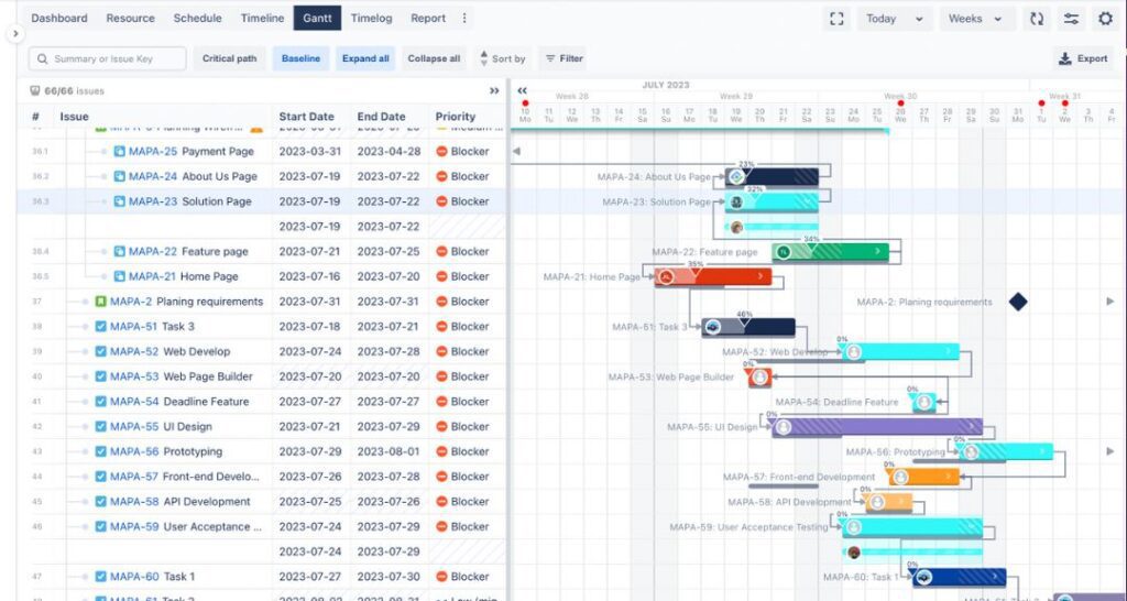
Gantt Chart for Structure PPM

-
Key Features: offers hierarchical task structures, customizable Gantt views, and powerful reporting.
-
Best For: large teams managing complex projects with interrelated tasks.
BigGantt
-
Key Features: task grouping, critical path analysis, and drag-and-drop scheduling.
-
Best For: teams looking for a versatile Gantt tool.
WBS Gantt-Chart for Jira

-
Key Features: Work Breakdown Structure (WBS) integration, milestone tracking, and resource allocation.
-
Best For: enterprises requiring advanced project management capabilities.
ProScheduler
-
Key Features: combines resource planning, Gantt charts, and reporting for complete project visibility.
-
Best For: teams focused on resource management and timeline optimization.
Challenges with Classic Gantt Charts
While traditional Gantt charts are useful, there are many pitfalls that show up along the way:
-
For large projects with numerous tasks and dependencies, Gantt charts can become incredibly complex and difficult to read.
- If tasks are ahead or behind schedule, adjusting all subsequent tasks manually can be time-consuming and prone to errors.
-
Classic Gantt charts are not ideal for visualizing resource allocation and availability.
-
Gantt charts are inherently linear and predictive, which clashes with the iterative and adaptive nature of agile project management methodologies.
-
While they excel at showing project timelines, Gantt charts typically offer limited insight into project scope details or detailed cost breakdowns.
-
Once created, a Gantt chart can quickly become outdated as project variables change.
Planyway for Jira: A User-Friendly Alternative
To easily overcome these challenges, try Planyway timeline instead. Here's what you get with the plugin:

- Visualize work items across projects on a timeline that you can group by user, project, epic, team, or component.
- Easily drag and drop Jira work items to reschedule them, extend duration, or reassign them.
- Build up the clear hierarchy of tasks visualizing all work item types as well as subtasks.
- Link work items with dependencies, show milestones, and view work according to sprints and releases.

Planyway easily transforms the view into the resource management dashboard at a click. The workload view lets you optimize workload automatically, see who is over or under allocated, take vacations into account.

Was this helpful?
Thanks!
Mary from Planyway
0 comments