Community resources
Community resources
Community resources
This chart predicts when projects will be done!
Hello Jira Community,
If you’ve ever been managing a project of any kind, you know how important it is to have a good idea of when you can expect the work to be done. Today we’ll learn about a chart that does exactly that!
I’m Vova from the Screenful team. We build productivity analytics for modern leaders. Our Jira integration makes it easy to create dashboards and reports from your issue data and share the actionable insights with your team. Today I want to show you how we forecast our team’s workload and how you can do it too.
Screenful’s newest Workload (forecast) chart may look similar to the Workload (planned) chart which I talked about in April. While the Workload (planned) chart was based on the set start and end dates for the issue, the new chart makes forecasts based on your historical velocity. Instead of set start and end dates, it looks at how fast you've completed work in the past and makes predictions assuming your future delivery speed will correlate with your past performance.
Getting started with forecasts
Getting started is easy and can be usually done in under two minutes: simply create a Screenful account, connect your Jira projects, and navigate to the new Forecasts section in the Insights tab:

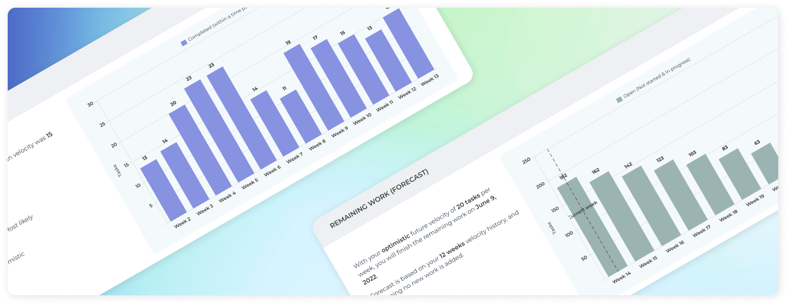
The topmost chart shows your historical velocity as the amount of work completed per week. Below is the new Workload (forecast) chart that shows how long it takes to complete the remaining work based on the velocity history shown above.
These two charts help you to see your past velocity, and get a data-driven forecast for the remaining work. Instead of guesswork, you can use the data to make your own judgment!
Chart customization
In addition to creating Workload (forecast) in the Insights tab, you can also create it as a custom chart to then attach to your dashboards or scheduled reports. For this, go to the Charts tab and click Add new chart → Blank new chart, and select the Workload (forecast) as the chart type. The chart editor opens with the chart settings. You can select one or more data sources and any of your numeric fields as the unit. Here’s an example chart:

How to read this chart?
The chart shows a burndown of the remaining work on a weekly total until all the work is done. The leftmost bar is the current week and the rightmost bar shows the week when all the work is completed. As the work progresses, the remaining work reduces until it goes to zero.
At the top of the chart, you can switch between the Most likely, Optimistic, and Pessimistic scenarios. The most likely scenario assumes that you will complete the same amount of work (e.g. issues or story points) as you’ve had on a median week in the past. In the Optimistic scenario, you will complete at least the same amount as the top 20% of the weeks in the past. In the pessimistic scenario, you will complete as much as the bottom 20% of weeks in the past. The percentiles are configurable in the chart settings so you can specify to yourself what you consider most likely, optimistic, or pessimistic for your future delivery speed 😃
In the above example, there are 173 open issues right now, and it will take 10 weeks to complete the current backlog of work to be done.
By default, this chart assumes that you will complete roughly the same amount of issues per week as you have done in the past. It uses a 12 weeks median as the basis for the forecast but you can adjust it in the settings.
And that’s how easy it is to tell when a project will be done!

That’s it for today. As always, I’d love to hear from you. Please do not hesitate to comment on this post or reach out to us at hello@screenful.com if you have questions or feedback.
Was this helpful?
Thanks!
Vova Kenih
About this author
Customer Success
Screenful
Helsinki, Finland
1 accepted answer
0 comments