Community resources
Community resources
Community resources
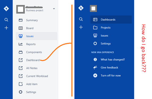
Am I the only one that is really concerned about the new design?

There are multiple things I don't like, but the most glaring is the 100% horizontal flow. The are 4 vertical elements and 0 horizontal. For some reason this makes me super anxious. I can't really even verbalize why.
I also don't like a minimum of 2 clicks to view a list of issues. I like the old way of clicking on "issues" to see your most recent search/filter. This could easily be fixed. Related to this is having to click a "back" arrow to get back to the main navigation (I say main, but now there is a new, higher-level, nav to the left of this which is 99% useless).
Another problem I had was after viewing a dashboard, I struggled to return to the original menu. I ended up having to click "Projects" and pick my project again.
Why do these two separate menus even exist?
2 comments

@roam_scott I too am having some 'usability' growing pains with the new design, specifically with the moving between project admin and system admin. Configuring Custom Fields and Setting up Screens, checking my work, testing issue creation.
It seems really cumbersome at the moment. I'm not sure if this is just because I am new to the interface, and haven't found the most efficient ways of getting around, or if there are design problems
I am most decidedly missing my "back to X project" button, from the system configuration options.
I did enroll in the Design Feedback group, and have submitted Feedback though the Home page. I hope I get a chance to chat with folks about it, maybe I'll learn a trick or two about efficient navigation!

I'd be happier if someone could just explain the two different menus (light and dark). What are they? What is their individual purpose? Why is there overlap? How do you get to each? etc...
@roam_scott let us know if this page helps you and your teams understand the difference between the new sidebar navigation.

I suppose it helps a little. But as a wise person once said, a user interface is like a joke. If you have to explain it, it's not very good.
Opinions vary, and I'm sure the team put a lot of time and effort into this, but for me it's a miss.
Recommended Learning For You
Level up your skills with Atlassian learning
Learning Path
Become an effective Jira admin
Manage global settings and shared configurations called schemes to achieve goals more quickly.
Streamline Jira administration with effective governance
Improve how you administer and maintain Jira and minimize clutter for users and administrators.
Learning Path
Become an effective Jira software project admin
Set up software projects and configure tools and agile boards to meet your team's needs.
Was this helpful?
Thanks!
- FAQ
- Community Guidelines
- About
- Privacy policy
- Notice at Collection
- Terms of use
- © 2025 Atlassian


