Community resources
Community resources
Community resources
- Community
- Q&A
- Confluence
- Questions
- Leat Time Scatter Plot
Leat Time Scatter Plot
I'm putting together a lead time graph in COnfluence, extracting data from Jira and manipulating it in a transformer table in Confluence.
I managed to create the graph, using the Time line type, replacing the line with bubbles. All of this worked ok, but the problem is that when creating the graph when I have more than 1 record per date, it is adding up.
I don't want you to add up, I would like you to add the balls for each record.
it's possible?
example:
01 Feb 2024 3
01 Feb 2024 6
When placing the data on the graph, the values 3 and 6 are being added together, therefore it only shows 1 record with the sum (9).
2 answers
Hi @Márcia Croce ,
As you've mentioned the Table Transformer macro, I suppose you use our Chart from Table macro to create your graph.
So, the behavior is an expected one for Line Chart and Time Line Chart: if you have several numbers of smth belonging to one place (date, project, etc.), these numbers are summed up and then reflected on the graph.
You've mentioned that you use "the Time line type, replacing the line with bubbles" - so, I suppose that this is the case. And by the "bubbles" you mean using dots or dashes instead of a solid line. But the graph itself still remains Line or Timeline.
As a workaround, you may use the Bubble Chart type:

SELECT *,
"1" AS 'Dot'
FROM T*


Now as we draw real dots and not a dotted line, you can have several separate numbers to be reflected under the same date.
You must be a registered user to add a comment. If you've already registered, sign in. Otherwise, register and sign in.
Hi @Márcia Croce,
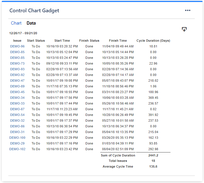
You best option here would be our Great Gadgets app. It offers a Cycle Time Control Chart gadget that you can easily configure to display the Lead Time Scatter Plot that you are looking for. And everything will be in real time, without any manual work. The gadget can be used in both Jira and Confluence.

All you have to do is to configure it to use the filter or the board that returns the issues of your team, then to measure lead time (from issue creation to done) and eventually to set a threshold for highlighting the issues that took longer than expected (the ones in red-color).
It can also display a Data tab with a detailed report about the issues, which you can easily export in CSV:
See here this gadget in action along with Lead Time Histogram and Cycle Time Trend gadgets, which you might find also useful: https://community.atlassian.com/t5/Jira-Software-articles/Building-a-powerful-Kanban-dashboard-in-Jira-with-Great-Gadgets/ba-p/1664331
I hope this helps, If you have any questions, please don't hesitate to contact us at support@stonikbyte.com.
Danut.
You must be a registered user to add a comment. If you've already registered, sign in. Otherwise, register and sign in.
It would be awesome to use this gadget, but I'm not authorized to instal anything in the Jira's company
You must be a registered user to add a comment. If you've already registered, sign in. Otherwise, register and sign in.

You must be a registered user to add a comment. If you've already registered, sign in. Otherwise, register and sign in.