Community resources
Community resources
Community resources
- Community
- Q&A
- Confluence
- Articles
- How to Make Beautiful Pages in Confluence
How to Make Beautiful Pages in Confluence
Your audience is human and we humans don’t always see what's right in front of us. According to research published by Time, 55% of people spend 15 seconds or less on a page. If your pages look like this, chances are high that people won’t absorb any of the information.
An aesthetically pleasing Confluence page isn’t just for beauty’s sake. It enables your team to find what they need and find things quickly.
In this article you’ll learn how to:
Best use widths and layouts
Add structure to your page
Highlight what matters
Deemphasize less important content
By the end, your Confluence pages will be works of art, and you won’t need to be the next Picasso to pull it off.
Want to see it in action? Check out how to make beautiful pages in Confluence on YouTube.
Communicating the Purpose of the Page
With the average person spending less than a minute on a page, it's important to communicate the purpose immediately and concisely. You can achieve this by putting the most relevant information at the top of your page.
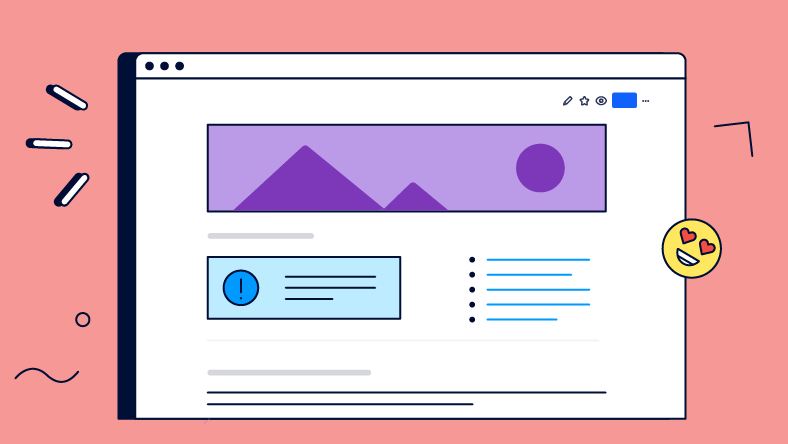
The Header Image communicates what your page is about. Don't add an image just for the sake of adding one. If you don’t have an image that communicates what the page is about, use a neutral image, or none at all.
The Page Title is the most effective way to quickly and succinctly communicate the purpose of your page. The title of a page is important for a variety of other reasons, including searchability. Learn more about page naming conventions for better searchability in Confluence.
Info Panel macros are great for conveying a bit more information about your page, other than your title or header image can convey. At first glance, the Info Panel stands out and catches the reader's attention.
Setting the Layout and Width
Adjusting the width and layout of a page can be very powerful when used effectively.
Layouts make your page more readable and skimmable by breaking up information. It’s best to combine different layouts to group your content and create visual interest.
Width is important depending on the type of content on the page. Written content like blog posts or employee handbooks are best written on narrow pages for readability. Tabular information, like tables and diagrams, are better on wider pages, where filling the screen enhances people’s experience.
If features like layouts and width are new to you, check out our introduction to the Confluence editor tutorial on Youtube.
Adding Structure and Sections
People will be able to locate the information they need more easily if your page is structured clearly.
Headings are the most straightforward method of adding structure to a page. The highest numbered heading indicates a new section, one heading number lower indicates a sub-section, etc.
The Divider macro is another simple way to split up your content in a page. It sections off the text with a line, which helps highlight where new content begins.
The Table of Contents macro allows your end-user to find the section they want at the beginning of the page. This also gives the user a fairly simple breakdown of what the page contains.
Emphasizing and Highlighting Content
With your intro and headings sorted, you've given your page some structure. Now it’s time to highlight the most important information to ensure your readers won't miss it.
Adding images helps quickly communicate the meaning of each section. A screenshot, table, chart, or suitable descriptive image can help people understand your written content more quickly.
Bolded and colored text can help emphasize certain sentences in your page, making them stand out from the rest of the text.
The Expand macro is a nice way to clean up a page that has a lot of information. This is great for bonus content that’s only valuable to some people. Just watch out, so you don’t hide important information that’s relevant for everyone.
Now let’s take a final look at what your Confluence page used to look like, versus the end result after optimising the design for better readability.

Beautiful! 🤩
Tell Us Your Use Case
There are so many great ways to make pages more beautiful in Confluence. What's your favorite?
Let us know in the comments how your team creates beautiful pages.
If you liked this article, you can read the complete version on Rock the Docs, our guide for technical documentation in Confluence.
We have plenty more best practice articles for Confluence, and videos as well. Go to Rock the Docs 👉
Cheers,
Steffen
Was this helpful?
Thanks!
Steffen Burzlaff _K15t_
About this author
Content Strategist / Developer
K15t
7 accepted answers
3 comments