Community resources
Community resources
Community resources
How to make your Confluence pages more interactive with buttons
When creating Confluence pages, we aim to make them organized, easy to navigate, and, of course, engaging. Lucky for us Confluence users, we have various built-in and third-party macros to help us achieve just that. But based on my own experience, one feature that is often misused or perhaps underestimated is buttons.
So why should you start using buttons within your Confluence pages? And how to create great ones?
Why use buttons within your Confluence pages?
- Facilitate navigation: Buttons make it easier to highlight important content and navigate through related Confluence pages. We often find buttons within internal or external parent pages such as the space overview, documentation, etc.
- Boost engagement: As mentioned earlier, buttons are primarily used to draw attention and make your pages more interactive. This makes them a powerful tool to drive action and increase engagement. And for this, they are way better than regular links. The reason? well, keep reading to find out 😛.
- Optimize space: Making use of space is extremely important to build organized and well-structured pages. With buttons (especially grouped buttons), You can better make the most of your space without changing the page layout and overall look & feel.
- Build your own templates: Confluence templates help you standardize content and make life easier for your teams. And depending on the template, buttons can be an essential component. With the ability to customize button styles, colors, and shapes, you can create templates that reflect your processes and brand identity.
The problem with buttons in Confluence
Confluence doesn’t offer a native buttons feature for the time being. Not quite sure about the reasoning behind the decision, yet Confluence does provide some alternatives that might do the job to some extent.
We’ve seen that some users insert buttons the old-fashioned way. They simply create images and insert hyperlinks, which might be a workaround, but it is not sustainable in the long term. Others who are not interested in getting third-party formatting apps, rely heavily on regular links and list macros to link to related Confluence content. The drawback here, especially with regular in-text links, is that they are not customizable and don’t draw attention, contrary to buttons.
With this said, if you intend to properly build your Confluence pages, drive action, and boost engagement, you have to work with buttons.
Best practices to effectively incorporate buttons within your Confluence pages
- Know when to use buttons or links: When dealing with buttons, the first questions to ask yourself is: when should I use one? And is it better to use links instead? This depends on the type of action you expect users to take. Buttons are best suited for primary and important actions within Confluence pages- especially public in my opinion. Think of a customer support portal or documentation. This is where you want to include your CTAs. Links, on the other hand, are more convenient when you want to link to additional or complementary resources within the body of your content. Think of backlinks, native Confluence page lists, etc.
- Know when to use button groups or tabs: Button groups and tabs might look the same at a first glance, especially when placed at the top of your Confluence page. Content is grouped in line be it horizontally or vertically. But when should I use each one? And where do they differ? To put it simply, use button groups to drive action and link to related content (internal or external) and tabs to specific sections. Button groups are ideal for presenting related actions or options, offering users quick access to various choices without consuming much space. Tabs, on the other hand, help you organize multiple content sections, allowing users to toggle between them.
- Choose clear messaging: Specifying what the button does is the obvious thing to consider. Clearly label your buttons with descriptive text that indicates what action will be taken when the button is clicked. This helps users understand the purpose of the button.
- Specify placement: Choosing where to place your buttons can significantly affect engagement. Strategically place buttons where they are easily accessible and relevant to the content. Consider placing them at the top of your Confluence page, within the footer, or at the end of a section. Additionally, arrange buttons and links on your Confluence pages according to their importance using principles of visual hierarchy.
- Keep it Simple: I use this best practice for virtually everything, simply because it applies. When creating your template or working on a Confluence page, avoid overcrowding them with too many buttons. And the reasons are obvious: confusion and poor page experience. The more buttons you add, the more time your users spend deciding which ones to click, decreasing engagement. Only include buttons that serve a clear purpose and add value to the content.
- Make buttons pop and stick to consistent Design: As a marketer, I strongly believe in design, branding, and all that stuff. Not only for the sake of it, but because your users are attracted to elements that stand out and grow to expect them. Maintain consistency in the design of your buttons. Use the same (or variations) of color, size, and style to create a cohesive look and feel across your Confluence pages.
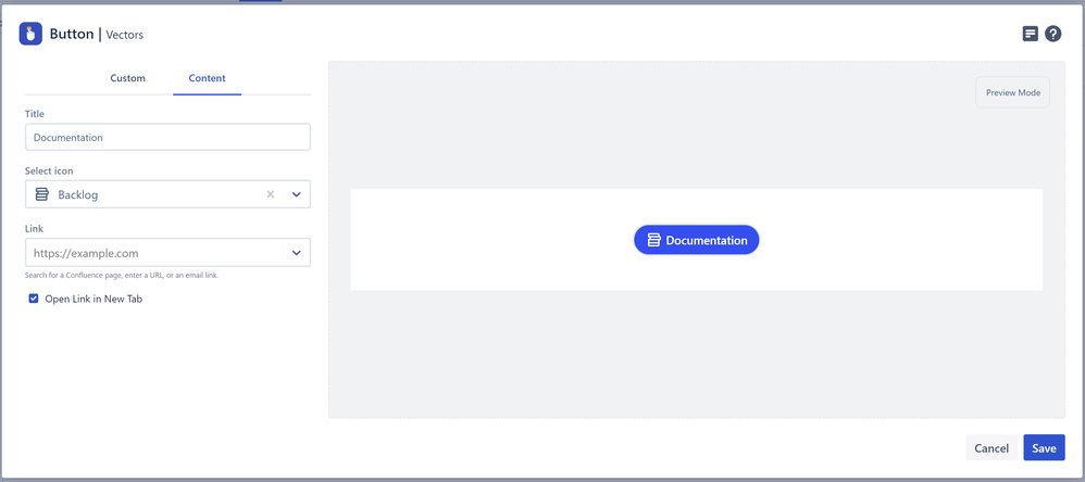
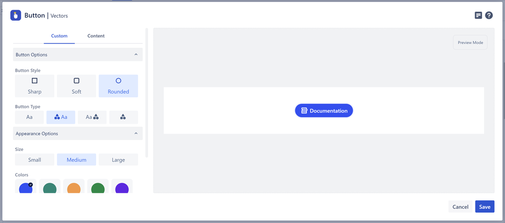
And there you have it! Buttons are essential to help you drive action and make your pages more interactive. The buttons in display in this article have been created with the newly revamped Buttons macro from our Content Formatting Toolkit for Confluence Cloud. To learn more, you can give our app a try here.
Was this helpful?
Thanks!
Fares Laroui_Vectors_


0 comments