Community resources
Community resources
Community resources
Custom Charts for Jira vs EazyBI Reports and Charts for Jira
I am looking for experience and recommendations to compare the 2 options anyone have a preference and examples to share? Any Pros and Cons to one vs the other?
3 comments
Our user asked to be able to display results in a pie chart for labels without duplicating the results when an issue has more than one label

Hi @Dawn Cooper ,
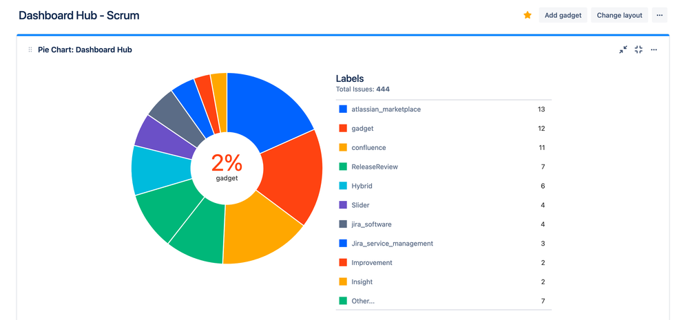
Here's how this can be achieved in Custom Charts for Jira with a few simple clicks:
I hope that helps with your question.
Kind regards,
Tom - Custom Charts Product Owner

Hi @Dawn Cooper ,
That's a great question and one that I get asked all the time when I give demo calls for Custom Charts for Jira.
I'm Tom and I'm the product owner of Custom Charts having been with the app from day one. In a previous life, I was a Jira administrator who was tasked with implementing EazyBi solutions in a wide range of companies (big, small, technical, non-technical, etc.) and there were two things I noticed:
- I was constantly being asked to update and maintain existing reports because no one else in the company had the time to spend hours or days watching tutorial videos and learning the custom scripting language to generate their own reports. EazyBi is an incredibly powerful tool, but unless you are a developer yourself, or are able to hire or utilize a team of developers to help you generate the complex reports you may find yourself contacting the EazyBi support team regularly asking for advice. This might be fine for a small number of people in a company, but it is not efficient for everyone who wants to make a simple pie chart or bar chart to spend hours our days learning such a complex app.
- Even though a company had powerful tools like EazyBi available, very few people were actually using them. I would regularly see the support team and project managers working with Excel or the built-in Jira reports because they didn't know that EazyBi was available or they did know but had no idea how to use it or who to ask.
I saw these situations occurring time and time again in a number of companies I worked for so I finally decided to do something about it. That is how Custom Charts for Jira came into existance.
I see Custom Charts and EazyBi working alongside each other as they have different target users. Custom Charts is designed with great UX and simplicity at its core. Custom Charts is simple, pretty and enjoyable to use which is very important for more non-technical / business users who want to build reports for themselves without needing to constantly ask for help. The reports look modern and were designed to move away from the Windows 95 aesthetic common with existing reporting tools.
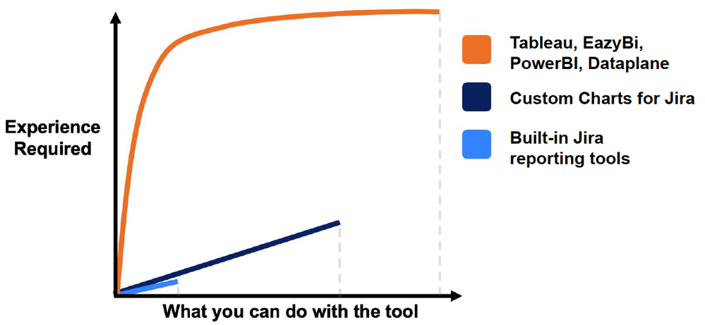
In terms of capabilities, this is a graph that I use to explain the differences between the various options:
The easiest option Jira users have is to make use of the built-in reporting tools. They are very easy to use (as they often only have one or two configuration options) but therefore have limited customizability.
At the other end of the scale are the complex big data reporting solutions such as Tableau, EazyBi, PowerBI, Dataplane, etc. These tools are very powerful but the learning curve is incredibly steep. I like to visualise that chart as a mountain slope where some super experienced climbers may make it past the initial cliff, but many inexperienced climbers won't even attempt it or start but quickly turn back.
Custom Charts is designed to be the best of both worlds. There is a very shallow learning curve allowing users to build charts and reports in seconds that look good and can be easily maintained. There are a lot of customization features that empower the individual users and helps to democratize the data in your Jira instance.
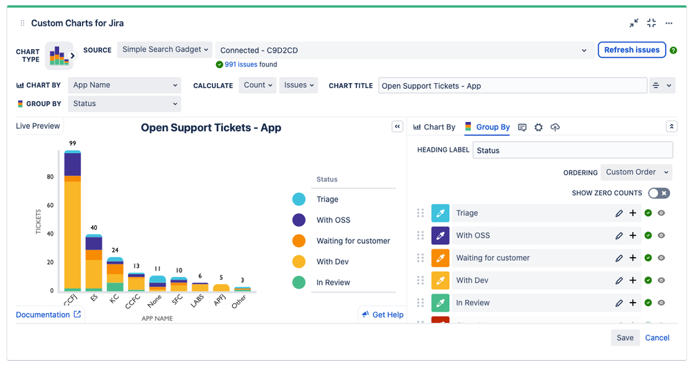
The real power of Custom Charts for users is the editor built directly into the Jira dashboard. No additional set up needed. No extra permissions and separate databases. No manual importing data and reporting on out-of-date information. Simply add a gadget to any dashboard and get started:
So far I've discussed the pros of Custom Charts. For cons, I'd say that it is not now and never will be as powerful or complex as EazyBi. If you're looking for a big data reporting tool that you can input complex logic and calculated measures, then EazyBi is the tool for you.
To put it simply, as I see it, EazyBi is designed for 10% of users in any given company, Custom Charts is for the remaining 90%.
I hope that provides some clarity on the design goals of Custom Charts and why the app exists. If you're interested in finding out more we have a few great links to help you out:
If you have any other questions, ideas or would like to know more I'm always happy to talk. The best way to reach me is at support@oldstreetsolutions.com
Thanks,
Tom - Custom Charts Product Owner
Hi @Dawn Cooper
As @Bill Sheboy mentions, having in mind your use cases or benefits you're looking for would help to indicate what's the best option. And I'd add one more app to compare :) We provide an app called Dashboards Hub for Jira, and depending on your needs, it may help you, because provides pre-defined dashboards templates for ITSM, Agile or DevOps teams; more than 60 gadgets, metrics and the powerful custom charts, anyone can create and share reports, with external or internal stakeholders:
Integrate all your Atlassian suite: Jira Work Management, Jira Software, Jira Service Management, Statuspage, Opsgenie, Insight, Confluence, Bitbucket and the Atlassian Marketplace and soon: GitHub, ServiceNow, Freshdesk.
Custom charts for your reporting. Customizable charts with line, bar and tile charts or tables. Also aggregations to calculate sums, min or max values, average, etc.
Pre-defined dashboard templates. Use pre-defined dashboards templates and more than 60 gadgets to create dashboards for ITSM, Agile or DevOps teams.
Hybrid hostings bridge. Smooth transition to cloud: Information from server/data center instances right into your cloud dashboard.
External share. Share your dashboards with secure and unique links with external stakeholders without access to your instance.
Enterprise ready. Enterprise features like support for Unlimited Horizontal Scale, information from different instances in the same dashboard.
- You can see a few live dashboards:
I'm gonna summon @Raimonds Simanovskis from eazyBI, besides being a nice guy, he can bring his vast experience!
Cheers,
pd: Server, data center and Confluence versions coming soon!
thanks, Our user asked to be able to display results in a pie chart for labels without duplicating the results when an issue has more than one label
Hi @Dawn Cooper
If you'd just need a pie chart, you could use Jira's native pie chart gadget:
But I understand that you want to filter out all the issues with just one label, right?
that is my same thought, I was researching the add ons and looking to see pros and cons of each, we are already researching EazyBI and my user asked about Custom Charts. He was questioning why we have a duplication of the ticket in the pie chart.
I am telling the user that the pie chart is not going to know when the label is a duplicating when he is pulling the label as a statistic. So the out of the box pie chart is working correctly. It is just the only example I have to offer at the moment. I was curious about the pros and cons of both add ons though.
The four options have some overlapping features, as a general rule, it's better to stay with the Jira native options (for the sake of price, performance...) provided your customers have their use cases covered.
When you have to buy a third party solution, think of the current needs of course, but also potential upcoming ones. And try to avoid edge cases that in many cases can be solved by approaching the case differently e.g., Instead of asking for csv export "We may need to export to csv the data, import it in an external tool, print it to a pdf, then send the monthly report by email" a public link to the live report could do the trick.
Anyway, all the presented options are really good products with top-notch teams behind!
Hi @Dawn Cooper ,
I'm Janis from eazyBI and I just wanted to throw in my perspective on displaying the issue report by the label in a pie chart.
As you already mentioned in one comment, if you group issues by a label, the pie chart will not "know" that the issue was already counted with another label. This will lead to having the same issue "under" different labels and the total number of counted issues will exceed the number of total issues.
To avoid duplicating issues, you'd have to either 1) manually decide which labels account for duplicates and merging those with "Primary" labels or 2) use only one label for each issue (only the primary). Either way, you'll have an "incorrect" count of issues for each unique label. Or some of the labels won't be displayed at all.
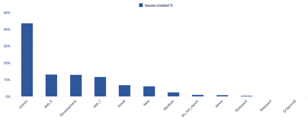
If the goal is to "Compare" the number of issues containing various labels, I'd suggest using bar charts or column charts as these types of charts are better suited for date comparison. Pie charts are best used only for simple composition charts (ideally one vs whole). (There's a whole topic where I've discussed how to choose the right chart type for your data).
In a bar chart like this, you can show an exact number of issues with a particular label or the percentage of all issues having a specific label. And in this case, you won't need to worry about the "double counting".
eazyBI vs ...
When it comes to the pros and cons of eazyBI vs Custom Charts or other general visualization apps, I agree with Tom from Custom Charts – it would not be a fair comparison as both apps are vastly different.
I would not agree that eazyBI is too difficult for non-technical/business users, and can only be used by developers.
As with any advanced tool, eazyBI can indeed get really technical if you need to build unique, complex, and advanced reporting and decision support systems with custom calculations and formulas. You can do that with eazyBI if needed.
At the same time, most organizations and users can use eazyBI without complex calculations. You don't need to be a developer or learn any scripting languages to build powerful Jira reports in eazyBI. You can easily build custom reports in minutes with drag-and-drop and a few mouse clicks.
Check out the "custom jira reports with eazyBI workshop" where you can try eazyBI and build a few Jira reports without installing anything. Or you can watch the "how to create smart reports without coding" demo video.
And if you don't know where to start, you can just copy hundreds of advanced Jira report templates to your account literary in seconds. These are not static templates, you can change, adjust, and modify anything. Check out our public eazyBI demo accounts and dashboards. Here are just a few of them:
- Project Overview Reports
- Agile Reports
- Sprint Overview Reports
- Version Overview Reports
- Age, Lead, and Cycle Time Reports
- SLA Dashboard
Cheers,
Janis | eazyBI
Was this helpful?
Thanks!
- FAQ
- Community Guidelines
- About
- Privacy policy
- Notice at Collection
- Terms of use
- © 2025 Atlassian


