Community resources
Community resources
Community resources
Analyzing Issue Status Transition Time with Histograms
Imagine a software development team working on a critical project with a tight deadline. As tasks move through stages like "To Do," "In Progress," "Code Review," and "Completed," the "Code Review" stage starts taking significantly longer than expected. This bottleneck is noticed once it's too late, leading to delays, missed deadlines, and frustrated clients. If the team had analyzed the transition times between statuses, they could have identified and addressed this bottleneck early on, preventing the following cascade of issues.
Bottlenecks in processes can lead to inefficiencies, delays, and increased costs. They can hinder an organization's ability to deliver products or services on time and meet customer expectations. Identifying these bottlenecks is the first step towards optimizing processes, improving productivity, and enhancing overall performance. By understanding where and why delays occur, organizations can take targeted actions to streamline workflows and prevent future issues.
Histograms are invaluable tools for revealing process pain points by visualizing the distribution of status transition times. By plotting the frequency of different transition durations, histograms help to:
- Identify Common Durations: Quickly see the most frequent transition times, indicating typical performance.
- Highlight Outliers: Easily spot unusually long or short transition times that may signal problems or exceptional performance.
- Uncover Trends: Detect patterns that indicate systematic issues or areas for improvement.
By providing a clear and concise visual representation of transition times, histograms enable stakeholders to grasp the situation and make informed decisions quickly. This article will guide you through creating and interpreting histograms to uncover and address bottlenecks in your processes, ultimately driving better outcomes for your organization.
The Hidden Costs of Ignoring Status Transition Times
Ignoring status transition times can have severe real-world consequences across various industries. Here are a few examples:
- Software Development:
- Scenario: A development team fails to monitor the time tasks spend in the "Testing" phase.
- Consequence: Bugs go undetected for extended periods, leading to a backlog of issues that must be addressed just before the release date. This results in delayed launches and poor-quality software.
- Productivity:
- Decreased Efficiency: Bottlenecks in processes lead to idle time for employees, reducing overall productivity.
- Resource Misallocation: Without clear insights into transition times, resources may be allocated inefficiently, leading to underutilization or overloading specific departments.
- Customer Satisfaction:
- Delayed Deliveries: Long transition times can result in delayed product or service delivery, frustrating customers and damaging the organization's reputation.
- Quality Issues: Prolonged status transitions can lead to quality issues, as problems go unnoticed or unaddressed for extended periods.
- Revenue:
- Lost Sales: Delays and quality issues can drive customers to competitors, resulting in lost sales and reduced market share.
- Increased Costs: Inefficient processes and bottlenecks can lead to higher operational costs and profit margins.
- Penalties and Fines: In regulated industries, delays and quality issues can result in penalties, fines, and legal consequences, further impacting revenue.
Organizations can mitigate these hidden costs by understanding and addressing status transition times, improving productivity, enhancing customer satisfaction, and driving revenue growth. The following sections will explore how histograms can be used to effectively analyze and optimize these transition times.
Histograms: Your Secret Weapon for Process Improvement
🧩 Imagine trying to solve a puzzle, but all the pieces are scattered randomly. It would help if you could organize them to see the bigger picture. That's where histograms come in. A histogram is like a visual puzzle solver, helping you manage and make sense of data by showing the frequency of different values.
In the context of status transition times, think of each bar in the histogram as a bucket collecting all the times that fall within a specific range. The height of the bar represents how many times it falls into that range. For example, if you're tracking how long tasks are spent in the "In Progress" status, a histogram can show you how many tasks took 1-2 days, 2-3 days, and so on.
Histograms are engaging because they provide an immediate, easy-to-understand visual representation of data. They help you spot patterns, trends, and outliers at a glance, turning complex data into actionable insights.
Why Histograms Are Perfect for Uncovering Transition Time Issues
- Visualizing Distribution:
- Histograms excel at showing the distribution of data. Regarding transition times, you can quickly see whether times are evenly distributed, skewed towards certain durations, or clustered in specific ranges. This visual distribution helps you understand the typical performance and identify any deviations.
- Identifying Bottlenecks:
- By plotting the frequency of different transition durations, histograms can reveal where processes are getting stuck. For instance, if you see a high frequency of long transition times in a particular status, it's a clear sign of a bottleneck that needs to be addressed.
- Highlighting Outliers:
- Histograms make it easy to spot outliers—transition times that are significantly longer or shorter than the norm. These outliers can indicate exceptional performance or serious issues that require attention.
- Comparing Performance:
- You can use histograms to compare transition times across different processes, teams, or time periods. This comparison can help you identify best practices, set benchmarks, and track improvements over time.
- Communicating Findings:
- Histograms are intuitive and easy to interpret, making them an excellent tool for communicating findings to stakeholders. Whether you're presenting to your team, management, or clients, histograms can help you convey complex data simply and compellingly.
- Guiding Decision-Making:
- By providing a clear picture of transition times, histograms enable data-driven decision-making. You can use histogram insights to prioritize improvements, allocate resources effectively, and implement changes that drive accurate results.
Creating Histograms that Reveal the Truth
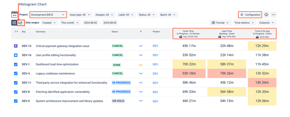
To visualize the time distribution based on different time metrics, let's use the Time Between Statuses by SaaSJet app.
First, you need to configure the time metrics you need in the configurator. Then, you switch from the report in the form of a grid to the chart view, which generates a histogram for you.
Next, you select the required time metric from the list and visualize its distribution.
How to Read a Histogram?
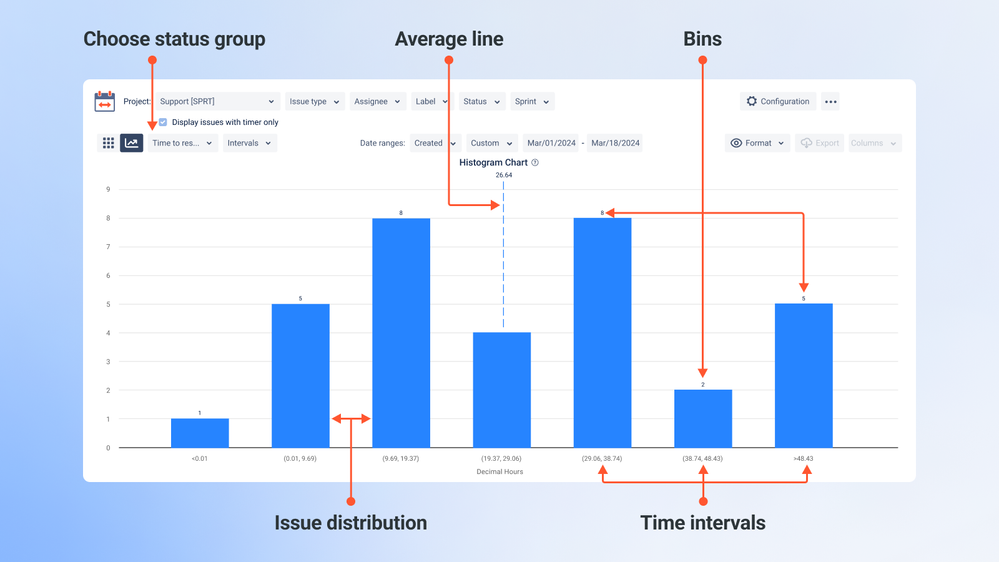
Columns show the time span of a time metric, with heights indicating the number of issues in that range. The vertical line represents the average issue time. Look for peaks, patterns, and gaps to identify bottlenecks.
Intervals
Bin width is the column's time range. Underflow creates the leftmost column, and overflow creates the rightmost column.
Default settings
7 columns. Underflow: 1.25 x status group's min value, Overflow: 0.75 x status group's max value.
How to Interpret Data from a Histogram
Interpreting a histogram of issue status transition time involves understanding the distribution of time taken for issues to transition through different statuses. Here’s a step-by-step guide to help you interpret such a histogram:
- Understand the Axes:
- X-axis (Horizontal): Represents the time intervals (bins) for the time metric (e.g., time to resolution).
- Y-axis (Vertical): Represents the number of issues that fall within each time interval.
- Identify Key Elements:
- Bins: The columns represent different time ranges (intervals).
- Vertical Line: Indicates the average issue time.
- Underflow and Overflow: The leftmost column (underflow) captures issues that took less time than the minimum bin range, and the rightmost column (overflow) captures issues that took more time than the maximum bin range.
- Analyze the Distribution:
- Peaks: High columns indicate a large number of issues taking a specific amount of time. Peaks can suggest common or typical times for issue resolution.
- Patterns: Look for any recurring patterns or trends in the data. For example, if there are multiple peaks, it could indicate different types of issues with varying resolution times.
- Gaps: Areas with few or no issues can indicate less common resolution times or potential bottlenecks where issues might get stuck.
- Interpret the Average Line:
- Average Issue Time: The vertical line shows the average time taken for issues to transition. Compare this with the distribution to see if a few outliers skew the average or if it represents a typical issue time.
- Identify Bottlenecks:
- Long Tails: If there is a significant number of issues in the overflow bin, it suggests that many issues are taking longer than expected to resolve, indicating potential bottlenecks.
- Short Tails: A high number of issues in the underflow bin might indicate that some issues are resolved quickly, possibly due to simple fixes or automated processes.
- Adjust Bin Widths if Necessary:
- Bin Width: The default setting of 7 columns might not always be optimal. Adjusting the bin width can help you see the distribution more clearly. For example, narrower bins can provide more granularity, while wider bins can smooth out noise.
Example Interpretation:
- Peak at 3-5 Days: A peak at the 3-5 day interval suggests that many issues are resolved within this time frame.
- Long Tail: If the overflow bin has a significant number of issues, it indicates that many issues are taking much longer to resolve than the average.
- Average Line: If the average line is to the right of the peak, it suggests that while many issues are resolved quickly, a few outliers take much longer, skewing the average.
By analyzing the histogram, you can gain valuable insights into the efficiency of your issue resolution process. You can identify common resolution times and spot potential bottlenecks slowing things down. This information can help you make data-driven decisions to improve your workflow and reduce issue resolution times.
So, go ahead and dive into those histograms! They're a powerful tool for optimizing processes and driving better organizational outcomes. 🚀
Was this helpful?
Thanks!
Iryna Komarnitska_SaaSJet_
About this author
Product Marketer
SaaSJet
Ukraine
8 accepted answers


0 comments