Community resources
Community resources
Community resources
3 examples of user story map
Product teams often struggle to build what users actually want. Features pile up, priorities blur, and the big picture gets lost in endless to-do lists.
User story mapping offers a different approach. It helps teams see their product through users’ eyes, turning disconnected features into a clear, meaningful journey.
Solving Flat Backlog Problems with User Story Mapping
If you’ve ever worked with a product backlog, you know the struggle. Everything is in one long list, marked as important, and it’s hard to see how it all fits together. This is what we call a “flat backlog” – and it often creates more problems than it solves.
A flat backlog makes it nearly impossible to see the big picture. Your team can’t tell which features should come first, how they connect, or what truly matters to users. It’s like trying to put together a puzzle without looking at the picture on the box.
This is where user story mapping comes in to save the day.
Why Story Mapping Works Better
Story mapping lets you see your product from your users’ eyes. You arrange features based on how people actually use your product, not just on a priority list.
When you create a story map, you’re telling a story about your user’s journey. This makes it much easier to spot gaps in your planning and identify what features really need to come first.
Story mapping takes a bit more effort at first. But it saves you from the headaches of confused teams, missed features, and unhappy users down the road. It’s like having a map instead of just a list of directions – you can see where you’re going and the best way to get there.
User Story Map Examples
Let’s look at three common user story map examples. Each example shows how different companies organize their features in a way that makes sense for their users.
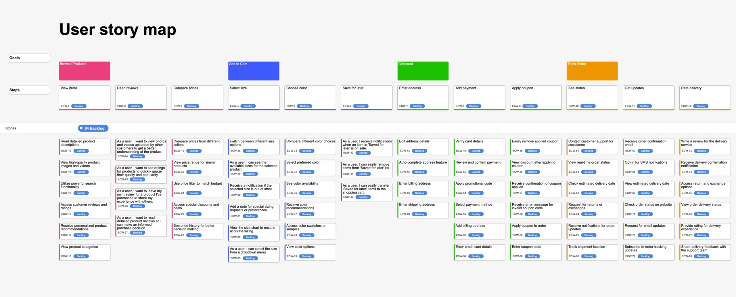
E-commerce Website Story Map
Imagine an online store like Target or Best Buy. Here’s how their story map might look
| Browse Products | Add to Cart | Checkout | Track Order |
| View items | Select size | Enter address | See status |
| Read reviews | Choose color | Add payment | Get updates |
| Compare prices | Save for later | Apply coupon | Rate delivery |

→ View E-commerce Website Story Map in more details
What makes this map work: It follows how people naturally shop online, from finding products to completing their purchases. Each column represents a key part of the shopping experience.
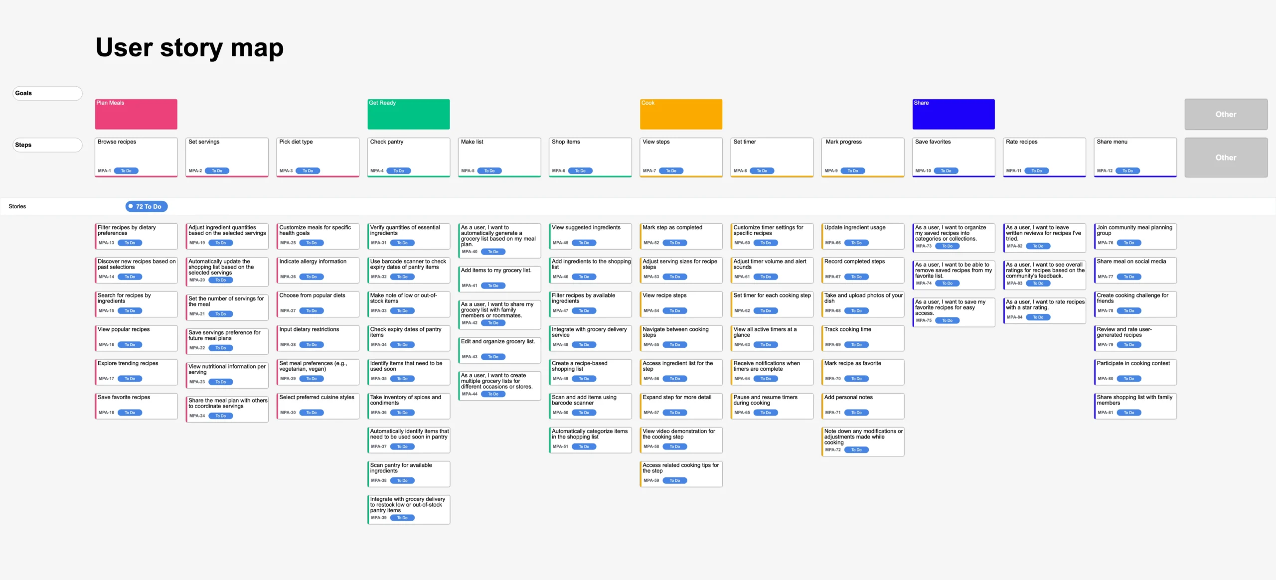
Meal Planning App Story Map
For a meal planning app like Mealime or Paprika, the story map focuses on the cooking journey:
| Plan Meals | Get Ready | Cook | Share |
| Browse recipes | Check pantry | View steps | Save favorites |
| Set servings | Make list | Set timer | Rate recipes |
| Pick diet type | Shop items | Mark progress | Share menu |

→ View Meal Planning App Story Map in more details
What makes this map work: The map captures the entire meal preparation process, not just the cooking part. It helps users succeed at every step, from planning to sharing their experience.
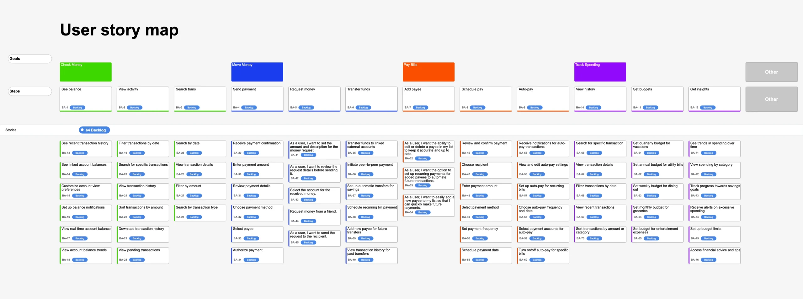
Banking App Story Map
Think of apps like Chase or Bank of America. Their story map prioritizes common banking tasks:
| Check Money | Move Money | Pay Bills | Track Spending |
| See balance | Send payment | Add payee | View history |
| View activity | Request money | Schedule pay | Set budgets |
| Search trans | Transfer funds | Auto-pay | Get insights |

→ View Banking App Story Map in more details
What makes this map work: This map organizes features around key banking activities people do most often. It makes daily banking tasks easy to find and use.
Story maps might look different for each product, but they all share one thing: they show how features work together to help users achieve their goals.
Final Words
Story mapping isn’t perfect, but it’s a powerful way to understand your product. It helps you:
- See what users really need
- Find gaps in your product
- Prioritize the right features
- Explain your vision clearly
The best products tell a story – not just through code, but through experiences that solve real problems. Story mapping is your tool to create those experiences, one user step at a time.
Was this helpful?
Thanks!
Liam - DevSamurai
About this author
Product Marketing Specialist
DevSamurai
13 accepted answers
3 comments