Hi, I’m Mary, a Customer Success manager at Planyway, and in this guide, I’ll walk you through building a powerful Jira dashboard that drives team efficiency in 2026. Here’s what we’ll cover:
-
Why use dashboards in Jira
- How to create a Jira dashboard
- Most useful Jira dashboard gadgets and how to use them
- Supercharge Jira dashboards with Planyway for Jira
- How to share dashboards
- Jira dashboards in Confluence
-
How to make a good and a bad dashboard
Why use dashboards in Jira?
Jira dashboards act as a command center for your projects, bringing critical data into a single, customizable view. They transform scattered information into actionable insights, helping teams:
- Track progress in real time
- Spot blockers early
- Make data-driven decision
- Keep stakeholders aligned
Whether you're a project manager overseeing deadlines, a developer tracking sprint workloads, or a team lead optimizing workflows, a well-designed dashboard saves time, reduces chaos, and keeps everyone focused on what matters most.
How to сreate a Jira dashboard
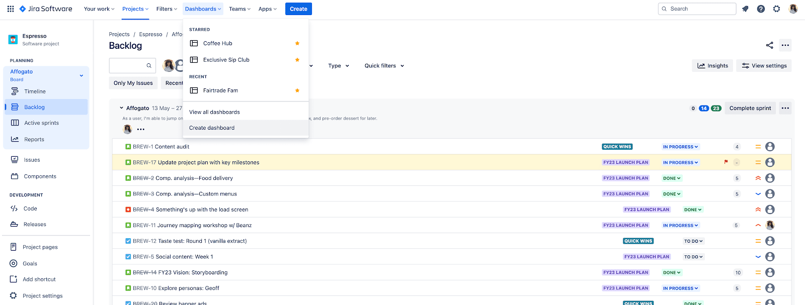
1. Navigate to Dashboards
Go to the Jira main menu and click on Dashboards > Create Dashboard.
2. Set Up Your Dashboard
-
Name: Choose a clear, descriptive name.
-
Description: Add a brief explanation of the dashboard’s purpose.
-
Permissions: Decide who can view and edit the dashboard.
3. Add Gadgets
4. Customize Layout
5. Save and Share
Most useful Jira dashboard gadgets and how to use them
Jira dashboards are only as powerful as the gadgets you choose. Here’s a breakdown of the most useful dashboard types and the key gadgets that make them effective.
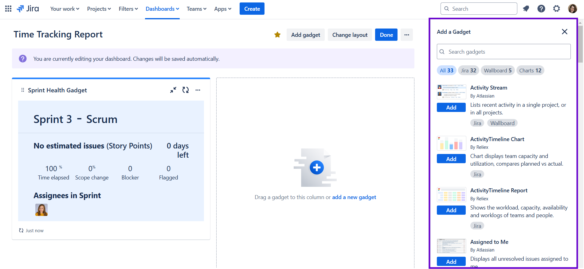
1. Team Progress Dashboards
2. Project Overview Dashboards
3. Issue Tracking Dashboards
Supercharge Jira dashboards with Planyway
While Jira’s native dashboards are powerful, some critical views—like cross-project roadmap, resource planning and time tracking reports—are missing out of the box. That’s where Planyway for Jira comes in, adding a dynamic flexible timeline directly to your dashboards for unmatched visibility.
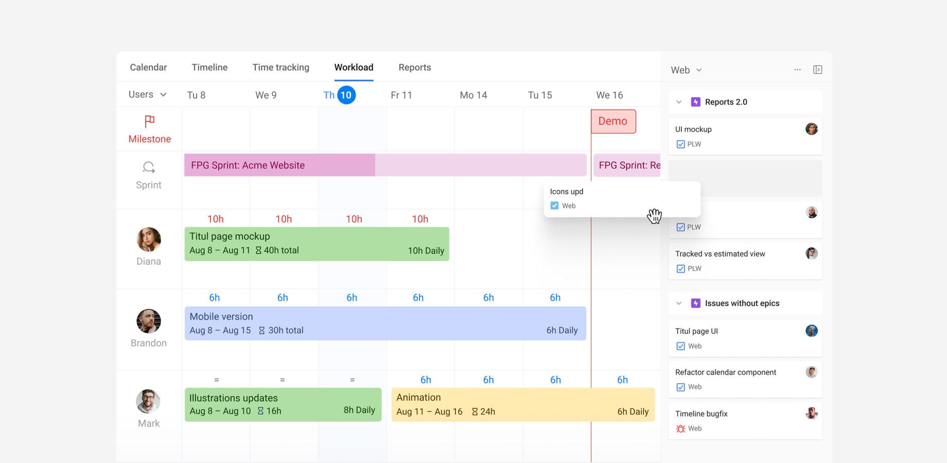
What Planyway brings to your Jira dashboards
Cross-project roadmap that adjusts your workflow
- Visualize work across multiple projects in a single chart grouped by projects, epics, users, teams, or components.
- Roll out the Gantt-like hierarchy for a more granular approach.
- Track sprints, milestones and link work items with cross-project dependencies.
- Save filters to switch between teams and projects without reconfiguring the view each time.
- Syncs with Jira: changes in Planyway update Jira issues instantly (and vice versa).
Team workload & resource management
- Workload indicators show who’s over or under capacity.
- Balance workload simply by stretching work items on the timeline.
- Set different capacities for different team members.
- Link workload to the original, internal, or remaining estimate.
- Take vacations into account.
- Switch between Balance and Liquid modes when calculating workload.
Time tracking and reporting
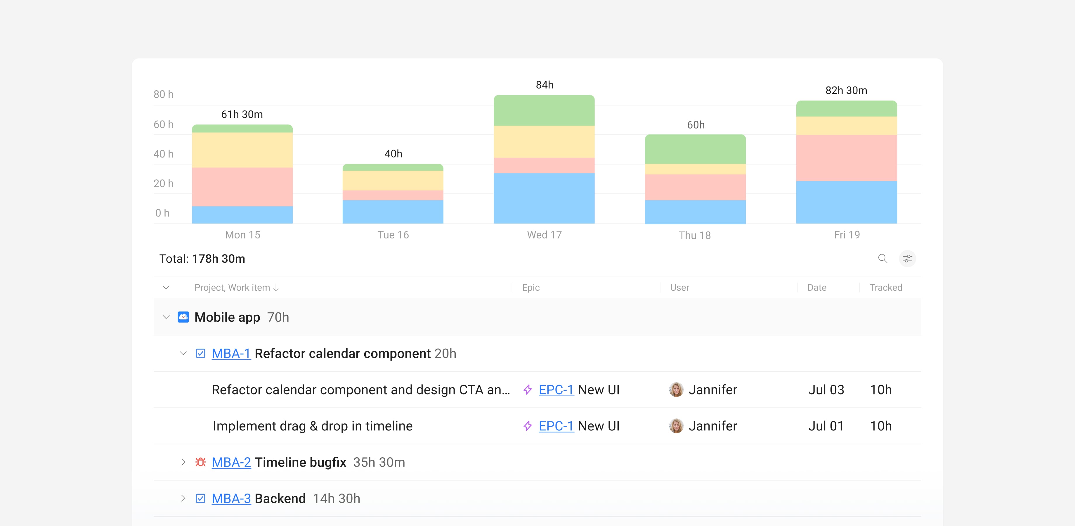
- Track time either in Jira work items, list or calendar view, or timesheets (coming soon).
- Build insightful time reports that show only the data you want to see.
- Compare planned time vs tracked with a dedicated report.
- Easily export dashboards by link, PDF, or Excel.
How to add Planyway to Jira
- Install Planyway from the Atlassian Marketplace.
- Open Planyway
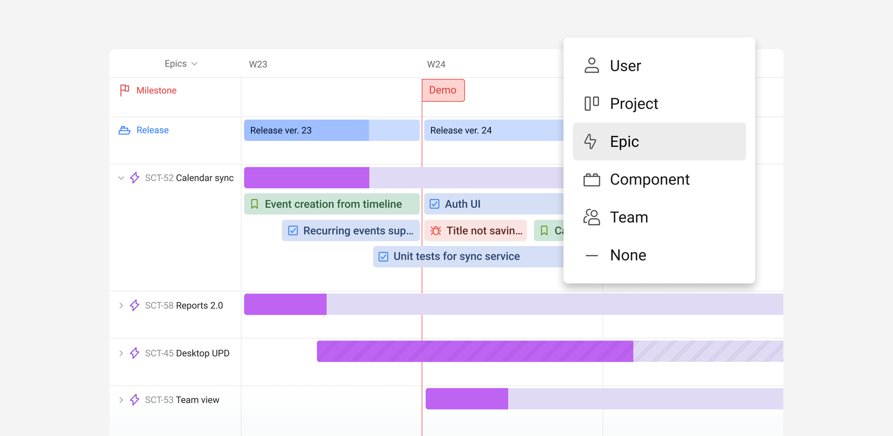
- Configure your view: filter by project, user, team, or epic.
Pro Tip: combine it with native gadgets (e.g., Sprint Health + Planyway Timeline) for a complete Agile command center.
Why teams LOVE Planyway
“Planyway’s timeline replaced 3 separate tools for us—now we plan sprints, track resources, and report to stakeholders all in Jira”.
— DevOps Lead, Tech Company
|
Missing in Basic Jira ❌
|
Solved by Planyway ✅
|
|
Cross-project timeline
|
✅ Unified timeline that visualizes data from different angles
|
|
Resource management
|
✅ Team workload and capacity planning
|
|
Time tracking reporting
|
✅ Easy time tracking, report, and estimate vs. tracked time
|
Ready to upgrade your dashboards?
👉 Try Planyway free | 📺 Watch a 2-minute demo
Dashboards vs. reports vs. board
Jira offers three powerful tools for tracking work—dashboards, reports, and boards—but each serves a distinct purpose. Here’s how to choose the right one for your needs.
 1. Boards (task management)
Purpose: Visualize and manage workflow (e.g., sprints, kanban).
Best for: Teams executing work (developers, Scrum Masters).
Key Traits:
- Dynamic: updates in real-time as tasks move (e.g., To Do → In Progress).
- Workflow-centric: focuses on process (columns = statuses).
- Types: Scrum, Kanban, Agile boards.
Example: a sprint board shows user stories moving across columns daily.
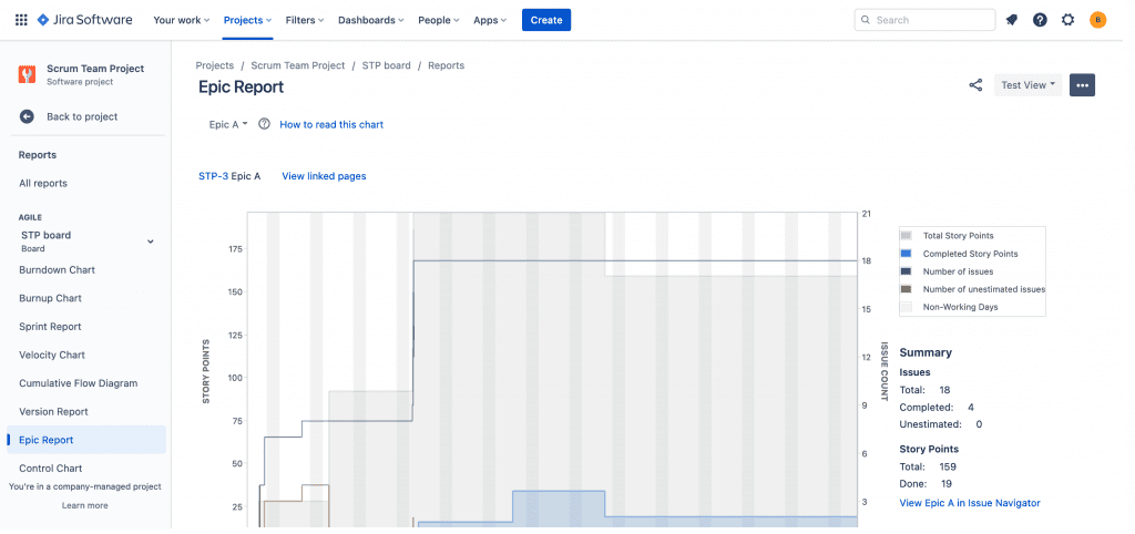
2. Reports (in-depth analysis)
Purpose: Analyze historical trends and performance.
Best for: Retrospectives, stakeholder reviews, audits.
Key Traits:
- Static: snapshots of data at a specific time (e.g., sprint report).
- Project-specific: generated per project (Project → Reports).
- Deep metrics: cycle time, velocity, burndown charts.
Example: a Burndown Report helps assess if a sprint is on track.
3. Dashboards (real-time monitoring)
Purpose: track live status across projects.
Best for: managers, leads, and stakeholders needing a high-level view.
Key Traits:
- Dynamic: auto-updates (gadgets refresh with new data).
- Cross-project: combines gadgets in one place.
- Customizable: tailor to roles (e.g., DevOps vs. execs).
Example: a dashboard with a Sprint Health gadget + Created vs. Resolved chart.
When to use each tool
|
Tool
|
Best For
|
Limitations
|
|
Board
|
Daily task management
|
Limited to one project
|
|
Report
|
Post-sprint analysis
|
Static data
|
|
Dashboard
|
Real-time cross-project tracking
|
Requires setup
|
Pro Tip: combine them! Use a board for daily work, reports for retrospectives, and a dashboard for leadership updates.
How to share a Jira dashboard
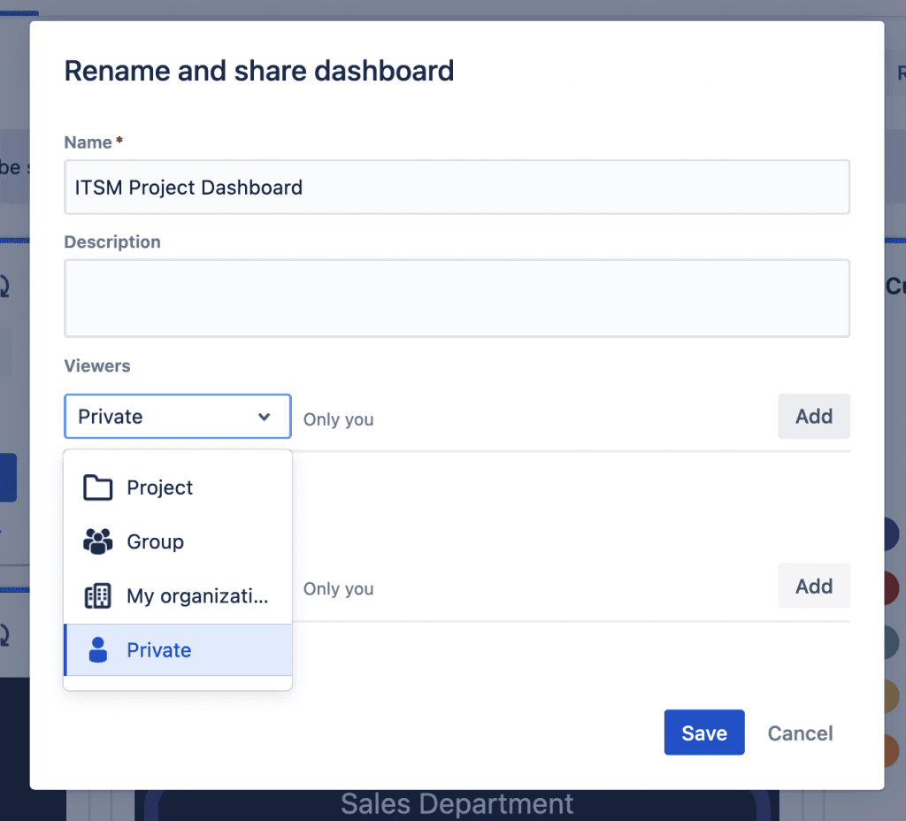
Jira offers several options for sharing dashboards and filters:
-
Private (default option):
-
Group:
-
Public:
-
My organization (Jira Cloud only):
-
Who can access: all users in your Atlassian Cloud organization.
-
Use case: ideal for sharing dashboards with all team members in a managed Atlassian organization.
-
More info: learn more about Atlassian Organizations.
-
Any logged-in user (Jira Server and Data Center only):
How to make a BAD Jira dashboard
When done poorly, a dashboard can confuse your audience and undermine your message. Here’s how to ensure your dashboard tells a bad story—and how to avoid these pitfalls.
1. Too many gadgets
Just like a story with too many characters can be confusing, a dashboard overloaded with gadgets becomes impossible to follow.
Best practice: limit your dashboard to 6 gadgets or fewer. If you need to show more data, create additional dashboards for specific use cases. Smaller, focused dashboards communicate information more effectively than a cluttered, all-encompassing one.
2. Too much text
A dashboard filled with excessive text is the opposite of visually engaging. While a list of Jira issues can be useful, overloading your dashboard with text forces your audience to interpret raw data rather than understanding your insights at a glance.
Best practice: limit text-based gadgets to one issue list per dashboard and focus on visualizations like charts and graphs that tell a clear story without requiring heavy interpretation.
3. Irrelevant charts
If your team doesn’t care about certain data points—like niche issue statuses or non-core team assignments—don’t include them. Worse, combining unrelated charts creates a disconnected, confusing narrative.
Best practice: curate charts based on the specific message or insight you want to deliver. and ensure every gadget on the dashboard serves a purpose and contributes to the overarching story.
4. Poorly designed charts
Bad charts confuse rather than clarify. They might use the wrong chart type, display bad data, or suffer from poor formatting.
Examples of Bad Charts:
-
Unclear pie charts: tiny, similar-sized segments make it difficult to compare data.
-
Confusing bar charts: bars without labels or inconsistent scales fail to communicate effectively.
Best practice: choose the right chart type for your data. For example, bar charts are often better for comparisons than pie charts. Clean your data before visualizing it. Eliminate duplicates and inconsistencies, such as multiple "To Do" or "Done" statuses.
5. Misleading data
Even the best-designed charts can’t save a dashboard if the data itself is flawed. Faulty data leads to faulty conclusions, and you’ll lose your audience’s trust.
Best practice: validate your data before building your dashboard. Avoid visualizing incomplete or misleading information. If the story isn’t clear, don’t tell it.
How to make a GOOD Jira dashboard
A great Jira dashboard doesn’t just display data—it tells a story that engages your audience and drives action.
1. Define audience
Before creating your dashboard, consider who it’s for:
-
Entire team: highlight collective progress and blockers.
-
Individual team members: provide tailored insights into personal performance.
-
Supervisors or stakeholders: focus on high-level metrics and outcomes.
Narrowing down your audience helps you shape the story your dashboard will tell and ensures the information presented is both relevant and actionable.
2. Craft the right story
Your dashboard shouldn’t just be a collection of data points—it should guide your audience through a narrative that leads to insight and action.
Example: imagine you’ve noticed some team members taking significantly longer to resolve customer requests, which impacts customer satisfaction. Here’s how you can structure your dashboard’s story:
-
Set the context: display workload distribution across all assignees.
-
Lead into the issue: use charts to show average resolution times and customer satisfaction (CSAT) ratings by assignee.
-
Highlight the key insight: identify top-performing and underperforming team members.
-
Encourage discussion: use visualizations to prompt conversations about workload balance, training needs, or process improvements.
3. Make your charts comprehensible
Follow these best practices to ensure your charts are easy to understand:
-
Choose the right chart type: use bar charts for comparisons, line charts for trends, and pie charts for proportions—avoid mismatched chart types that confuse viewers.
-
Add context: label axes, show percentages, and include descriptions to clarify your data.
Pro Tip: link to Confluence pages for additional context or metric definitions, ensuring stakeholders have all the information they need.
What’s your favorite gadget or dashboard setup? Share your tips and tricks in the comments!


