As of 12/17/2024, it seems that the UI elements have completely changed for Jira.
Side Details Section
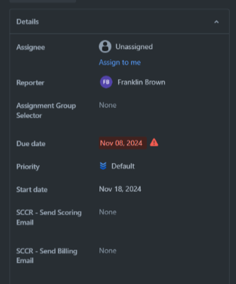
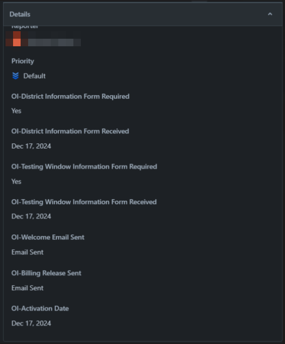
Moving from a side-by-side layout to a vertical one, has significantly impacted readability and efficiency. Previously, the side-by-side view allowed for quicker scanning and comprehension of details, as related fields could be viewed simultaneously. Now, with the vertical layout, users are forced to scroll more to find information, breaking the flow of work and making it harder to reference multiple fields at once.
Before:
After:
Main Content Section
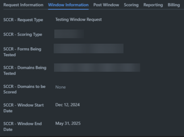
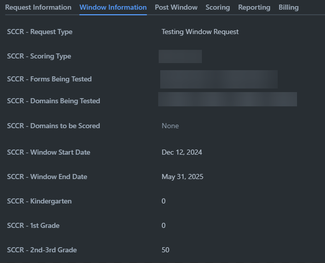
Previously, the two-column layout allowed for quick scanning and comparison of related fields due to their close proximity. With the new layout:
- The excessive horizontal spacing between columns makes it harder to view information cohesively.
- Both columns being left-aligned breaks the natural flow, as the eye must repeatedly shift and scan across wide empty spaces.
- For tasks with many data points, this scattered alignment slows down comprehension and increases time spent finding information.
Before:
After:
The previous design was far more efficient for quickly reviewing tasks and related data. I recommend:
Main Section
- Reducing the spacing between the columns.
- Considering aligning the second column closer to the center for better flow.
Side Detail Section
1. Move back to a two column system where each row represents a data field.
Thank you for reviewing this feedback, as it directly affects day-to-day usability for detailed task management.

