I have the following 7 columns on my jira board;
- Backlog
- To Do
- In Progress
- Blocked
- QA Ready
- Release Ready
- Done
However, irrespective of what statuses I have mapped to them, they show as follows;
- Backlog = Grey i.e. not in progress
- To Do = Blue i.e. in progress
- In Progress = Blue i.e. in progress
- Blocked = Blue i.e. in progress
- QA Ready = Blue i.e. in progress
- Release Ready = Blue i.e. in progress
- Done = Gree i.e. complete
I would like to change this as it skews my board metrics / reports and therefore provides me with inaccurate data.
What I would like the columns to emulate is as follows, which is how my workflow statuses show;
- Backlog = Grey i.e. not in progress
- To Do = Grey i.e. not in progress
- In Progress = Blue i.e. in progress
- Blocked = Grey i.e. not in progress
- QA Ready = Blue i.e. in progress
- Release Ready = Green i.e. complete
- Done = Gree i.e. complete
Is anyone able to help me or is this a bug with Atlassian?
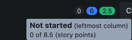
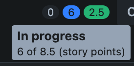
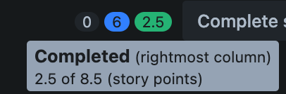
Please see attached screenshots, it looks like it's defaults the left most column to grey i.e. to be done and the rightmost column to green i.e. completed. Can this default be changed to allow for more columns to be grey and green?