Hi,
I would like to change the layout of how some of my data is displayed within a gadget. Currently I have created a report for my project's SLA met vs breached incidents per prio. I do not really like how it looks and I would like to change it into a bar chart. So currently it looks like this:
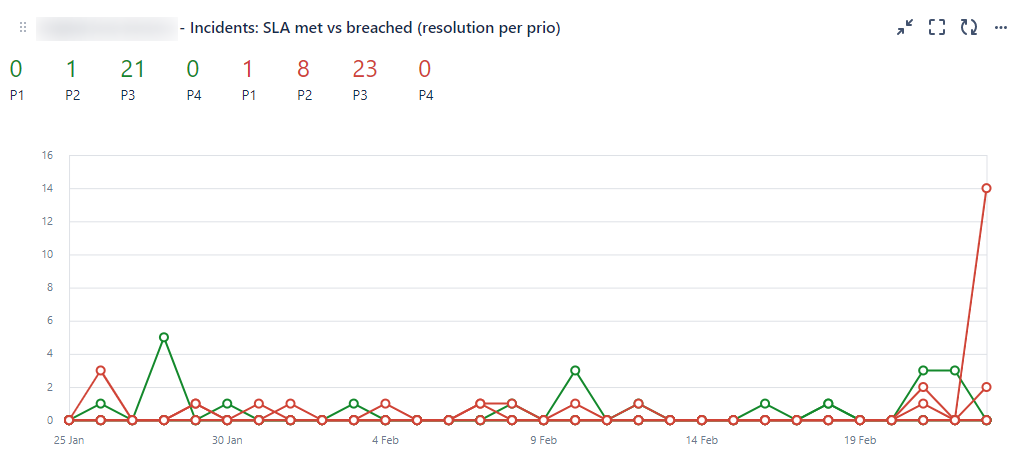
And I would like to make it look like this:
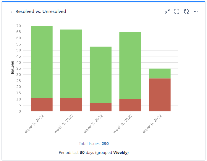
but on the X axis to display the Priorities, in red to show the breached ones and in green the resolved ones while setting the time frame for the last 30 days. Does anyone know if it would be possible to create such a filter and use one of the existing gadgets to display this data in this way in my dashboard?


