Our organisation is using the new Jira Navigation from today.
Yes it is mainly better with the navigation along the top instead of down the side but I see this problem below almost immediately.
1. I perform a search of issues using one of the standard filters.
2. The I modify it slightly by changing the selection of issue type (I want to see bugs only).
3. Jira shows the results and this is fine.
4. I can choose the "detail view" or "List view" and this is also helpful.
But much of my little laptop screen is filled with the selection fields and Filter Headings :
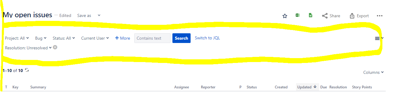
I cannot find a way to change the size of this area. Is it possible to just show the RESULTS of the search without the Selection fields that I used ? I want this area collapsed so that I have maximum room for the results. Is this possible in the new navigation ? This is a real pain as it takes up about 33% of my screen.....
Thanks experts (or anyone !) in advance for your help !
-----
Now the 1st June, and still not one answer ? Can nobody help ? :-(

