Community resources
Community resources
Community resources
- Community
- Q&A
- Confluence
- Questions
- In Stiltsoft's Chart from Table macro, is it possible to use Atlassian Design System colours?
In Stiltsoft's Chart from Table macro, is it possible to use Atlassian Design System colours?
In the Stiltsoft's Table Transformer macro, one can use the Atlassian Design System colours, as described here: https://docs.stiltsoft.com/tfac/cloud/using-beautiful-colors-from-the-atlassian-design-system-203719047.html
Is it possible to do this in the Chart from Table macro as well? If it is possible, do you have any hints on what steps I should try next?
-----
Additional context:
- I use the Table Transformer macro to apply background colour to the Status column of my table (T1). For flexibility, rather than using CASE, I made a new table (T2) where I map the status to those Design Tokens. Then I do a LEFT JOIN on the Status column, which brings in the appropriate Design Token (if defined) which I then apply with FORMATWIKI.
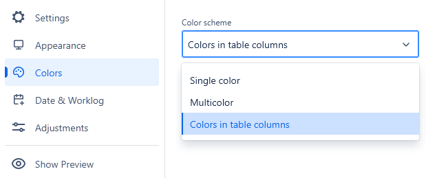
- I would like to reuse that table (T2) in the Chart from Table macro. The settings below shows it is possible to obtain the colour directly from the table. The Table Transformer macro above uses "var()" to "convert" the Design Token into the colour. But it's not clear how to do this in the Chart from Table macro.
1 answer
Hi @Aravind Pai ,
You may try the following:
- Leave the full string with "var" in the T2 for the Table Transformer macro. We mean, your cells will contain smth like this: var(--ds-background-accent-red-subtlest, red)
- Make sure to adjust your SQL query accordingly (no "var" in the FORMATWIKI, it will be taken from your T2):
FORMATWIKI("{cell:background-color="||T1.'Color_column'||"}"||T1.'Data_column'||"{cell}") AS 'Colored_data_column' (or whatever is working currently for your case) - Then you may use this T2 table to color your chart: with the "var" present, it is possible
If you are stuck and need to share more details with us to look at the issue closely, please contact our support portal directly (it is confidential, nobody will see your queries and screenshots).
Hello team,
The solution is a reasonably good one and it worked for me.
One further improvement though, as also visible in the screenshot you shared, is the colour inside the pie is hardcoded to white. In this case, it also causes the text to be unreadable due to poor colour contrast.
[My apologies for the late response. I tried out the solution you mentioned late in the day and thought I'd reply the next day, but forgot.]
You must be a registered user to add a comment. If you've already registered, sign in. Otherwise, register and sign in.
Hi @Aravind Pai ,
Yes, indeed regular light colors make the white text turn black but it doesn't work for the Atlassian Design System:
We've created an improvement ticket for our backlog and attached this question to it - once the feature is implemented, we'll get back here.
You must be a registered user to add a comment. If you've already registered, sign in. Otherwise, register and sign in.


You must be a registered user to add a comment. If you've already registered, sign in. Otherwise, register and sign in.