Community resources
Community resources
Community resources
- Community
- Q&A
- Confluence
- Articles
- Make every screenshots count in your Confluence documentation
Make every screenshots count in your Confluence documentation
One of my best contoured memories from my days in journalism is arguing with my editor-in-chief about a photo I chose for one of the international news pages.
He didn't like it. And found the photo important enough to intervene. A photo can make or break the page. Documentation is no different. A wall of text is offputing. But so is a bad screenshot you hoped would help the reader.
Screenshots, photos, graphics, and other forms of visual content have a role to play and information to carry.
Before you take a screenshot...
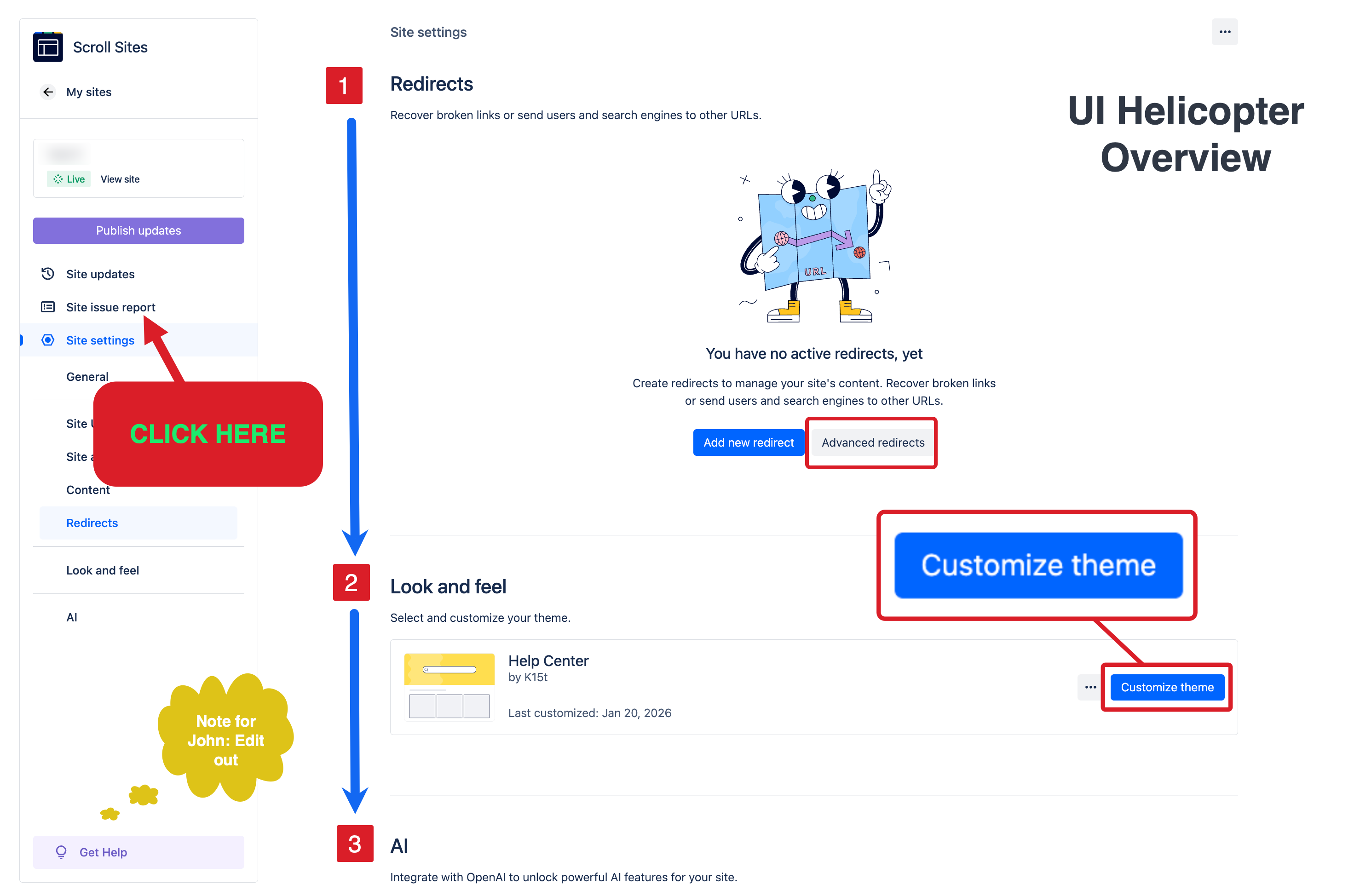
Think about what is the purpose of the image. Should it provide a ‘helicopter’ overview of the user interface? Focus on a specific clickable UI element?
Let’s explore some of the most frequent screenshot sins to put you on the right track.
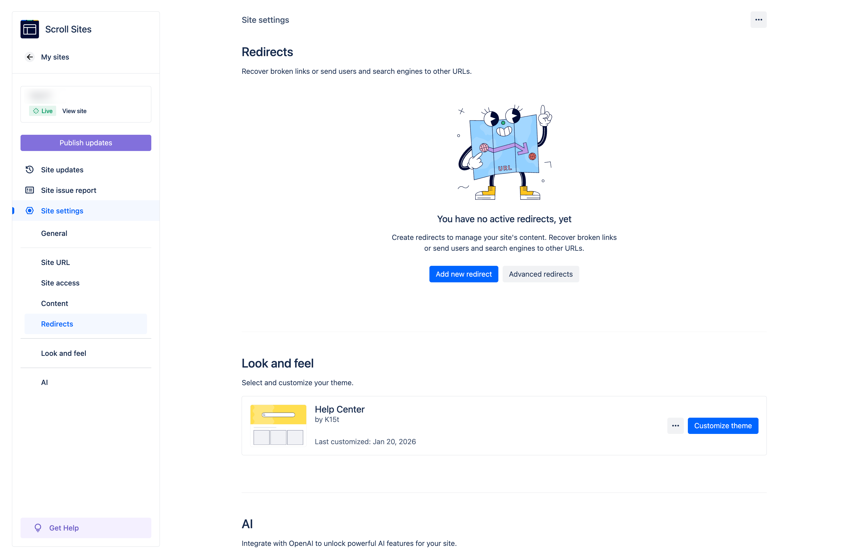
Sin 1: Taking full-screen captures. Do you really need a full screen capture to tell users they need to click Customize theme.
Sin 2: Insisting that all screenshots are of the same size. Inevitably, this policy will make some text too small too read (see above) and some UI elements comically big.

There’s no perfect size but there is a (near) perfect policy. A screenshot should provide context specific to the action you expect users to take or to what they need to learn. Aim for balancing context, readability, and staying closely to the real life appearance.
Let your screenshots talk
You may take THE perfect screenshot but you can go an extra mile pixel to help readers sail through your docs and accomplish the goal.
Cropping, blurring, and masking specific elements might be necessary to hide sensitive information. Another frequently used post-production trick is applying a light frame around the image, especially if both the page and the image have a white background (you can do that in Confluence).
To help users focus on a specific section of the image, use additional visual elements, such as arrows, frames, magnifiers… But use them subtly, your screenshot doesn’t have to be fancy but it should convey the right information.
Sin 3. A technical writer discovering the Tools menu and going overboard with knowledge...
Whatever you do, don't do THAT.
You might be tempted to use your company colors to highlight elements in your screenshots. That’s OK but do so with accessibility in mind.
Screenshots and Confluence
Now you have your great looking screenshots, but they're only one part of the bigger topic.
- How do you balance text and visuals?
-
Can you scale up image management within Confluence?
-
When should you use diagrams instead?
- What is your organization's policy for creating and using visuals within your organization?
As a part of our learning content efforts about using Confluence for documentation, we put together a comprehensive guide about best practices for using images in Confluence.
Important! There's an Easter Egg hidden in one of the screenshots in the linked guide. If you find it, let me know in the comments section :)
P.S. That dispute with my then editor-in-chief? I won.
Was this helpful?
Thanks!
Kris Klima _K15t_
2 comments