Community resources
Community resources
Community resources
🍂🎃 Apptoberfest discussion: analytics & reporting apps

Hi Community! Welcome to the first weekly Apptoberfest discussion topic: analytics & reporting apps 📊
Atlassian’s Marketplace is full of analytics & reporting apps to help teams track, visualize, and communicate productivity, project progress, workload distribution, and more.
What we want to know is, what are your favorite apps for analytics and reporting? What information do you use your app(s) to track, and how does this help your team stay on top of projects and improve?
Let us know!
(Not sure what Apptoberfest is? Click here 🎃 )
12 comments
Thanks for sharing, @Suvradip Paul! In case anyone here is considering a similar integration to export and analyze Jira data but isn't sure where to start, care to share any details?
For example, what do you track once the data is in a spreadsheet? What information would you miss out on if you couldn't export Jira data directly to spreadsheets?

This is definitely something I would like to learn more about as at present we don't make much use of reporting and it has such valuable potential.
Possibilities are endless. Basically it requires some Excel knowledge to imagine that..
That kind of integration is easy to set. We can connect to Jira directly from Excel by typing the URL and our credentials. Once we would get data we can do with it whatever we want like with REST api data. Usually what we are missing in Jira is ability to sum / compare fields values, so getting all values and interact somehow with this data later can create cool reports with dynamic data, charts, .. etc.
And Excel Dashboards can be pretty powerful..
EazyBI
Simple, Eazy as its name and amazing no code report building capabilities.
I'm a huge fan of eazyBI for reporting for several reasons:
- Extensive customizability on reporting. I can pretty much build any report I want to build that is beyond the base functionality of Jira reporting.
- Dashboard Integration - eazyBI's default dashboard widgets allow other users to view reports, and drill into issues from within the gadget
- Support - their support team is excellent. Any time I've run into an issue with setting up stuff I've emailed them and they've responded with a solution either online or they went in and fixed my report automatically (cloud).
2 cases in point.
I was doing some work for a client that wanted individual user burndowns, instead of sprint burndowns. I couldn't find a solid app in the marketplace that offered that functionality. Then I ran into eazyBI, installed a trial, then set up individual burndowns and demoed it to the client, which they really liked. Even though it is very customizable and at times can seem overwhelming, it's been great to be able to build anything I want and display it however I want
Internally, our onboarding team was managing metrics (such as time within each status in the onboarding process, rate of success from one stage to the next, etc) via a Google sheet. They needed to manually enter and maintain data in the google sheet for the reports to work, causing so many bottlenecks and making the reports unreliable. Whenever partners asked for metrics the team would spend hours updating the data. With eazyBI, not only did I recreate their metrics, I set up a dashboard for them and told them they could use the dashboard to share metrics with the partners at our company, without extra time spent. This was a huge sell, and we estimated this was saving them about a few hours of work each week.
I'm certainly not an eazyBI ambassador (and they're not paying me for any of this) but I like that I can display the data in different ways with the click of a button, and make the graph(s) appear as I want it (down to color, legends, etc).
Potential downside - since it's very flexible there is a bit of a learning curve for how to use it, but their online documentation is full of examples and as mentioned their support team is very responsive. I just like that for clients, I can recommend this app, and then whatever KPIs or other metrics they need to track I can just do it in eazyBI and not have to go find another app.
Awesome, thanks for sharing @Sam Nadarajan ! I'll bet your onboarding team really appreciates the extra time 👏
Agree, eazybi is not as easy as people may think :)
You will have to go through their video tutorials and documentation to get a good grasp of its capabilities.
That being said, their support staff gets back to you within 24hrs and for any report I have built, they provide excellent recommendations.
Our Key Reporting and Analytics Apps:
EazyBI: Mainly for Agile, Insight, JSM, Xray, Zephyr and Tempo Reporting and any report that requires customized calculations with visuals.
Agile:

JSM:

Rich Filters: Reports that requires filters since OOTB this is not available

Structure: Any reports that require hiearchy views

Thanks,
Fabian
@Fabian Lim I like your JSM dashboards! Do you run a large external client facing JSM (cloud) instance? Interested in exploring more customer metrics and trends? Check out AI Insights for JSM - Cheers :beers: Ulrich
I've always wanted to get in to Structure but I feel like sharing an Advanced Roadmap shows the hierarchy just as well, what else does Structure do (haven't taken a deep dive in it yet).
@Fabian Lim your dashboards look the least mesmerizing! :D
I enjoy too much looking at graphs. You can see a lot in such a small space! Great job Fabian!
One of the cool apps that are used is Xporter (link)
Thanks to that this app Jira data can be used to create offline documentation including PDF, Excel, Word.. Once we have our template ready later is is very easy to choose it and have it. We do not need to spend time on formatting data later. When configuring the templates possibilities are endless. We can also use some predefined from the Template Store of course if we want. That is also handy.
Huge benefit is also that it can be configured per project and hidden to certain users. This should be by default an option for every app on the marketplace especially reporting / analytics apps that might cause performance problem (getting large parts of data by multiply users)
We use Xporter for templates to meet reporting needs as required by some of our government clients. Saves our PMs a bunch of time having to configure reporting each time one is due!
We use Time Reports for Jira Cloud. I didn't see it in the list, but here is the link:
https://marketplace.atlassian.com/apps/1212077/time-reports?hosting=cloud&tab=overview
It gives us really good reports to manage internal billing for business units based on hours entered.
oh this looks interesting, looks like a lighter addon than Tempo Timesheets. Logo is awfully similar though
Once, we made a blog post with four of our favorites Atlassian Marketplace apps for project reporting, and those were:
- Custom Charts for Jira to get quick charts with issues and projects cross-information.
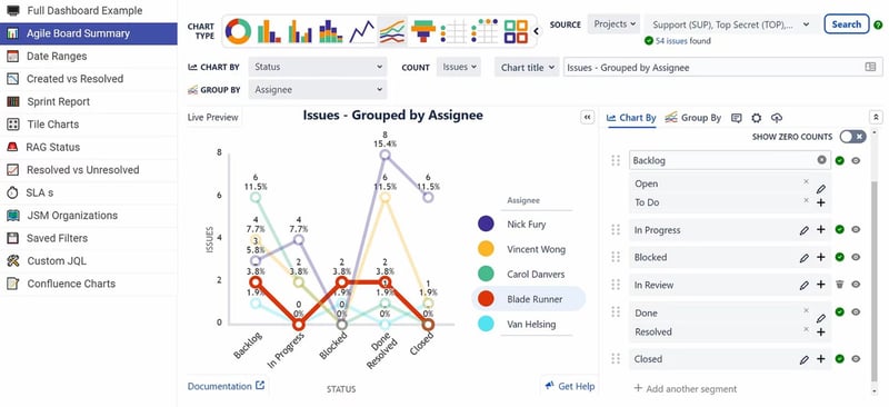
- Rich Filters for Jira to get dynamic dashboards based on the project information.
- eazyBI for Jira to obtain advanced reports with project information. Full overview.
--project-reports-business-intelligence-Atlassian-DEISER.png?width=800&name=eazyBI-for-Jira-and-projectrak(profields)--project-reports-business-intelligence-Atlassian-DEISER.png)
- Dashboard Hub for Jira to get predefined dashboards to track projects easily.

Although we're in the Project Management category of the Apptoberfest, it would also be interesting for you to learn from the reporting possibilities Projectrak offers for project reporting by using the five different gadgets to embed in Jira Dashboards.
Thanks for the mention Huwen! The app is now called Dashboard Hub for Jira (and Confluence) :)
Here's our last demo to track Top beer stocks for 2021, Litters of beer consumed during Oktoberfest, Beer Blockers and the Pretzel Rate Requests:
I realized that after writing this review! It's updated in the blog post, and I already modify it here. Thanks for noting it @Gorka Puente _Appfire_ 😅
And cheers to that #Apptoberfest demo; it is pretty fun!!
Thanks for sharing. Will be looking at Dashboard Hub and custom charts for Jira.
Hey @Fabian Lim , let me know if I can be of any help with Dashboard Hub, always up for a demo! gorka dot puente at appfire dot com :)
Most of our customers prefer EazyBI since they are using Xray and Zephyr. We mainly use EasyBI, Tempo, Power BI.
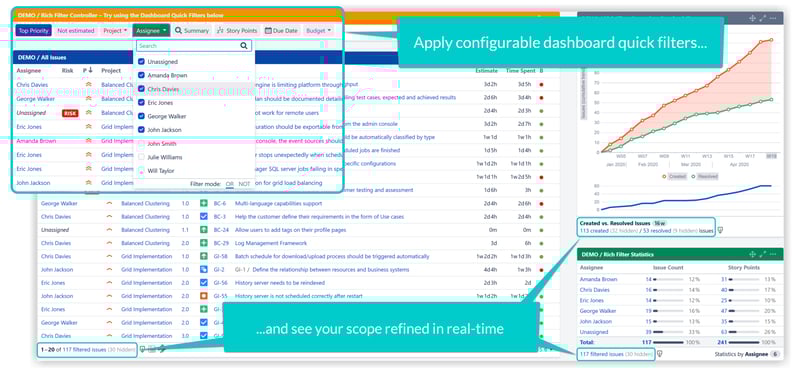
I really really like Rich Filters for Jira Dashboards. It allows for single dashboards to be set up that essentially do the same thing. For example, we used to have a dashboard for EVERY one of our customers(~55). But now, we have 1 single dashboard that we use the Rich Filter controller to show each individual looking at the dashboard the specific customer they want to look at.
We have also used it to determine the most used request types so we can provide a better experience for our users as well, determining most used and least used allows us to consolidate over time. Rich Filters::Service Desk Dashboards
It's also visually enjoyable & simple to look at.
Hi @Maggie Norby Adams and Hi all!!
Regarding analytics & reporting apps I recommend the following (it is true that there are many other very good ones, but just to give an example)
EazyBI in terms of reports and gadgets in more complex dashboards, makes it easier for the customer to view data in different formats and is always very well received, has multiple ways to represent the data and brings that plus to the dashboards that are created natively in Jira, especially when making calculations and represent them visually.
JQL Booster Pack allows to extend the functionalities provided by Jira natively, such as:
- Show related Issues through a specific link.
- Manage versions (planning and management).
- User management, we can show component leads, project leads, users that belong to a specific group or role...
Among many other functions that help users to extract the information in filters themselves or include them in dashboards.
Tempo Timesheets also covers many of the requirements of customers who are interested in extracting reports based on the log work of users, accounts and teams based on roles, and allows greater control over the hours spent on projects.
Best Regards!
Hey ya! Thanks for the kind shoutout to JQL Booster Pack :)
I hope more people can benefit from our features thanks to your lovely comment. 💙
Kind Regards
Jack Nolddor @ Sweet Bananas
We use INFOdation TMS. We like this app for clear review of testing. Easy to use, but many features.
I like EazyBI for reporting, Tempo Timesheets for time reporting and Big Picture for project management reporting/vision.