Community resources
Community resources
Community resources
Measuring the Impact of a Process Change: Time in Status Before and After
Process changes are inevitable—whether it's adopting a new review workflow, introducing automation, or redefining responsibilities. But how do you prove that a change improved your team’s performance?
The Time in Status app provides a data-driven answer. It helps you measure what matters: the flow of work across your board—before and after you introduce a process change. This isn’t about tracking time for the sake of it—it’s about understanding how your process performs in the real world and optimizing it based on facts, not assumptions.
Why Visibility Into Change Matters
When introducing a process update, it’s easy to assume it's helped—or to receive mixed feedback that’s hard to quantify. Time in Status makes the invisible visible. By comparing workflow performance over time, you get clarity on:
- ✅ Whether your changes are working as intended
- ✅ Where new bottlenecks might have emerged
- ✅ How specific statuses or assignees are affected
- ✅ Whether process churn decreased or increased
With this insight, you can confidently iterate, roll back, or scale a new approach.
Step 1: Choose a Before/After Comparison Window
To evaluate impact, start by defining your "before" and "after" periods. Ideally, choose timeframes that are equal in duration and include a representative set of work items.
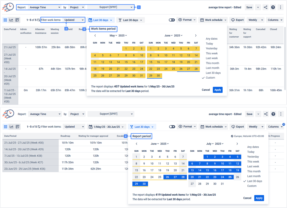
Use Report Period and Work Item Period filters to isolate tickets by the correct time frames. Also, use all the task filtering options available, such as sprint, project, label, JQL, filter, etc. This ensures you’re comparing apples to apples. For example, compare tickets tagged with label = bugfix during Sprint 21 and Sprint 22, or focus on tasks from a specific team or epic.
This granularity ensures your comparisons reflect real operational change—not noise from unrelated work.
Step 2: Use the Right Metrics for the Right Insight
Each team’s change looks different—so your analysis should match your goals. Here’s how Time in Status helps answer specific business questions with depth and clarity:
🧪 Is our new QA process reducing rework?
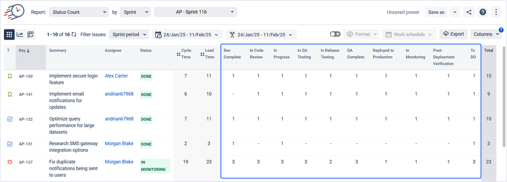
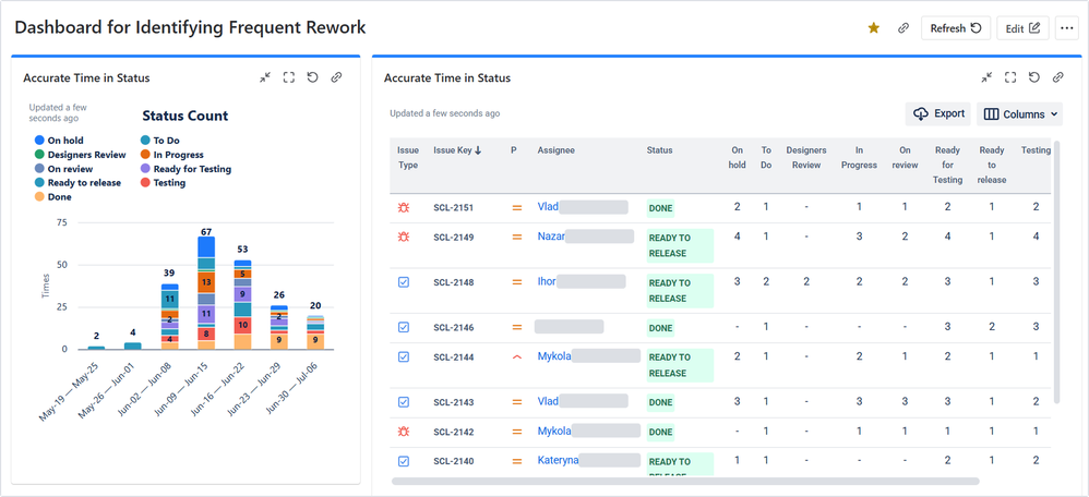
- Use Status Count Report to see how often issues are entered as "Reopened." A spike here suggests ongoing issues with quality or unclear requirements.
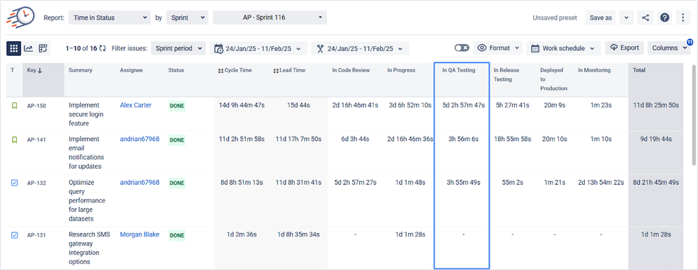
- Compare Time in Status for QA-related stages like “In Review” or “QA Testing.” A shorter time here may indicate faster cycles—or less thorough reviews.
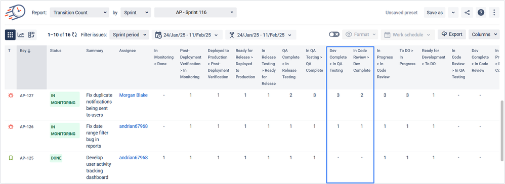
- Review the Transition Count Report to measure how frequently issues bounce between development and QA. Fewer back-and-forth transitions = higher review quality and more precise definitions of done.
⚙️ Did automation help us move tasks through faster?
- The Average Time Report shows the overall time spent per status. Compare before vs. after automation to check if the average time in manual stages like “Waiting for Approval” decreased.
- Use the Pivot Table View to segment issues by an “automation” label or component (or other characteristics). Drill down into automated flows and identify whether the time savings are consistent across assignees or issue types.
👥 Are team members affected by the change?
- The Assignee Time Report gives a breakdown of the time each person spends in each status. Use it to see if the change shifted effort disproportionately onto one team or assignee.
- Combine this with Status Grouping to measure Lead Time or Cycle Time by role (e.g., Dev, QA, PM) to detect bottlenecks at a group level.
⛔ Are we still getting stuck in the same places?
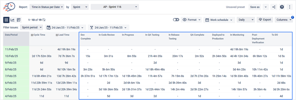
- Use the Time in Status per Date Report to break down daily performance. This helps you see if tasks consistently stall on specific days or in certain statuses.
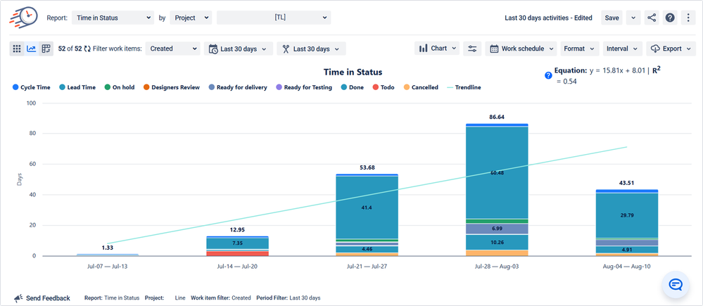
- Visualize this data using Bar or Area Charts to uncover trends. For example, are there issues spending more time in “Blocked” on Mondays? Are urgent tickets spiking mid-sprint?
By combining these reports, you turn raw time data into insights about behavior, efficiency, and team experience.
Step 3: Make Your Insights Easy to Understand
Insights are only helpful if they’re understood. Time in Status supports multiple display formats to match different audiences:
- Pivot Table View lets you segment by fields like assignee, issue type, sprint, or component
- Bar, Pie, and Area Charts help translate rows of time data into digestible visuals
- Status Groups simplify the story by bundling complex workflows into high-level phases (e.g., QA, Dev, Waiting)
This matters most when presenting to leadership, collaborating across teams, or aligning retrospectives with measurable outcomes.
Step 4: Share, Present, and Automate Reporting
You’ve done the analysis—now help your team act on it:
- Export your reports as CSV or XLSX for deep dives or documentation
- Embed findings in Confluence pages to support planning meetings or demos
- Use the JSON Feed to push data to Power BI, Google Sheets, or Qlik dashboards
- Save configurations with Presets to quickly re-run comparisons after each sprint or monthly review
- Add reports to your Jira Dashboards using Time in Status gadgets for always-on visibility
Making reporting easy means it gets used—and improvements become continuous.
Example: Proving the Value of a Workflow Update
Let’s say your engineering team adds a “Blocked” status to highlight dependencies earlier.
With Time in Status, you:
- Track how often and how long issues sit in “Blocked” (Time in Status + Status Count)
- Spot who’s most affected (Assignee Time)
- See if tasks still bounce between “In Progress” and “Blocked” (Transition Count)
- Analyze scope (epics, labels, components) using Pivot View to contextualize the effect
If those numbers start trending down over the next two sprints, you’ve proven the change reduced friction—and have evidence to back it up.
Turn Process Change Into Measurable Outcomes
Process changes are only valuable if they’re effective. Time in Status turns every improvement experiment into a measurable case study:
- ✅ Prove what’s working (and what’s not)
- 🔍 Reveal root causes and friction points
- 📊 Generate shareable, credible insights
- 🚀 Support continuous delivery and agile transformation
Try it yourself—start your trial or book a demo to see how Time in Status can help you deliver smarter, faster workflows.
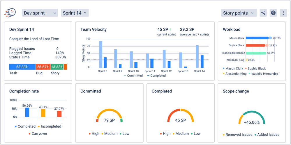
Want more examples? Check out our sprint report deep dive—a real-world case of how Time in Status turns sprint data into actionable improvements.
Was this helpful?
Thanks!
Iryna Komarnitska_SaaSJet_




0 comments