Community resources
Community resources
Community resources
Jira’s Status Button Moved. What It Breaks, What It Fixes — and How to Measure the Impact
If you opened a work item in Jira Cloud this week and thought, “where did Status go?”—you’re not alone. Atlassian has relocated the Status control from the right-hand context panel to the area below the Summary in the main content area. The change is rolling out across projects, and reactions range from “finally, more logical” to “please, put it back.”
This article cuts through the noise with a pragmatic, data-driven approach to responding. We’ll examine who benefits, who’s hurt, what you can do today, and how to quantify the real impact on flow using our Time in Status app—then utilize those insights to enhance your team’s throughput (regardless of where the button is located).
What actually changed
- Old: Status lived in the right context panel (often “always visible” while you scrolled the description/comments).
- New: Status sits under the Summary, next to “Add”/app actions. It scrolls off with the page.
- Rollout: Not perfectly uniform yet; you may see different placements across project types/views for a while.
Why it matters: For short, simple issues this is no big deal. For long descriptions, deep comment threads, or users who frequently review/read and then transition, it introduces extra scrolling and context switching. It also separates Status from other “completion” fields, such as Assignee, which many teams update together.
Who benefits, who’s hurt
- New/occasional users: Discoverability under the Summary can feel more “obvious,” especially on narrow screens.
- Power users & triagers: Muscle memory breaks; Status no longer pinned. Reviewing comments, then transitioning now requires a scroll back to top.
- Admins/trainers: Documentation, screenshots, and enablement all need touching. Mixed placement across project types adds confusion.
Verdict: The change helps with onboarding, but it costs throughput in heavy, comment-driven workflows—unless you adapt the workflow and tooling.
A UX lens
Good UX for a primary control like Status hinges on proximity, consistency, and persistence:
- Proximity: Group Status with fields you change together (Assignee, Priority, Fix Version).
- Consistency: Same place across Jira Software/JSM/views.
- Persistence: Keep it visible while reading long content, or offer a fast, reliable shortcut.
Currently, we prioritize one (sometimes proximity for new users) at the expense of the other two. That means process friction. And friction is measurable.
Don’t guess. Measure. (With Time in Status)
If this change truly helps, you should see more frequent transitions and shorter dwell times. If it hurts, you’ll see elongated status durations and later-in-thread transitions. Here’s how to quantify it in a few minutes using Time in Status.
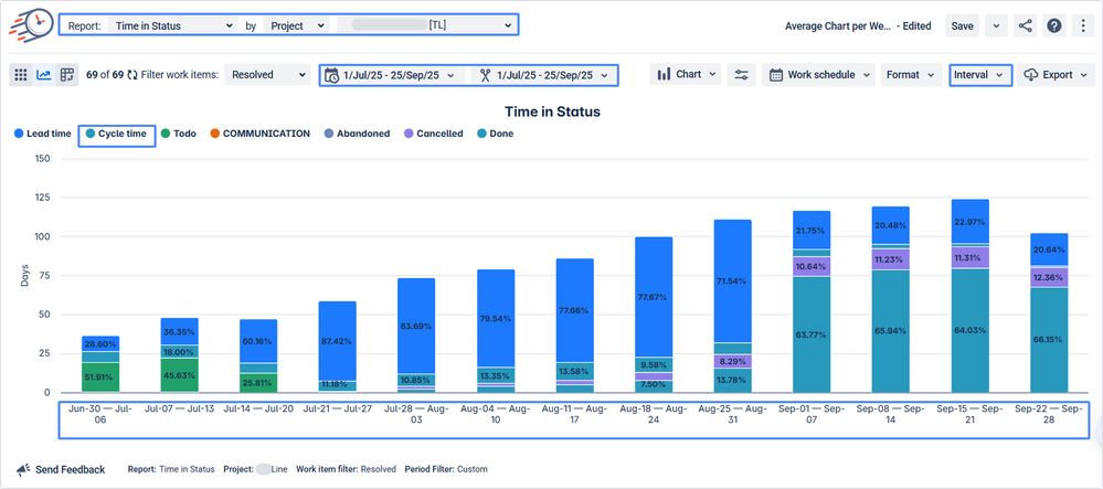
1) Before/After Cycle Time comparison
Goal: Did your lead/cycle times get longer after the UI change?
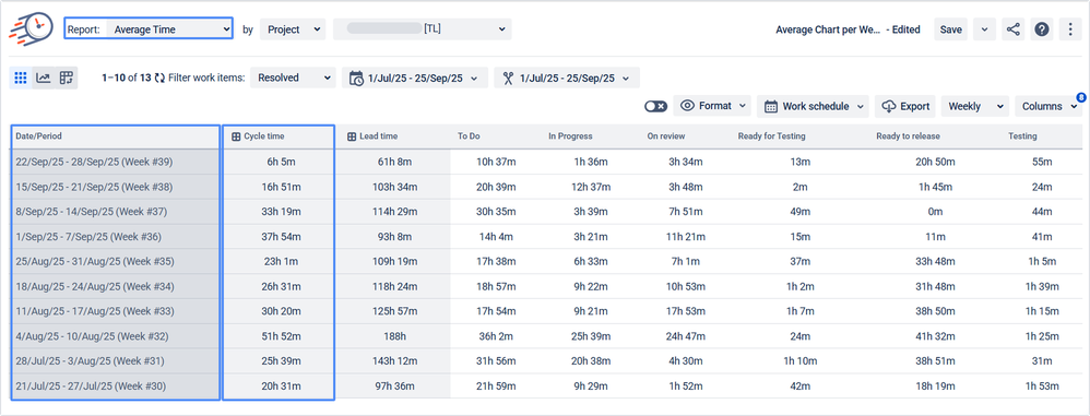
How (Time in Status, Average time reports):
- Create two filters (or date ranges) for the same projects/issue types.
- In Time in Status, open the Time in Status report and create a Cycle Time status group.
- Go to Chart view, select Column chart, and observe how the time metric changes over time.
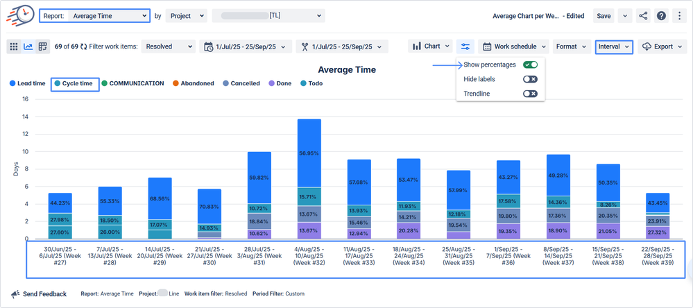
- Go to the Average time report and compare the average values as well.
- For a more informative view, you can choose to display the indicators as percentages.
What to look for: a statistically meaningful lift in total cycle time or in specific wait states after the change.
2) Status-after-comment friction
Hypothesis: If Status is no longer persistent while reading comments, teams will comment first and transition later.
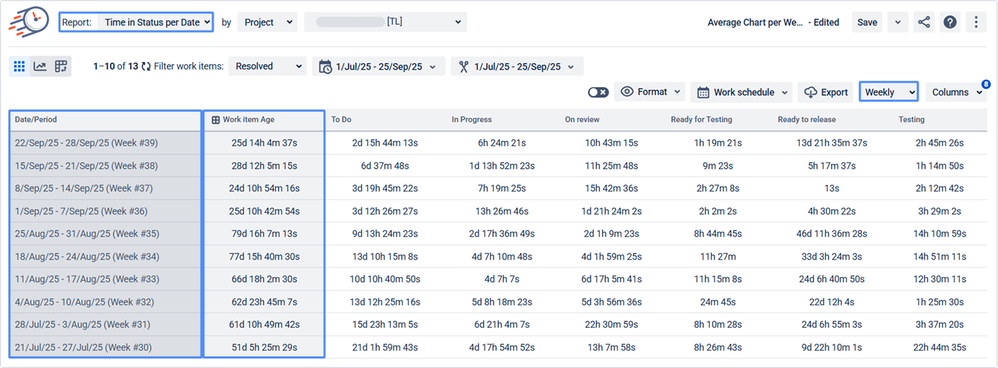
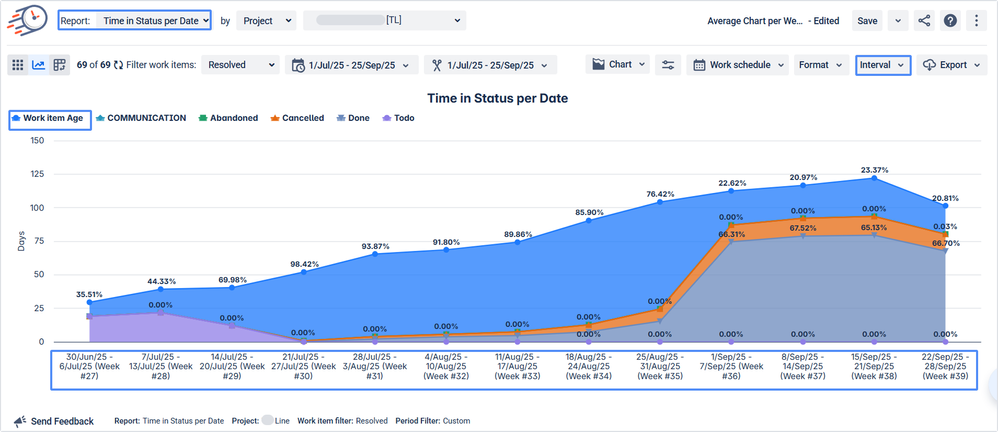
How (Time in Status per Date report + Status Group Work item Age):
- You know exactly which projects have too many comments. Build a JQL query or select the necessary project in the filters.
- On the grid, configure statuses into the Work item Age status group (add all statuses from your workflow except for the Done status).
- Compare whether the Work item Age indicator has changed between periods.
What to look for: an increase in the long tail of “Work item Age” after comments—evidence of comment→scroll→transition delays.
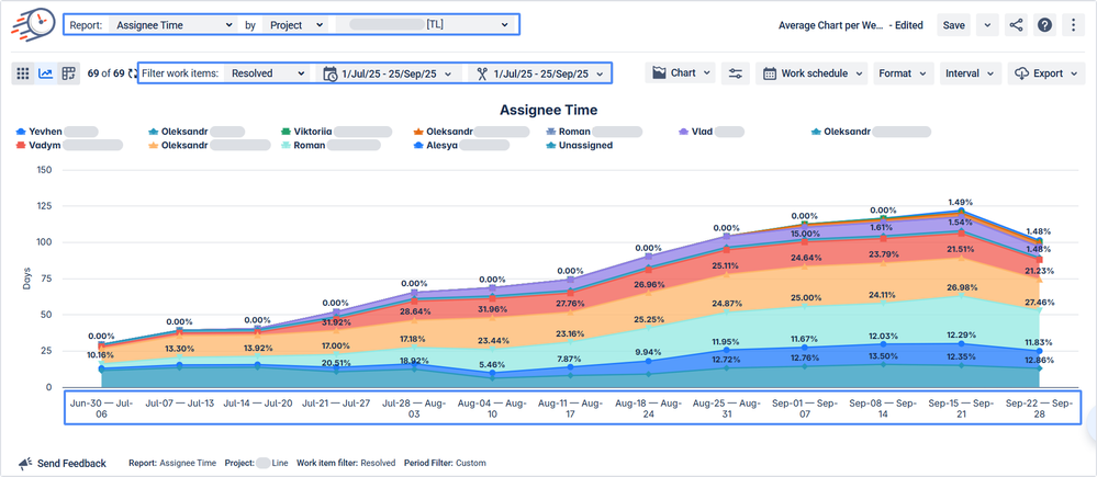
3) Role-based impact (Assignee Time)
Hypothesis: The change affects reviewers, QA, and managers the most (roles that involve reading more than typing).
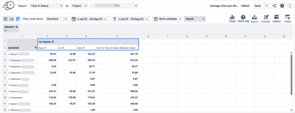
How (Assignee Time report, Pivot tables):
- Use Assignee Time to aggregate duration based on the assignee of the work item.
- Segment by Groups (QA/Reviewers/POs) or Projects with long descriptions.
- Compare pre/post rollout.
What to look for: disproportionate increases for reading-heavy roles.
Immediate coping tips (no customization required)
- Use board drag-and-drop to transition when your workflow allows it (often much faster for common moves).
- Shortcuts: hit ? in Jira for your site’s keyboard shortcuts. Many sites map Change status to a key (commonly D)—it jumps straight to the transition dialog.
- Micro-training: add a 60-second GIF in your team space: “Status now lives under Summary” + “Use D to change status quickly.”
Practical use cases our customers are rolling out
- Release Managers
Use Time in Status → Cycle Time + Work item Age to make the cut/no-cut decision: “Nothing older than 24h in In Review ships.” - Support/Success
In JSM queues, monitor Time in Waiting for Customer / Support. If it spikes post-change, your agents are losing time to UI friction—refocus on queue hygiene and shortcuts. - QA Leads
Add a Transitions report gadget on your QA dashboard. If it drops, QA isn’t moving cards as often—retrain to use board transitions and the shortcut dialog. - Program/Portfolio
Use Assignee Time to visualize where initiative work is burning hours—then eliminate the top two slow statuses by either policy or automation. - Change Management
Run a before/after Time in Status snapshot when you roll UI/process changes. Make it standard practice to instrument the change, not just announce it.
Final take
UI debates are emotional because they poke at muscle memory. The only way to overcome opinion stalemates is to confront reality. If the new placement truly helps, you’ll see it in your Cycle Time. If it hurts, you’ll catch the Work item Age spikes and fix the workflow—or present complex data back to Atlassian.
Either way, your team wins.
Try Time in Status
If you want the Status Dashboard template or a no-pressure trial of Time in Status, reach out, and we’ll get you set up in minutes. You’ll have a clear, defensible read on whether this change is helping—or quietly slowing your teams down—and concrete levers to pull next.
Time in Status | Book a quick demo-call
Was this helpful?
Thanks!
Iryna Komarnitska_SaaSJet_



4 comments