Community resources
Community resources
Community resources
- Community
- Products
- Confluence
- Articles
- Theming for Confluence is now GA
Theming for Confluence is now GA
Hello Community!
The Confluence Cloud team is thrilled to share that theming is now generally available (GA) for all customers, including those on release tracks. We have been working towards this milestone for several months and have been gradually rolling out access through an alpha and beta program. Thanks to all of your feedback, we are now ready to move Light theme, Dark theme, and the match browser setting into general availability!
Try out themes in Confluence
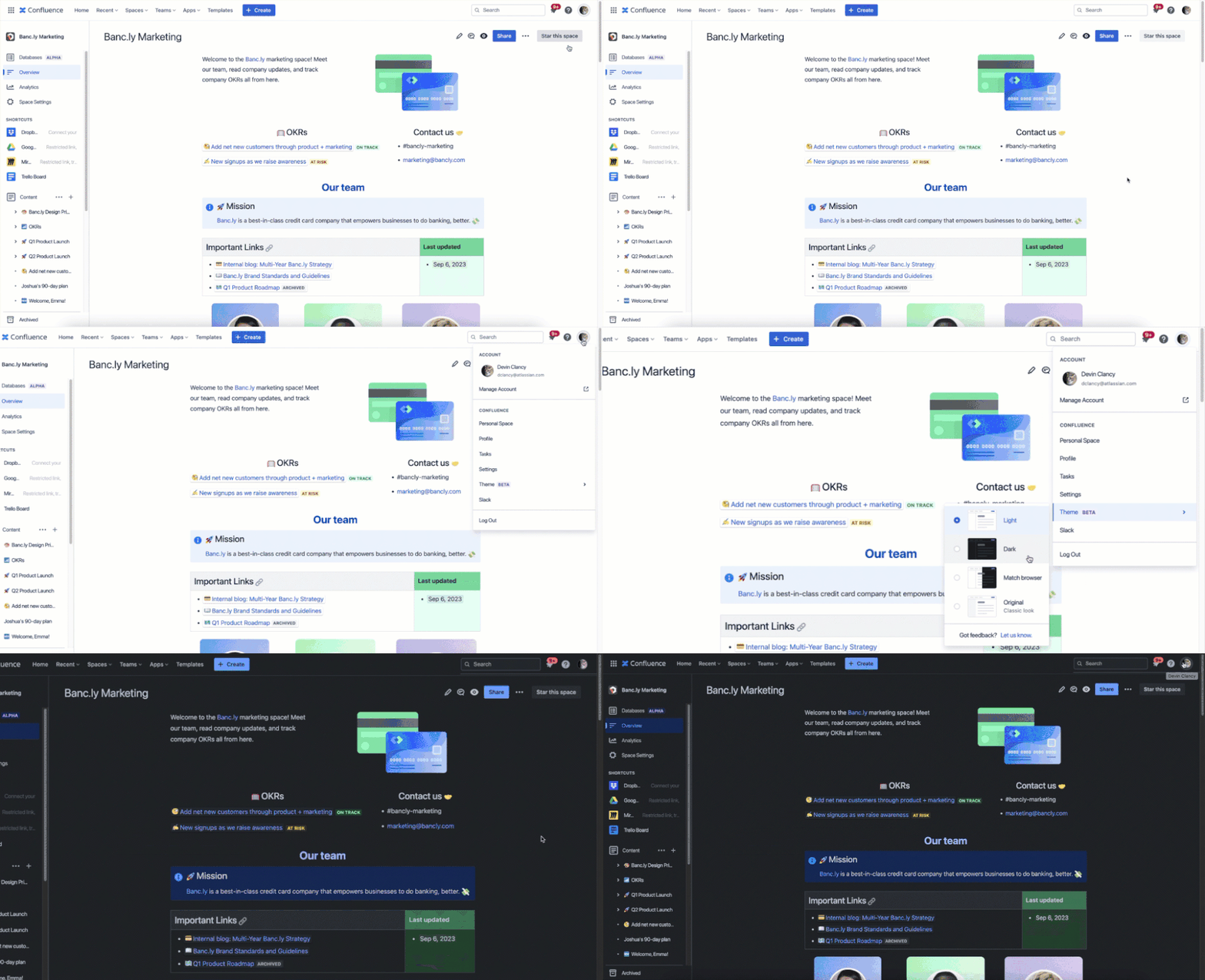
If you haven’t had a chance to try our new themes, it’s easy to do: Click on your profile icon in the top-right corner, then select Theme from the dropdown and choose from one of four options:
-
Light: Our new default theme, very similar to the classic Confluence colors but with higher contrast for better accessibility.
-
Dark: Our new dark theme, which can reduce eyestrain and save battery power.
-
Match browser: This setting will follow whatever theming you’ve picked in your browser.
-
Original: The classic Confluence colors. We plan to remove this option in the near future once we are confident that the new light mode works well.
What has changed since alpha and beta
We initially trialed our new themes with a small group of users during our alpha. This allowed us to spot and address any glaring issues before rolling out access more broadly. We then invited all customers on continuous release tracks to try out themes during our open beta. During this time, we received a lot of feedback from the community to help us refine the experience further. Rest assured that we read every single piece of feedback and have tried our best to address these bugs and suggestions. There is always room for improvement but we are confident that themes are now stable and usable for all Confluence customers.
Over the last few months we’ve adjusted dozens of design tokens for better contrast, added theming support for additional macros, and made hundreds of icons and illustrations compatible with theming. Recently, we also solved the two most commonly reported bugs:
-
Custom colors in the top navigation bar
Custom color schemes set by Confluence admins are now compatible with dark mode. Admins have the ability to set a custom color scheme for the top navigation. Because these custom colors take precedence over user-selected themes, some users were previously reporting that their navigation bar did not match the rest of their experience in dark mode. We’ve implemented a solution that adjusts these custom navigation background colors to something more appropriate in Dark theme but still keeps the essence of the admin-selected light color.
-
Colors in the legacy editor
We also heard from many of you working in the legacy editor or on pages that have migrated from the legacy to the new cloud editor that text and table cell colors were hard to see in Dark theme. We’re happy to share that our color picker in the legacy editor is now compatible with all themes and we’re also offering support for colors on pages migrated from the legacy editor.
What's next?
While the majority of experiences are now supported by themes, we realize with a product as expansive and robust as Confluence there will be loose ends that still need tending. We will continue to polish the experience and we always welcome your feedback. In the near future, we plan to retire the original theme in favor of our new light theme, which provides higher contrast for better accessibility.
Thank you to all of you who have taken the time to share your feedback with us. Your insights are invaluable in making our products better for everyone! We also want to give a huge shoutout to our marketplace partners who have been working hard on adopting themes for their apps. Apps make our products more powerful and delightful and we love to see all of the progress in creating a more seamless Confluence experience for our users.
Was this helpful?
Thanks!
Laura Mehrkens

About this author
Senior Product Manager, Confluence Cloud Ecosystem
Atlassian Community Events
- FAQ
- Community Guidelines
- About
- Privacy policy
- Notice at Collection
- Terms of use
- © 2024 Atlassian


4 comments