Feature updates for the new Confluence Cloud experience

Hi there,

I'm a product manager with Confluence Cloud, and I wanted to inform you about a couple of feature updates we've recently made to the new Confluence experience. There's been plenty of feedback about the new experience since we first started rolling it out back in July. We've been listening to this feedback (and will continue to listen!) as it helps us prioritise which features we build or improve. Below are two features we've rolled out to the new experience as a result of your input. 

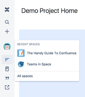
Firstly, we heard from a lot of you that it took too many clicks to move from space to space. To help solve this problem, we've introduced a space switcher. The space switcher lets you quickly access spaces you've visited recently, and also gives you a link to the space directory ("All spaces"). Here's the space switcher with the sidebar expanded and collapsed:
Screen Shot 2017-09-18 at 9.45.06 pm.png        Screen Shot 2017-09-18 at 9.30.30 pm.png

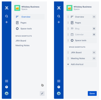
We also heard that a key missing feature with the new experience was the ability to customise space navigation - that is, to remove items, or change their order. So from now on, if blogs or an app aren't important to a space, you'll be able to remove links to them. Or if you want pages to be the first item in the navigation, you can move the link to the top of the list. Admins and space admins can use the edit pencil at the bottom of the sidebar to start customising:

sidebar_customization.png

We're continuing to read and learn from the feedback we're receiving from you about the new Confluence experience—whether it's via the in-product feedback form, on the Community boards, or via feature requests on our public-facing JIRA instance. So please keep sending us your feedback! We're always looking to improve Confluence, and will continue to ship improvements once the new experience is switched on for all customers in the coming week.

Thanks for reading!

Caroline


3 comments

Bruno Miretti September 19, 2017

Edit: "The space switcher lets you quickly access spaces you've visited recently, and also gives you a link to the space directory ("All spaces")"

well only if you're logged in, anonymous users seem to be forgotten with the new features you implement, in this case they will only see "All spaces", no history. Moreover they can now see the "Space tools" option! Please improve your testing with anonymous users, I have 4 or 5 tickets opened for issues detected while navigating as an anonymous user.

Thanks anyway for the update, this is not as good as sidebar customization but it helps a bit.

Wolfgang Seidler October 10, 2017

Hi Caroline,

this usability concept with the side bars confuses me.

On top right side I have "action" buttons to edit, watch, share ... the page, but in order to search or add a new page I have to fade in the blue sidebar. This adds additional clicks and mouse actions to find a function I'm often using. For me it would be more useful ti skip this blue sidebar and have this on top with the other "action" buttons or in the drop down list behind the "...".

confusing_confluence_cloud.PNG


The next usability issue for me is the "configurable" sidebar.

I'm often working in confluence either by reading, adding or editing content. Most important for me is the page tree, cause I use confluence to document and collaboratively increase content (quality).

So I know the space content and structure. I read a page and I want to open another page (for comparing, getting additional information, linking to the right context ...) in another browser tab. This is a very, very frequent usecase - specially when working on the description of backlog items.

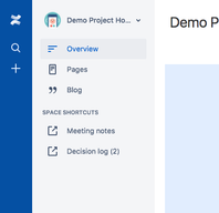
Now I have to open the page tree with a button "Pages". If I just click, my current page will disappear and a super large overview of the page tree level 1 is displayed (see below). Alternatively I open it in a new tab, than I permanently have to switch tabs in order to look into the space content). This not only takes time, but also decreases the focus on the work, cause I always have to search for the tab with the overview.

How can I have the page tree and the current page content in one tab of my browser again? As far as I remember this was working "out of the box" before the latest design changes.

Confusing_missing_pagetree.PNG

Both columns/bars currently provide more than limited value to me - at least the way they are currently implemented.

Thanks for your help.

Kind regards

Wolfgang

Wolfgang Seidler October 10, 2017

I just posted a comment, edited it afterwards and now it's gone ...

Comment

Log in or Sign up to comment
TAGS
AUG Leaders

Atlassian Community Events