Community resources
Community resources
Community resources
Feedback on Cloud vs. Server content
Hi all!
I wanted to start a discussion around differentiating cloud vs. server content. Specifically I would love to know:
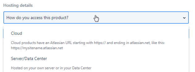
- Have you noticed improvement in differentiating this content after we introduced the new cloud/server tagging in the create flow?
- If you're following Confluence Cloud or Server content, did creating a Confluence Cloud subcollection help you keep track of this content better?
- Does it make sense to also add a Server subcollection?
- Does it make sense for products to have three collections -- Cloud, Server and both/either/I don't know? What about forcing Cloud vs. Server? What about users who genuinely don't know?
- Are there any other products that definitely need dedicated Cloud subcollections?
- Any other ideas for how to organize this content going forward?
Would love any general thoughts/brainstorming around this.
7 comments

Another idea is that you can provide a bit of context around the selection of cloud and server to help users who don't know. Or information on where they can locate that information.

Agree with you, @Meg Holbrook especially on the last idea. There could be a ? bubble that guides them to distinguish between cloud vs server or to ask their admin.

Totally agree with @Meg Holbrook and @carolyn french - great idea to help the users to find out what system they are working on
Would also be great to have the opportunity to have a Server subcollection!

But the context is already there:
Yes I should have been clearer about this -- we did add the Cloud/Server question about a month ago and I'm hoping to find out if it's helping the questions be tagged more appropriately. @Meg Holbrook have you noticed this improving?

@Monique vdB, yes. It has absolutely made a huge difference in day-to-day responding. The first response to a user now doesn't have to be 'are you on server or cloud?'

Must have fallen asleep when I wrote this, as I had clearly read those release notes! I am still seeing a lot without server/cloud specified, but I'm sure it's helping.

@Monique vdBI may not go in your order but I will try to answer all questions:
- Definitely we need a Server Subcollection
- I see users now selecting Confluence Cloud which is good (however which I don't think it is your problem guys, many users think Cloud = AWS). I think Atlassian Cloud will make more sense.
- JIRA needs Atlassian Cloud, Server
- "Not sure" is definitely needed as some users are really not sure what type of instance they are working on
- I prefer Marketplace Add-ons than Marketplace Apps (consistency with what we already have within the Apps) so that users don't get confused especially the newbies. Also I don't think they are Applications, they really are plugins
Best of luck!

@Fadoua - As far as I remember, Atlassian changed the name "Add-on" to "App" officially about one year ago. The marketplace is using app ("Search for apps", "Explore apps"). The menu in Jira Cloud is still using the name "Add-ons". Don't know, what's right now, app or add-on. But it should be consistent everywhere.

+1 here, all UIs are still using plugins/addons and that's far more appropriated in my opinion.
The "cool" approach on Cloud UI + marketplace is a great initiative but should keep consistency on the products. Most "Apps" are just basically addons. We can agree that Tempo Budget for instance could be an App as it's bringing a complete new aspect to Jira, where most of the Apps are just extending some features.. that's confusing for new users!
A simple way could be to ask the user if browsing Jira is easy, if yes, he/she's definitely using Server :D
I don't have control over this one, have to stick with App since that's what the official terminology is now. :)

Atlassian do have a poor record of choosing group names - Cloud, Server and Data Centre all confuse users (OnDemand was clunky, but unmistakeable). "App" is utterly dreadful, as most of the world sees it as a contraction of "application" which has another meaning in the ecosystem.
But, we're at the whim of the marketing people, so hey.
And as for @miikhy 's "A simple way could be to ask the user if browsing Jira is easy, if yes, he/she's definitely using Server :D" - you owe me a new cat, I've just laughed coffee all over this one! It's not really much of a joke though - the number of people (both grizzled veterans and total newbies) who simply can't find anything is scary.

Took our chance to mention it :P
Oh no @Nic Brough -Adaptavist-, not the cat :(

I learned on cloud, so the complexity didn't strike me until I used server and then had to go back to cloud. Sigh.

Um, it's Center not Centre. Which only proves your point, Nic. I'm going to stick to plugin. Since that's what most of the Marketplace calls them in their documentation.

@miikhy turns out the cat has now forgiven us, judging by the tuna-scented hiccups! I bribed her for forgiveness
@Matt Doar Center not Centre. Yes, very true. But as an English person who went to an English grammar school, my paws betray me when typing centre. I know it's center in American English, and that is what the brand is.
Of course, it's a another reason I think Atlassian branding could have done better, by picking something spelt the same way.

Yeah, I'm a bit messed up, half and half now.
Any product that starts with J will be hard for half the world to pronounce. Zheera, Heera, and more.
And it's spelled "spelled" not spelt "spelt" :)

American vs British English battle... *grabs popcorn*

It's an internal battle for me, being both

- Yes! I fully agree with @Meg Holbrook on this one: it's critical when providing screenshots and there are huge differences in features.
- Not concerned about collections, I don't use them to track anything. But I don't think it would be good to force people to choose between Cloud and Server, I think some people would choose one just to submit their question without actually knowing what they're using.
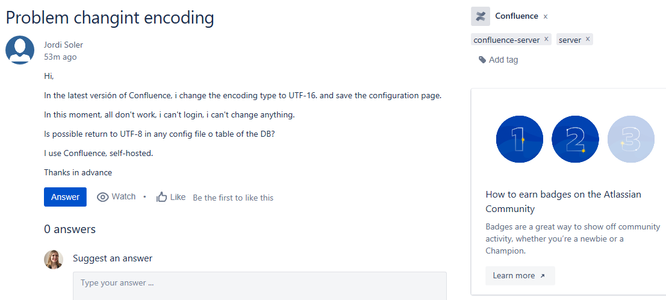
- Suggestion for the tags location: when I scroll down to the answer box, I don't see the tags anymore. Now it looks like this:
And I'd like to have it like this:
@Manon Soubies-Camy I love this suggestion.
@Test User KL and @Scott Grieder ^^^
@Manon Soubies-Camy has a very good point: it would be helpful to keep the tags visible at all time.

And the "main" tags too - a lot of questions have something like "Confluence" "thing1" "thing2". The "things" don't tell you a lot about the system you're looking at. I'd like to keep them collection/main tags with the others.

True! I don't remember why I didn't move the collection with other tags but I guess it's because it is bigger than other labels. So maybe let the bigger label (with Confluence logo) up there and add a regular label (just "confluence") with the other ones?
This is probably overkill but....
If there was a URL field that allowed users to paste in the URL to their instance could the Tag field automatically suggest tags from that URL, similar to a postal address field finder?
Not even sure if this is possible but I could see this making life easier for users and community champions and the community in general.
Thanks

There might be a security problem with this. I would not enter our internal URLs into a field on a public website.

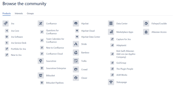
Looking at this is a little chaos to me..
It is not even sorted alphabetically, hard to read, some products have subcategories, some not.. Everything simply gray without any life (color) that could be better for eyes.
Hmm.. Since some products are only on Cloud (like Stride, Atlassian Access, .. ) and some are for server (Bamboo) and some are for both (JIRA, Confluence, .. ) maybe instead of creating another sub-collections for Cloud/Server products we can start filtering like this..
Community > Products > Cloud (Server) > Confluence
instead..
Community > Products > Confluence > Confluence Cloud (Confluence Server)
In other words first choose to type of product (Cloud or Server) and later have only list of products that are inside this category.
Thanks to that maybe someone would also be able to watch only Cloud or Server topics. We could also make data center also as separate. The key point where to make a visual switch. it might be a button that make it more dynamically (gray out products or show only applicable) or a sub menu below "Products" .. or using different colors.
What do you think?
Another great point, thanks for this feedback!
Color differentiation would be a nice solution. Also maybe expandable/contractible menus?

Remember that color is for adding information, and never the sole way to differentiate things. You should be able to print something in black and white and not lose information. Atlassian Design Guidelines and me as a color blind person
@Matt Doar yes! That is a great point and very important our design guidelines are color-blind friendly.

We should always give a choice to users :) .. Would be good if you can switch in your profile from colors to black and white :) . I think overall many new things should be provided as option for people to choose . If they do no like it they can switch back to the old view. If you set up an counter you can check how many people are using which version of a view and later remove the one that is less used. That is better approach than giving only one new option when someone liked a lot more the old one. Some people do not like changes and would like to better customize their workspace. Maybe some day Community could have themes and people would be able to decide about more elements of design. If for example this kind of menu with a list of products would be 100% dynamic to let people choose which option do they like to see and how (colored or not) that would be awesome! :)

To try to run through the original questions instead of getting side-tracked on comments:
- Have you noticed improvement in differentiating this content after we introduced the new cloud/server tagging in the create flow?
- Heck yes. In the last 3-ish weeks, I've only asked "Server or Cloud" a couple of times, and my "Oh hang you, you mean the other one" frequency is way down. Except on the questions where I forget to read the label.
- If you're following Confluence Cloud or Server content, did creating a Confluence Cloud subcollection help you keep track of this content better?
- Personally no, but I'm interested in all of it, and would not expect this to help me. I did notice a couple of my colleagues finding references to our add-ons faster though
- Does it make sense to also add a Server subcollection?
- Very much so, as otherwise we're looking at "Confluence, or Confluence Cloud", and people will still see "Confluence" as "Cloud".
- I'm also thinking of Data Centre here. Until recently, almost everything barring the most low-level questions about clusters and shared storage for DC nodes could also apply to Server, the DC products are starting to diverge from Server as well.
- Problem with having Cloud/Server/DC separated - people don't understand which is which, because your Cloud provider runs your Server in a Data Centre, and they can run their server in a a data centre and a 3rd party running server for them would be running it in a data centre, but it's not their hardware so it's in "the cloud". Argh.
- Does it make sense for products to have three collections -- Cloud, Server and both/either/I don't know? What about forcing Cloud vs. Server? What about users who genuinely don't know?
- "All" might be a good option, but I'd try to discourage it by asking them for a second confirmation that they really are sure that they can't identify .atlassian.net in their url (or not), or that it really is a generalised question about the single application
- Are there any other products that definitely need dedicated Cloud subcollections?
- I'm not convinced there are Atlassian products that do
- It would be nice to do it for some apps. You all know I'm thinking of ScriptRunner (guess which t-shirt I'm in today), but I've seen stuff for Tempo Cloud which which could use it too, and, the lead candidate, well ahead of SR is Zephyr!
- Any other ideas for how to organize this content going forward?
- I'd like "assumed tags". If something is in a collection, there should be no tag for that collection, but it appears as part of the tags, so it's clearly searchable. The search should be weighted so that the collection is the heaviest, and tags second, and the internal distinction invisble to users.
Well first, I'm very glad to hear the new cloud/server picker has been helpful! I think if we take @Manon Soubies-Camy's suggestion above, it might make it even harder to miss.
Thanks for your other suggestions and thoughts. This definitely helps as I ponder our information architecture more broadly....
Hi @Monique vdB,
Not Confluence related, but here is a feedback from a Community user about Bitbucket:
Thanks @Caterina Curti! Is this user talking about the support portal? This doesn't look like the community Explore menu. Plus based on their question it looks like they did enter Bitbucket as their product and then have the option to choose Cloud or Server with our new create form. So this may be feedback for the Support team rather than a request for a subcollection? Correct me if I'm wrong!
Great attention to details @Monique vdB! You are right that the screenshot is from the https://support.atlassian.com/products/ page.
However, the Community list of products (https://community.atlassian.com/t5/Products/ct-p/products) looks very similar and only mentions "Bitbucket" and "Bitbucket pipelines".
(So similar that I did not see the difference without actually browsing to the page and opening both of them for comparison).
While I can see how the customer is not referring to Community in particular, it would be great to have a shared (across all platforms) and easy to understand way to differentiate between the two hosting options.
Do we have a way to see if the customer selected the right tag? I usually add the hosting type to each question I answer.
Cheers!
Was this helpful?
Thanks!
- FAQ
- Community Guidelines
- About
- Privacy policy
- Notice at Collection
- Terms of use
- © 2025 Atlassian


