Community resources
Community resources
Community resources
Confluence Tables: 4 Tips for Better Formatting
Looking to get more out of your tables? You're in the right place. Tables in Confluence are simple and easy to use, but sometimes you might want to make them stand out, do additional analysis with the data, or include them in more advanced ways on your page.
Let's talk about a couple of built-in features to get more out of your tables and how to push your tables further with the help of an app or two.
Option 1: Change the colour of your table cells
An easy, built-in way to improve Confluence tables is by adding a pop of colour. It's quick and simple:
1. Click on a single cell or click and drag over multiple cells.
2. Click the down arrow and hover over Background color.
3. Click a colour from the palette.
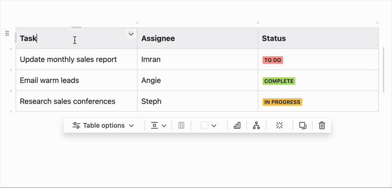
💡 Tip: If you choose a dark background colour, remember to change your text colour to a lighter one so users find it easy to read.
Option 2: Enhance reporting with layouts
Did you know you can embed tables in layouts? Confluence's layouts feature allows up to 5 columns, which is ideal for designing dashboards and reports to share with stakeholders.
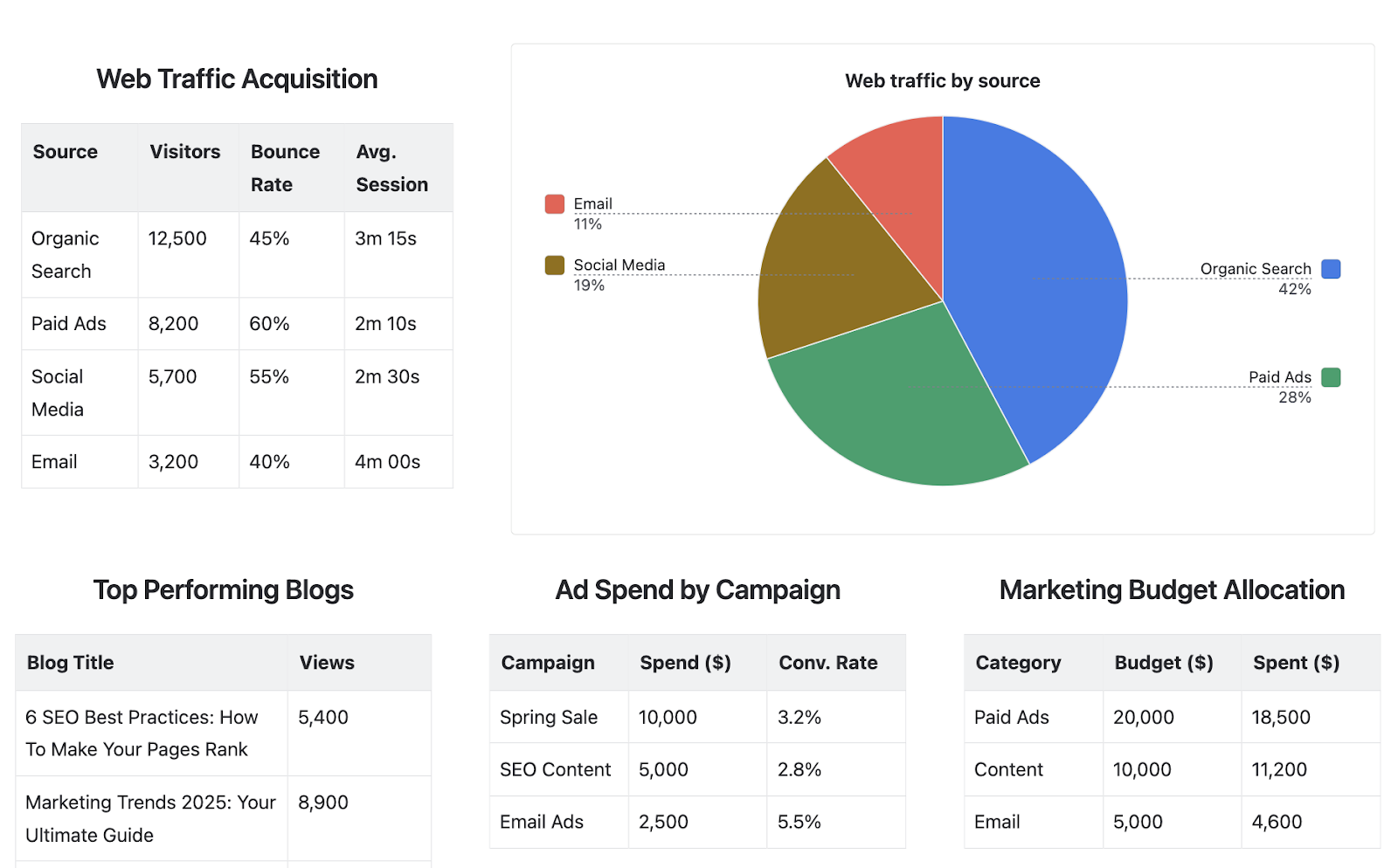
All you have to do is click the layouts button in the toolbar and add your table inside. It couldn't be simpler. This is a great option for displaying several tables in a neater, more professional way, making it more likely for users to engage with your content.
Want to go beyond what you can achieve with Confluence's native tools? We've got some ideas for you!
Option 3: Extend your table's functionality
Want to make your reporting even better? A third-party app can bring additional useful features to your Confluence tables. Table Filter, Charts & Spreadsheets - the best-selling app for tables in Confluence - does just that.
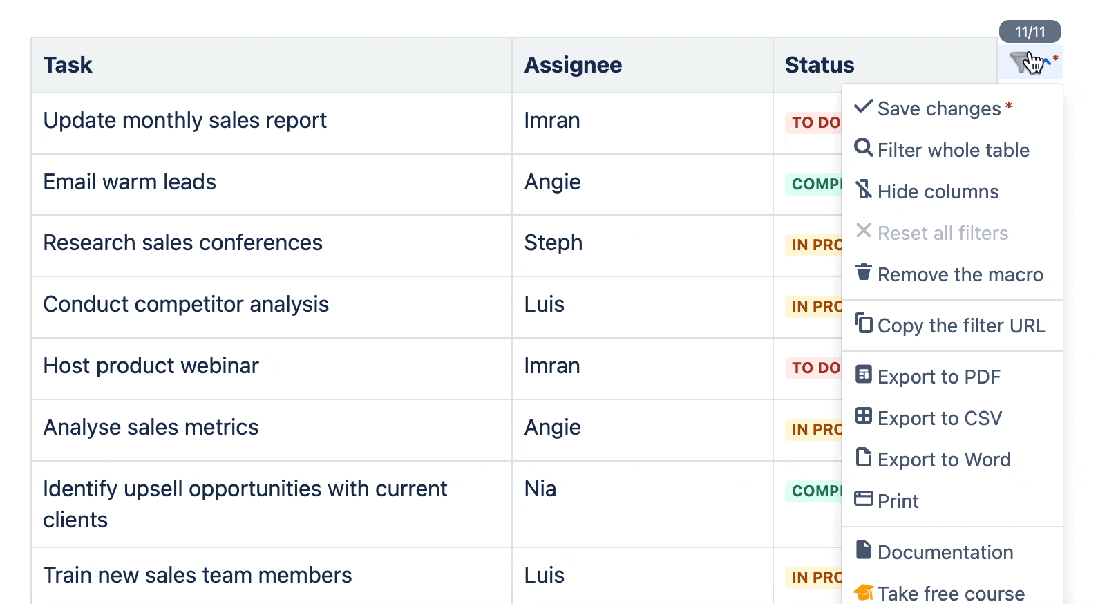
Whether you want to filter your table to focus on specific information, quickly generate a chart to gain visual understanding, or convert your table into a handy pivot table, this app turns Confluence into a powerful centre for data analysis and visualisation.
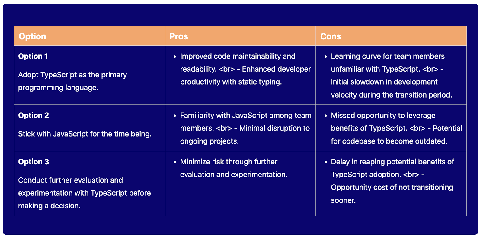
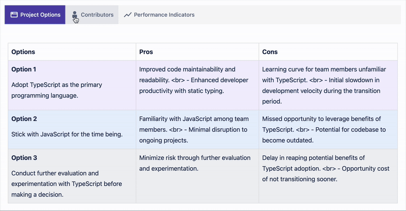
Option 4: Design more engaging tables
If you're looking for more advanced customisation, you'll need an app to help you!
The next part of our guide uses Mosaic: Content Formatting Macros & Templates, which includes various macros designed to improve page structure and style. This Atlassian Marketplace app comes from a Platinum Partner, ensuring the highest level of security and protection.
Here are some ways Mosaic's macro toolkit can enhance your tables:
1. Make tables stand out with a background colour
With the help of the Background macro, you can add a background colour of any shade to your table. It's perfect for highlighting key information on your page.
2. Add collapsible sections inside table cells
Tables can become overwhelming if cells contain too much information. The best way to avoid this is by adding an Advanced Expand to your table, which keeps content neatly tucked away until a user wants to read more.
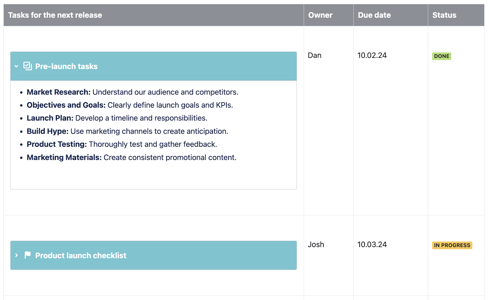
3. Separate tables with tabs
Similarly, too many tables on one page can be hard to navigate. Adding tables inside Tabs helps keep your page tidy and clean (and lets users browse the tabs at their leisure).
4. Add extra context and highlight important information
You can add extra insights to your Confluence tables with macros such as Buttons, Tooltips, and Advanced Cards. Here are a few examples:

-
Add more engaging links: Buttons make it easier for users to click through to another page or document. For example, buttons help users quickly find the correct documentation in an onboarding checklist.
-
Discreetly explain unfamiliar terms: If your table includes jargon or acronyms that users may be unfamiliar with, adding a tooltip is a great way to give users more information without making the table look busy.
-
Increase understanding with visuals: When used well, pictures can dramatically improve comprehension. If you have a team page with a table containing employee contact details, it's a great idea to include cards with employee headshots.
Interested? Try Mosaic free for 30 days
What's your favourite way to make tables more engaging? Let us know in the comments below! 👇
Was this helpful?
Thanks!
Zoriana Bogutska_Kolekti
About this author
Product Marketing Manager
Adaptavist
5 accepted answers
0 comments