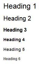
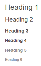
I changed the Confluence 'Heading Text' color to fit with our company color scheme and found that Heading 5 and Heading 6 are always shades lighter from the original color. This isn't obvious when the color is set to all black (#000000), but VERY apparent when using various colors.
As you can see, this is very hard to read when the color is too light.

Is there any way to prevent the last two headings from being lighter than the original color?