Jira Cloud Adoption: Simplicity is the Missing Superpower
As organizations migrate from Jira Data Center to Cloud, most users are excited about AI, Rovo, Automation, and the innovations Atlassian showcased at Teams ’26.
But adoption isn’t decided by features.
It’s decided by what users experience in their first few days.
When users land in Jira Cloud and struggle to find projects, backlogs, filters, boards, reports, or even important issue fields, adoption slows down—not because they resist change, but because they spend too much time searching.
AI agents can automate work.
Rovo can find information.
But users still need a system that is intuitive and easy to navigate.
If I were prioritizing the Jira Cloud backlog, my #1 item would be:
🎯 UI Simplification
Especially for large Data Center migrations.
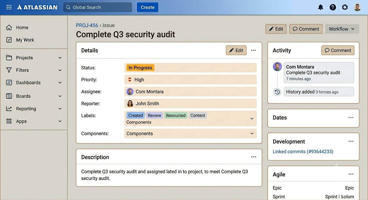
One area that stands out is the Work Item (Issue) View. While powerful, important fields often blend into the page without clear visual grouping. Better containers, field sections, and hierarchy would dramatically improve readability and reduce cognitive load.
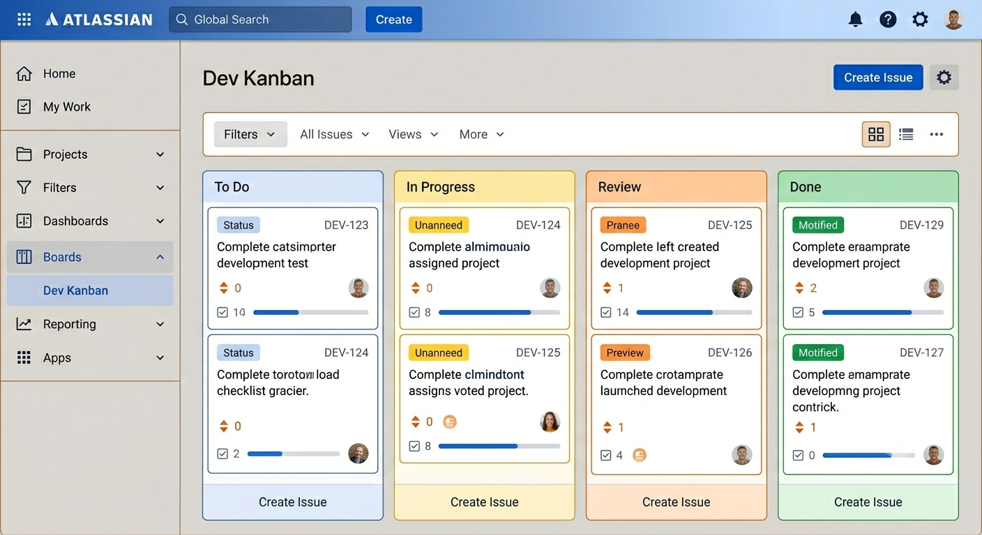
The concepts in the attached mockups (created with Gemini) explore what a simpler Jira Cloud experience could look like:
✅ Cleaner Work Item View
✅ Easier Project Navigation
✅ Search-first Experience powered by AI
✅ Simpler Administration
✅ More Focused Dashboards & Boards
added the conceptual view of UI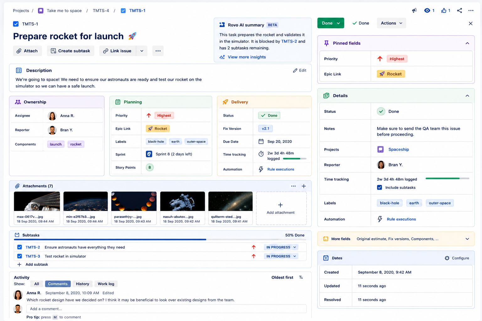
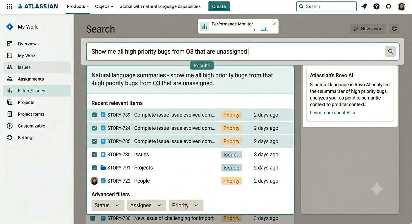
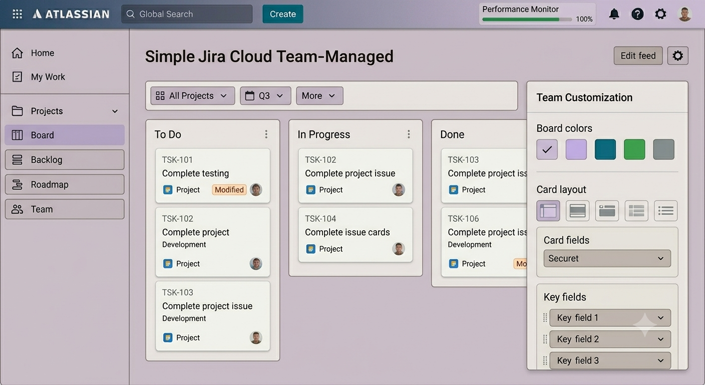
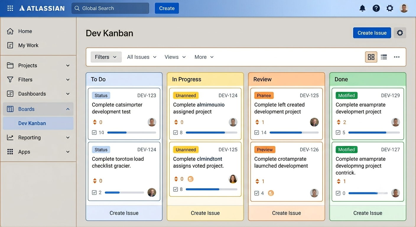
The future of work may be Human + AI.
But the foundation is still great UX.
Users shouldn’t need AI to find where things are. They should need AI to do more with what they’ve already found.
What UI improvement would you prioritize for Jira Cloud?
#JiraCloud #Atlassian #Teams26 #Rovo #UX #UI #CloudMigration #JiraAdmin #ProductDesign #HumanAI #AtlassianCommunity

