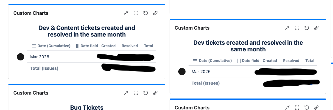
I have 2 questions.
1. I have a dashboard (screenshot below) and have been trying to get the charts to line up (see the blue line on the chart on left is higher than on right) but every time I lower it, it just pops back up -- it doesn't seem to allow any gaps between these charts. It would be easier on the eyes to see these charts be positioned equally. Is this not possible?
2. On this dashboard, we're trying to see the work done by our team. We currently have a chart that shows tickets that started in March and another chart showing Tickets completed in March. Is it possible to show tickets that have continued to be worked on throughout the month? What I mean is a ticket, for example, that started in January but the work continues over the course of several months, how do I see the hours the team has done? On the individual tickets, it doesn't seem to allow that level of depth, so hoping to get confirmation on that or see how we can in fact get to this granular level.