I'm trying to create a sample report with just a very basic need vs available. This is all fake data but i wanted to make a bar chart with this showing available vs needed:
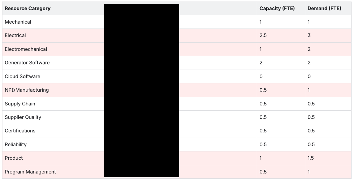
when I attach a chart to this, it doesn't display every row. Even when you hover over the bars, it doesn't tell you the label.
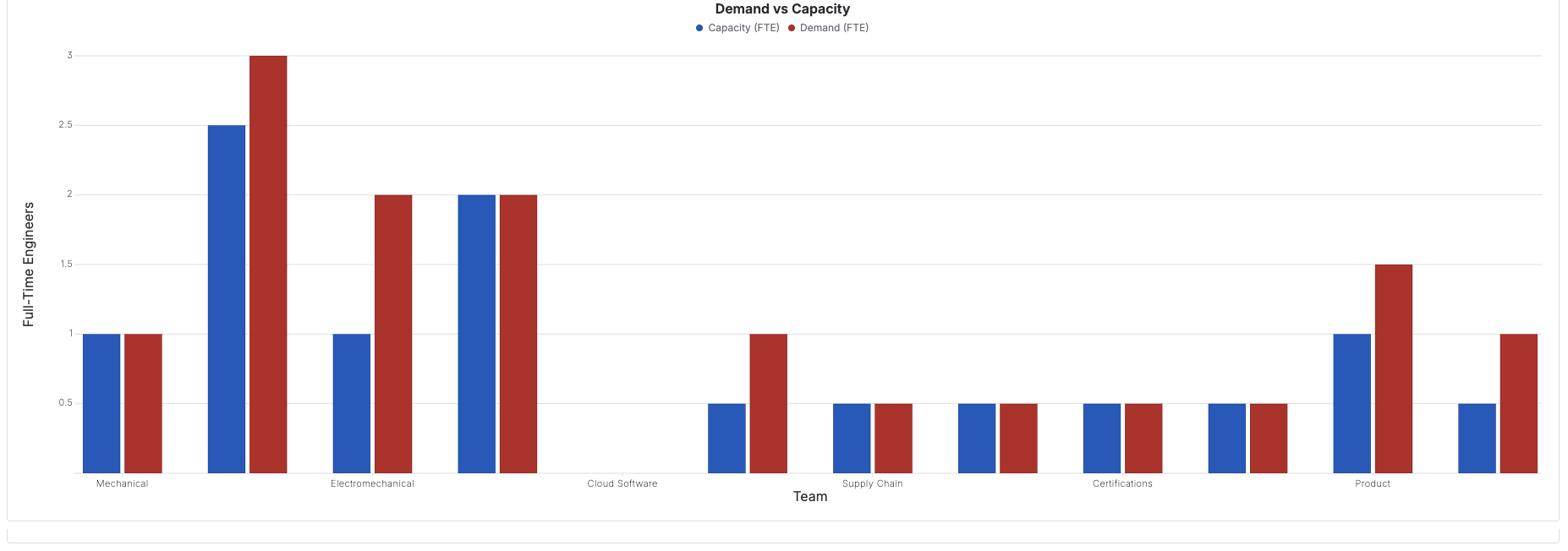
This is obviously not usable in its current form. Is there any way to force the chart to properly labels the bars?


