Hello Community,
I am trying to build a project planning dashboard in Jira that shows workstreams grouped by releases, with timelines and effort distribution. Below is what I am aiming for:
Hi Rahul,
Based on your requirements you will probably be better off using Atlassian Analytics Dashboards. The Jira dashboards, as you mention, don't allow you to show exactly what you need properly, without splitting the data over multiple widgets.
With Analytics, you can build the logic and structure into the query.
For your automation rule, you'll want to use a smart value to calculate the Effort, and then update the field with that value.
Within an action on an automation rule, you should select Edit work item field and then find your Effort field. Using this smart value should get you the right result
{{Planned End.diff(now).businessDays.abs}} * 8
That will calculate the business days between the data in Planned End and Now (say 4 days) and then multiply the answer by 8, giving 32 hours.
You can run the automation rule on a schedule (say 8am every day) so it's up-to-date each morning for your team(s).
Using Analytics for your dashboard is a bit more involved.
A SQL query that should get you most of the way there:
Is there any way to create it using a Jira dashboard and custom fields?
Not as far as I'm aware I'm afraid.
Jira dashboards are more for displaying raw data in a visual way, rather than manipulating it as you would in something like Excel.
You could create a number of custom fields to store the 'date bucket', but still wouldn't help aggregating the Effort. Plus that would be quite over-engineering a solution!
Hello, @Rahul.Chaudhary
Welcome.
You’ve described your needs very clearly. This is essentially release-based workload planning with timeline visualization, and Jira Cloud can only cover part of this natively.
✅ Dynamic effort calculation:
Jira Automation can calculate business days (Monday–Friday) using smart values, but it cannot exclude custom holidays.
Here’s the smart value you can use: {{#=}}({{issue.Planned End Date.diff(now).businessDays}}) * 8{{/}}
This calculates the number of business days between today and the Planned End Date, then multiplies it by an 8-hour workday.
Automation rule setup:
⚠️ Dashboard limitations in Jira Cloud
Native Jira dashboards, unfortunately, cannot:
So for anything involving Effort × Resource × Time, you’ll need an add-on or a custom solution.
If you want full flexibility without coding, consider No-Code Apps Creator for Jira, an AI-powered app that lets you create custom Forge apps by simply describing your requirements.
Your question is already an excellent prompt for the AI.
With it, you can:
✔️ Validate your idea and build your own workflow tool in minutes✔️ Deploy it directly in Jira and test it with your team✔️ Continue improving it using the builder
It’s a quick way to solve your problem — without relying on multiple Marketplace apps.
Give this AI tool a try, and you may be surprised by how quickly you can create something tailored to your process.
Can it be achieved using the in-built Plan functionality of the Jira?
Is there any way I can do it using the already existing features in the Jira?
From what I understand, Jira Cloud’s built-in features may not cover all your needs. You can automate effort calculations and filter issues by date, but for grouping, aggregation, and visualization, you will need extra tools.
So, there's no Jira inbuilt feature through which what I've stated can be achieved?
Hi @Rahul.Chaudhary
As suggested by Marc, for deeper insights, If you would like to try a mktplace app for tracking resource workload and capacity planning across multiple projects/boards, take a look at
Capacity Planner
The app offers:
1. Resource Tracking and Allocation : The app allows you to monitor and track various resources by adding them as part of a template, and their work allocation across multiple projects / sprints.
2. Real-time Visualization: Provides intuitive charts, graphs to visualize resource utilization and capacity levels in real-time.
3. Full Sprint / Project Fix version Capacity and Monitoring
Mode details here
Disclaimer : I am one of the app team member
Just to top up, the app can be added as a dashboard gadget as well
You can absolutely build this, but you’ll hit the limits of native Jira dashboards pretty fast. The cleanest way to get “Effort per Resource per week/month, grouped by release, as a heatmap / Gantt” is using Planyway for Jira as the actual planning dashboard (timeline + workload view).
Planyway is a Jira app that gives you:
Gantt-style timeline / roadmap
Workload & capacity planning per user
Multi-project portfolio views
Daily / weekly / monthly / yearly scales
So instead of trying to force native gadgets to sum numbers, you let Planyway be the “dashboard” for exactly the view you want.
From Atlassian Marketplace, install Planyway
Open Planyway from the Jira navigation
Connect your Jira projects (you can pull multiple projects into one Planyway workspace)
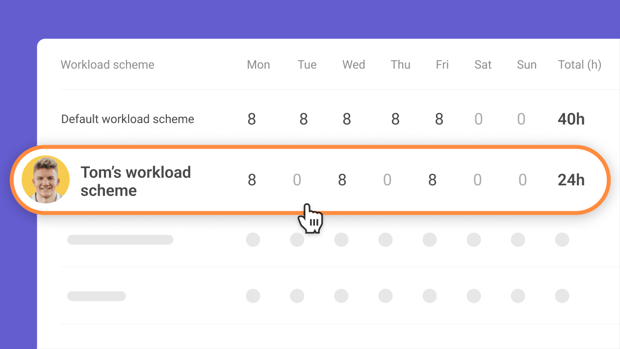
In Planyway Settings → Workload schemes:
Define per-user working hours per day (e.g. 8h Mon–Fri, 0h weekends)
Create workload schemes for different patterns (full-time, part-time, etc.).
Configure public holiday schemes and assign them per user
Add vacations/days off directly in user lanes; Planyway adjusts availability automatically when calculating workload
Result: your workload/heatmap is based on real availability (no weekends, no holidays, no PTO) without making Automation rules crazy.
In Planyway:
Switch to the Workload tab
In the top toolbar:
Group by → User (so each row is a person).
Scale → Week or Month for the x‑axis.
Filter by your release:
Use Fix Version filter = the release you want.
Fix Version
Ensure your Effort field is used:
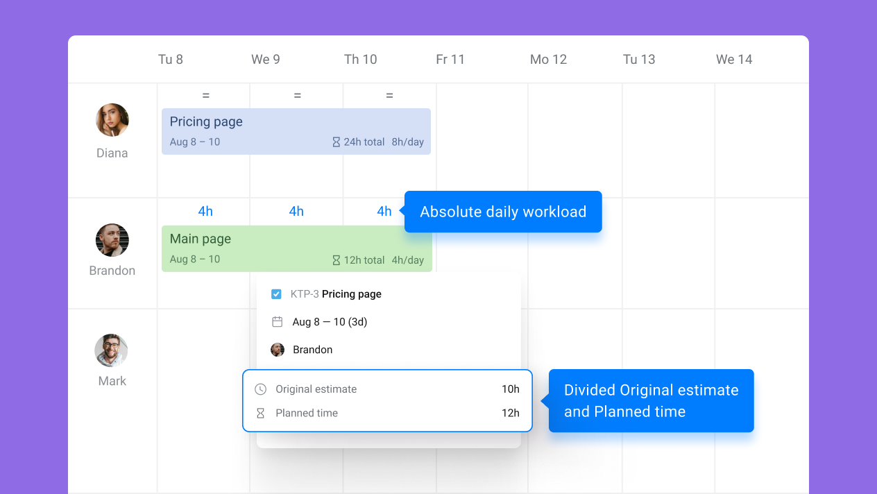
Under workload settings, choose estimates based on Original estimate/Remaining/Internal
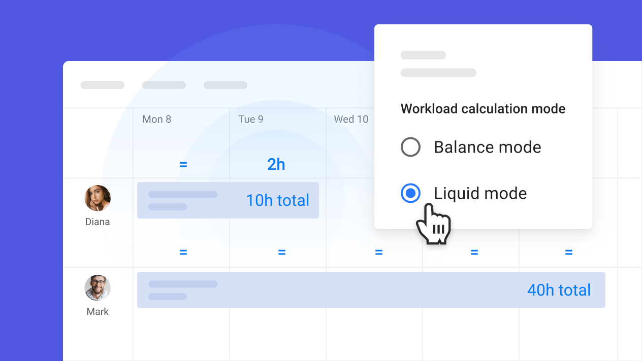
Choose distribution mode:
Balance → Planyway evenly spreads the issue’s estimated hours between start and end dates while respecting working hours and holidays.
Liquid → front-loads work as early as possible while still honoring capacity.
Now each user × week (or month) cell shows:
Total hours of assigned work in that bucket
Visual indicators of under/overload vs that person’s capacity
That’s effectively your heatmap of Effort per Resource per time bucket for the selected release.
For a more roadmap-style view:
Switch to Timeline view
Group by Team / Epic, depending on how you structure work
Set scale to Weeks or Months
Enable milestones / releases on the timeline so you can see key dates and deliverables
This gives you the Gantt-style “workstreams grouped by releases” you mentioned.
Your Resources custom field is multi-user, so you want a single issue to count for multiple people.
Resources
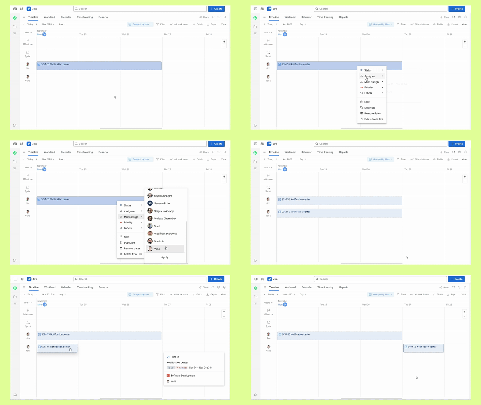
Planyway now supports multi-assigning Jira issues:
In Planyway’s timeline, group by User.
Drag an issue onto the timeline, then use the context menu to add additional users.
The card appears in each user’s swimlane, so you can see shared work clearly.
This is much more practical than cloning issues or creating “fake” subtasks just to represent people.
We're also splitting workload across multiple assignees (e.g. 50/50, 80/20) so the hours can be mathematically distributed between collaborators.
If you want a numerical report like:
Sum of Effort (hrs) per Resource per Week for Release X
Planyway gives you a couple of options:
Workload view itself – hover over cells or use the totals to see hours vs capacity per user per time bucket.
Time / workload reports & export – export to CSV/Excel and pivot there by User and Week/Month for deeper analysis or sharing with stakeholders. Or use the report that compares tracked time vs estimated.
Would it be possible for you to connect and provide a detailed walkthrough @Rahul_RVS ?
Would it be possible for you to connect and provide a detailed walkthrough @Mary from Planyway ?
Thanks for your reply.
We can definitely demo the app.
Pls book a suitable time slot -> https://calendly.com/rvsoftware/
And our app team will demo the app features.
Thanks
@Rahul.Chaudhary Sure!Can you please send a note to support@planyway.com so that we get your contact detail.We can arrange a call and set a demo to answer all your questions.
Hi @Mary from Planyway let me know of your availability for the same,
Hello @Rahul.Chaudhary,
I am Marlene, product manager of Quick Filters for Jira Dashboards.
Maybe our app can be helpful for you.
Our Quick Gadgets can build statistics (2d, line charts, bar charts, pie charts, ...) based on any Jira number field (like your efforts custom number field).
We also provide a "Quick Time Series Gadget" that can evaluate progress over time in a flexible way. It either provides the development of work item count or any numerical field.
You can check out Quick Filters for Jira Dashboards without installation on our demo dashboards.
It looks like you're new here. Sign in or register to get started.