Quarterly reviews don’t have to be a three-hour tour through 47 charts and a collective shrug. A quarter is long enough to see real patterns—and short enough to change course—if your report tells a story your team believes. This guide outlines how to design a quarterly report in Jira that identifies bottlenecks, demonstrates changes, and informs decisions. Along the way, I’ll show where Time in Status app slots in as the quiet engine that turns issue history into honest timing.
(Yes, caffeine still helps. But not as much as a clean status map.)
The job of a quarterly report (and why most miss)
A good Q report answers three questions clearly:
- Where did time actually go?
- What got better or worse (and why)?
- What will we change next quarter?
Most reports stumble because they try to be everything: every project, every chart, every metric. The result is a data buffet with no meal. The antidote: fewer metrics, tighter definitions, calendar-aware timing, and a straightforward narrative.
Rule of thumb: If a director can skim your report in five minutes and say, “So we’re waiting on approvals 40% of the time—that’s our lever,” you nailed it.
Timing beats counting in a sales pipeline, a service desk, and… everything
Counting tells you how much you touched. Timing tells you how efficiently the value moved.
- Lead time = created → done (customer experience).
- Cycle time = work started → done (your operational speed).
- Working vs. Waiting split = what to fix first (process vs. staffing vs. handoffs).
Ticket counts go up and down with scope. Timing tells you why.
Set up Jira for quarterly reporting
Not an overhaul—just enough guardrails to ensure Q reports are comparable from quarter to quarter.
- Name your clocks once.
Decide which statuses mean Start (e.g., In Progress), Pause (Blocked, Waiting for Customer/Approval), and Stop (Done/Released). Document it. Don’t debate it every sprint.
- Make “Done” actually done.
Ensure transitions to your final column set Resolution. (Future you—filtering by resolution date—will send thanks.)
- Stick to one estimation method per board.
Story Points or Original Estimate or Issue Count. Changing mid-quarter ruins trend lines.
- Define scope with saved JQL.
Use shared filters (by project, label, fixVersion, or board) so everyone’s pulling the same data set.
- Respect time zones and holidays.
Apply work calendars per team/region. Otherwise, your Berlin team looks “slow” because… they slept.
- Add context where numbers can’t.
Put decisions, risks, and scope rationale in Confluence; drop a Loom walkthrough; link to issues. The metrics explain what, your notes explain why.

Five high-leverage quarterly questions you can answer with Time in Status
The app reads your issue history and applies your Start/Pause/Stop definitions and work calendars. No timers, no manual logs—just the math you intended.
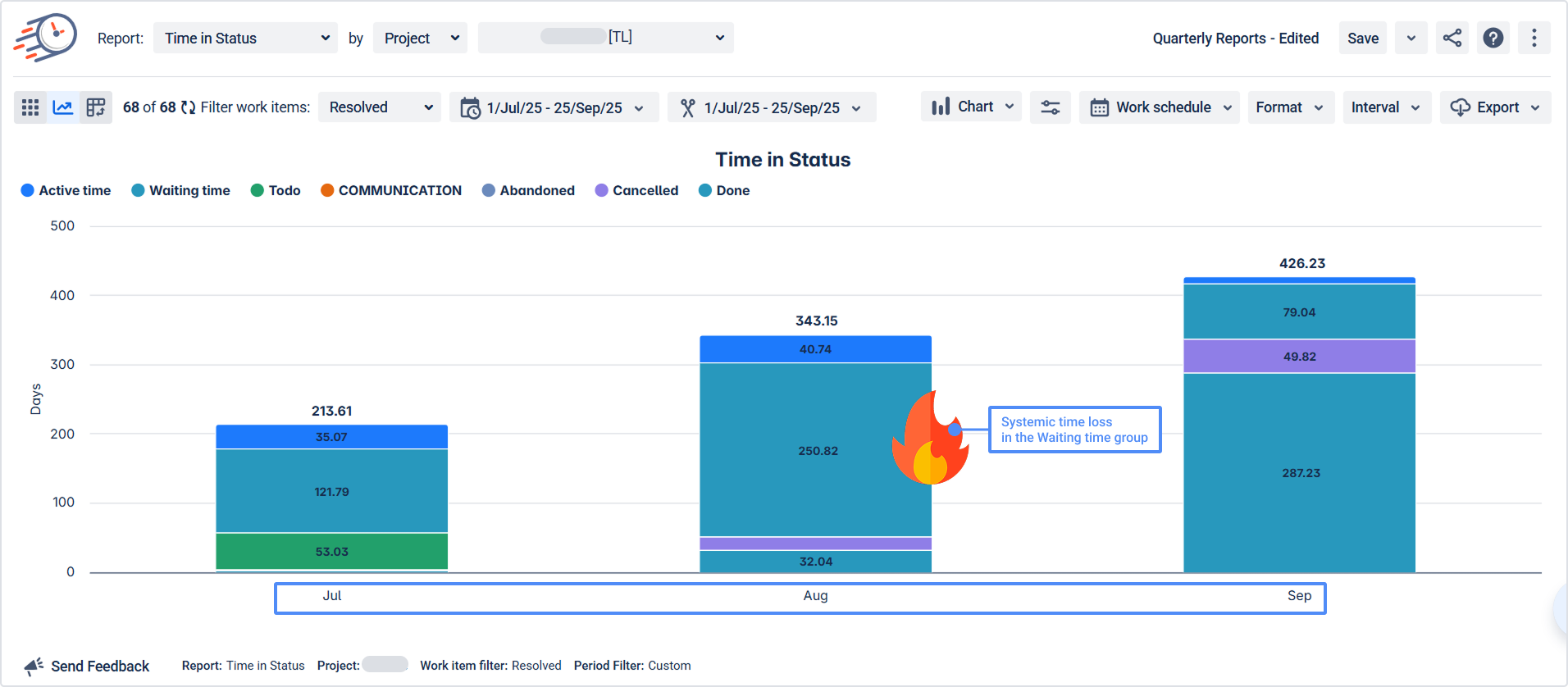
1. Where did we actually lose time?
Use: Time in Status + Status Groups (e.g., Active, Waiting, Review, Approval).
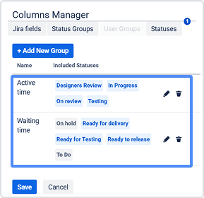
What you’ll see: A clear split of Active vs. Waiting across the quarter.
Outcome: “Waiting for Approval is 38% of lead time → batch reviews on Tue/Thu & add a clear entry checklist.” 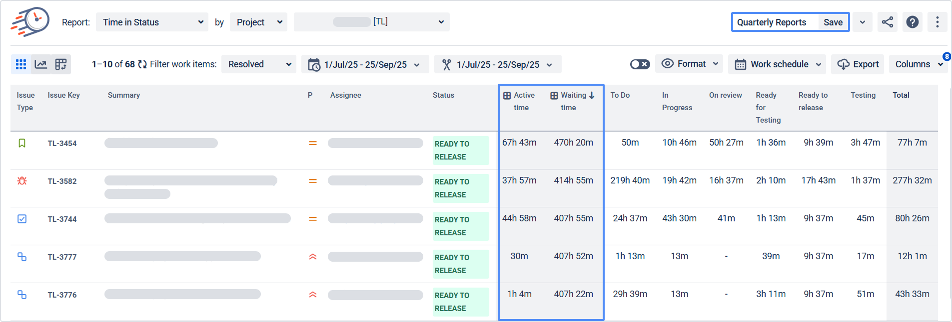
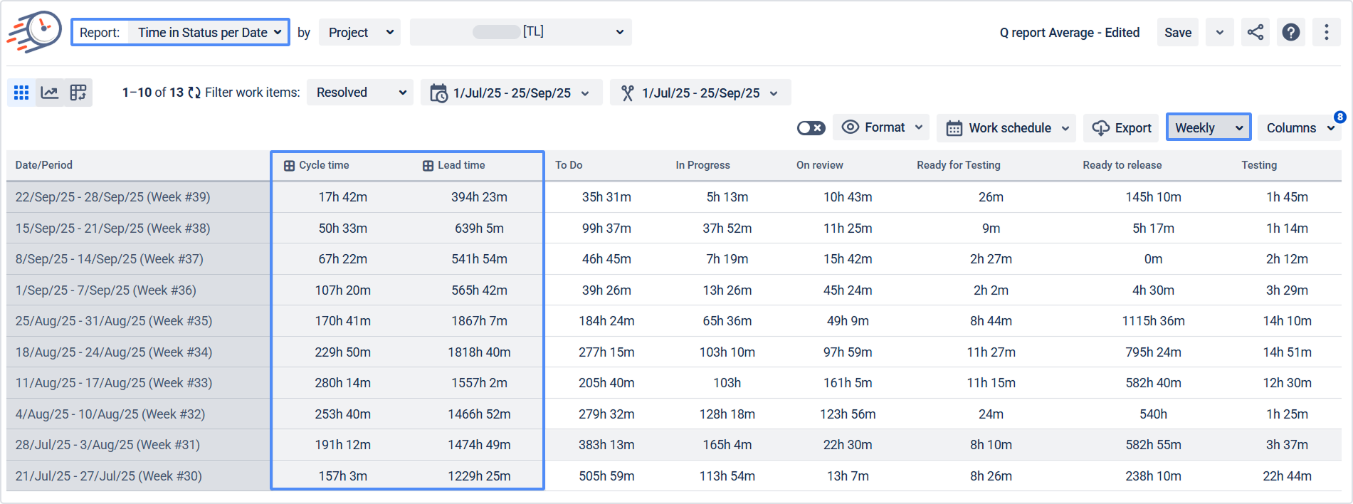
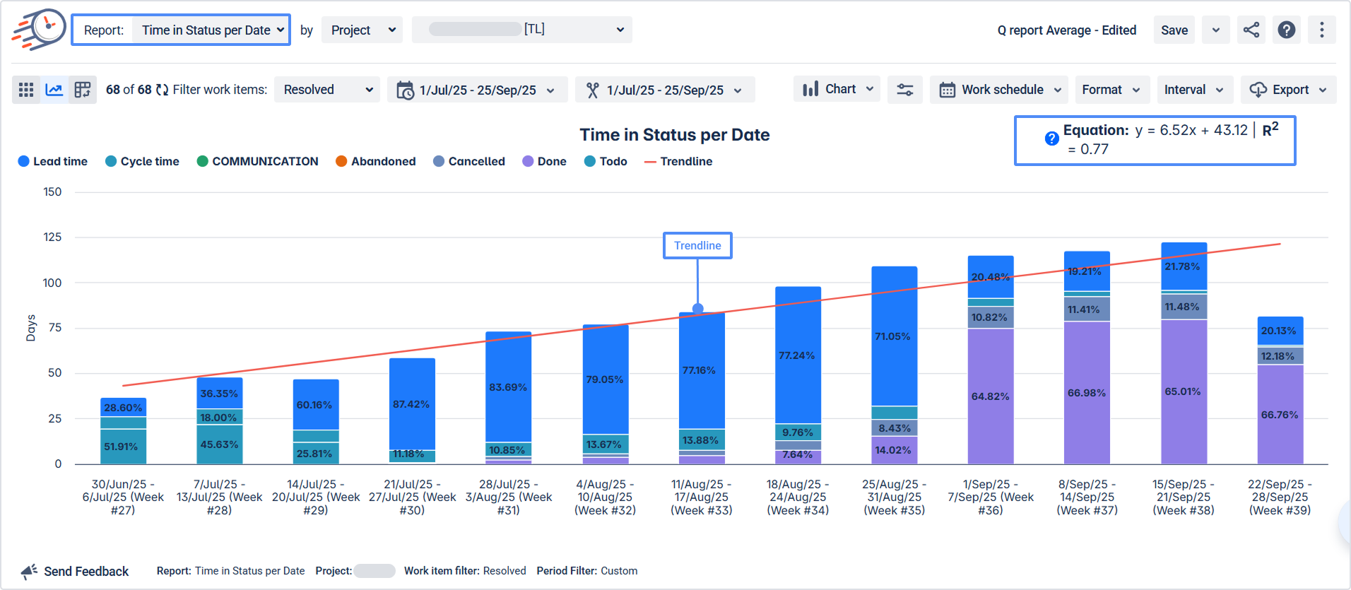
2. Are we getting faster—and more predictable?
Use: Average Time (per status) + Time in Status per Date (trend).
What you’ll see: Cycle time trend and variance (not just a single average).
Outcome: “Cycle time ↓ 14% and variance ↓ 22% after WIP limits → keep the policy.”
3. Who (or what) is overloaded?
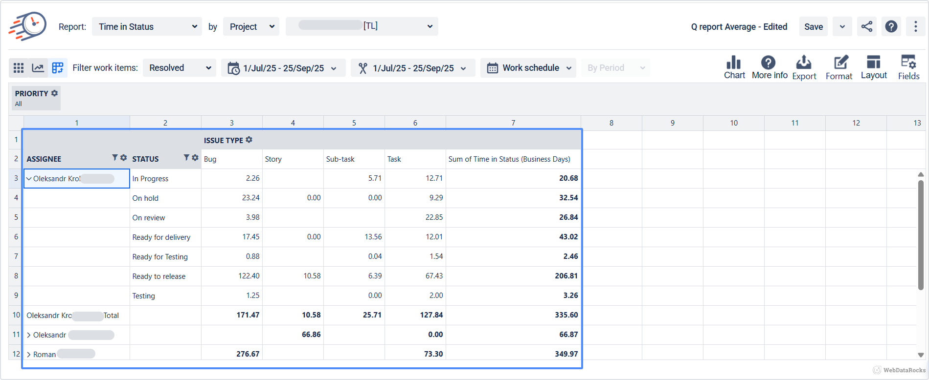
Use: Assignee Time and a Pivot (Assignee × Statuses × Work Item Type).
What you’ll see: Effort distribution in business hours, not hunches.
Outcome: “Two agents handle 70% of P1 time → create an on-call rotation and cross-train.”
4. Is rework hurting quality or trust?
Use: Status Count (reopened counts) + Transition Count (ping-pong loops like Dev↔QA or Tech Progress↔Waiting for Customer).
What you’ll see: Where loops happen and how often.
Outcome: “Reopens dropped 40% after we added acceptance criteria to the template.”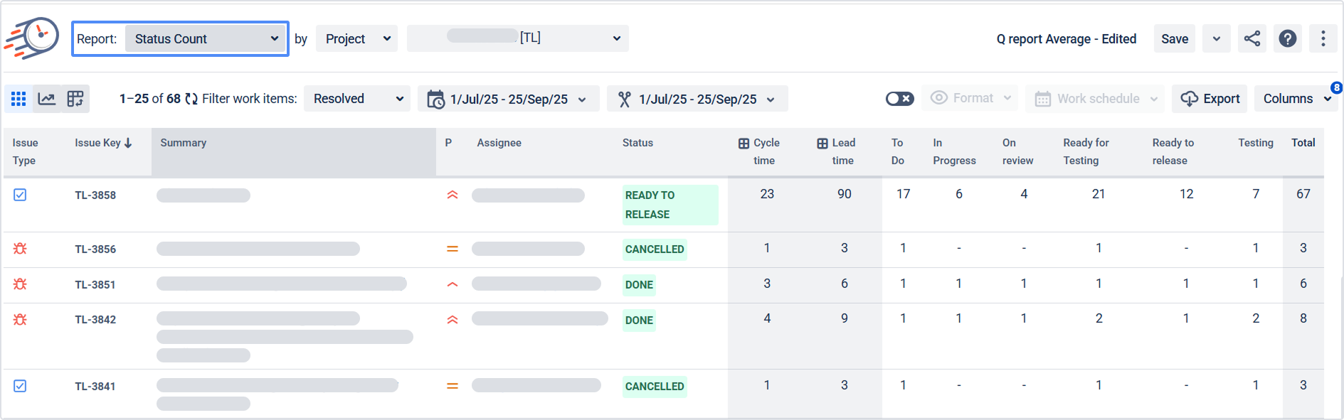
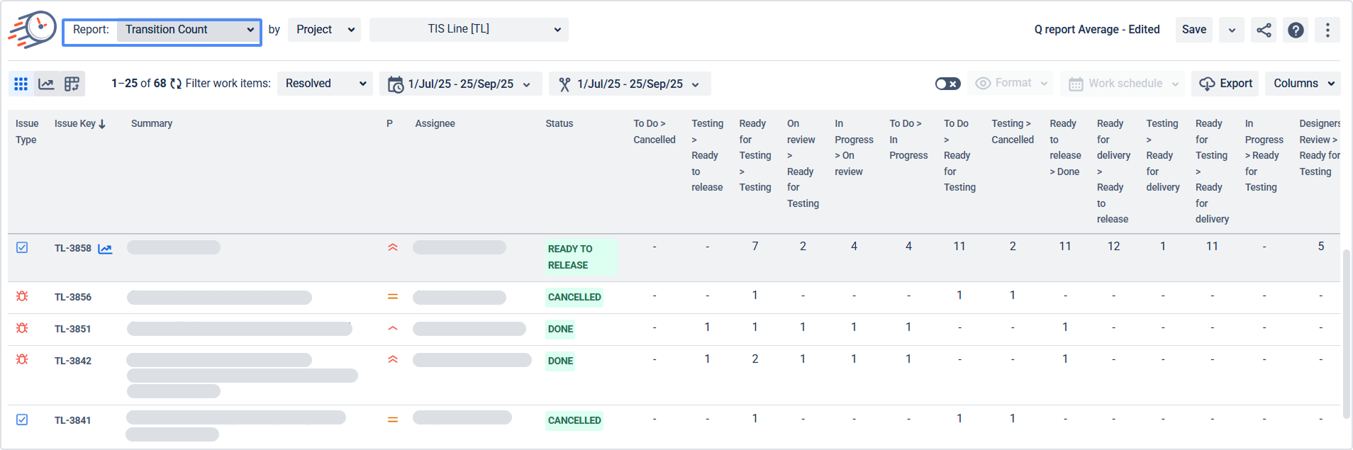
5. Did our change actually help?
Use: Label or version to tag the change (e.g., label = automation_triage), then compare Average Time and Time in Status per Date in matched windows.
What you’ll see: Before/after impact without spreadsheet archaeology.
Outcome: “Auto-triage cut Waiting for Support from 10h → 5.8h; expand to all P2 queues.”
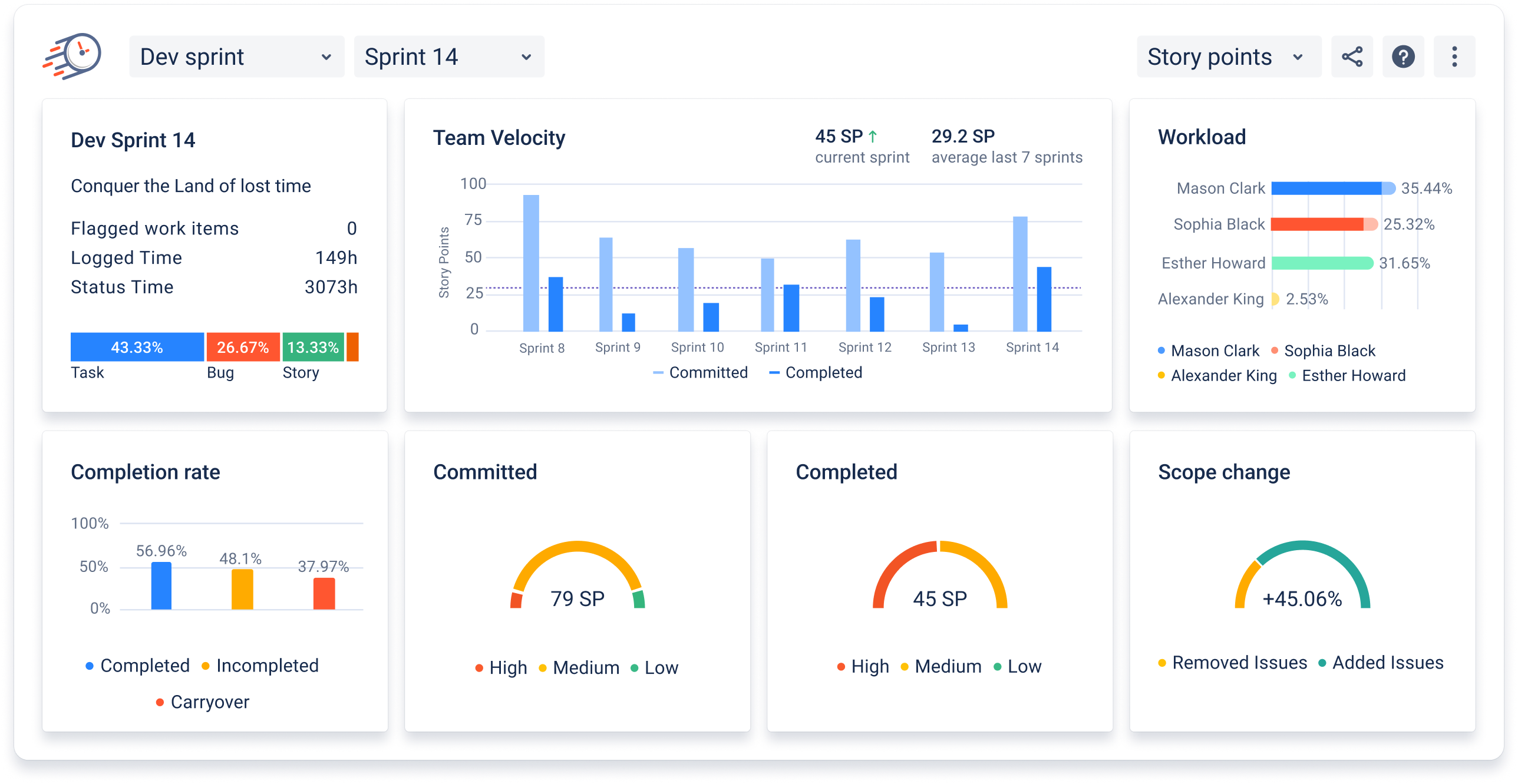
Scrum teams: the Sprint Performance Report (Cloud & Data Center) rolls up velocity (last 7 sprints), completion rate, workload by assignee, and scope change—a perfect chapter in your quarterly narrative.
Build your Q report in under an hour (playbook)
- Scope (5 min): Save shared JQL for the quarter.
- Calendars (10 min): Apply work hours/holidays per team.
- Status Groups (10 min): Define Start/Pause/Stop (+ Review).
- Baseline (15 min): Time in Status (with groups), Average Time trend, Assignee Time, Status/Transition Count; add Sprint Performance if you do Scrum.
- Tell the story (15–20 min): What changed? Why? What one experiment next?
- Publish (3 min): Jira dashboard gadget + Confluence page + saved presets.
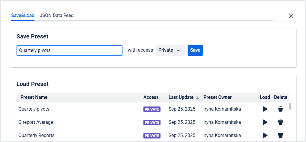
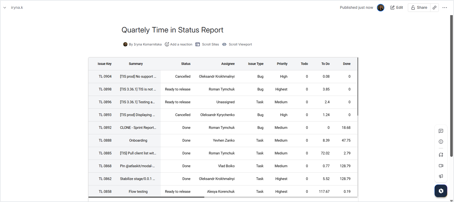
Name the dashboard “Q3 Flow Health” and pin it. Tiny bit of ceremony, big payoff.
Takeaway
Quarterly reporting should feel like a conversation, not a compliance ritual. My take: one page of flow metrics, a few honest notes on why things moved the way they did, and one experiment everyone can support. Keep the spotlight on lead time, cycle time, and the working‑vs‑waiting split—data, not drama.
If you’ve mapped Start/Pause/Stop and set work calendars, you’re 90% there. Time in Status reads your issue history and does the math you intended, so the report shows how work really moved—without spreadsheets breeding overnight.
What you can do next:
- Prefer to explore hands‑on? Start a Time in Status (Cloud or Data Center) trial and build your “Qx Flow Health” dashboard in minutes.
- Want company? Book a short demo. We’ll help map Status Groups, calendars, and your first before/after comparison—no pressure, just practical setup.
