I set up my time tracking reports in a table form, and I wanted to visualize them on the dashboard. It seems almost impossible. I already tried several apps, and none of them can do what I want.
I have three different reports based on components. Daily breakdown over the current sprint, Weekly breakdown over the last 6 sprints, and Monthly breakdown over the current year.
I want each report visualized in a way you can see in the image below:
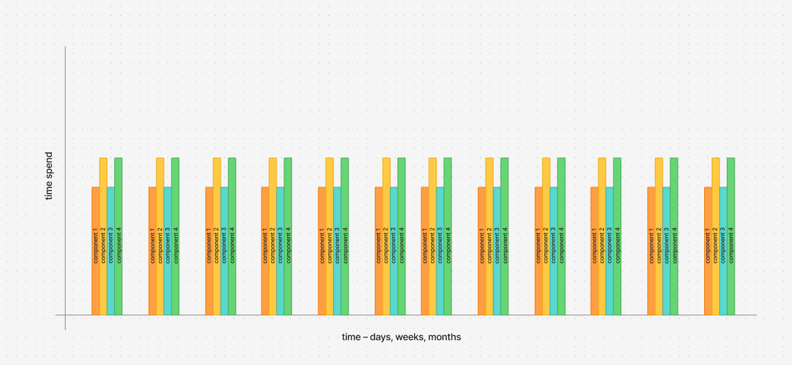
Setting up the y-axis is easy. Setting up the x-axis is impossible since all gadgets have the option to put components on the x-axis, but not date range broken down to days, weeks, or months.
I downloaded several apps, spent endless hours in documentation, and I can't do it. I got close with one app, but for some reason, that app does not see work logs, so the time spent is 0 on everything.
Is there any way to do it in Jira with or without apps, or should I just go to some other reporting tool?


