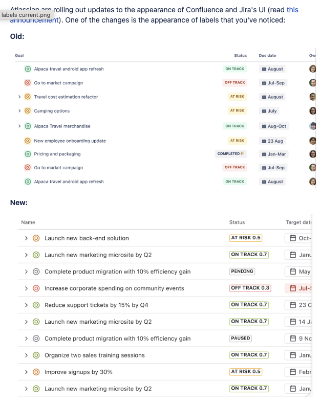
Seriously, Atlassian?! What members of your design team agreed this change was a good idea? This is a design regression, plain and simple.
Jira is used by thousands of teams to track important project outcomes. Labels aren’t just cosmetic—they’re functional, critical UI elements. I used to glance at a board and instantly know what was on track or at risk. Now I’m squinting at numbers and muted boxes. Why fix what wasn’t broken? And from an accessibility perspective, I can't even imagine people with color blindness or low vision using this.
The old labels were clean, colorful, and easy to scan. The new ones? Cramped, low contrast, and way too similar in color. Green looks like blue, yellow is dull, etc..
Atlassian: please rethink this. This is not practical.