I recently noticed the colors of the status macro changed in Confluence.
The green and yellow colors are just too similar for a color blind person like me. Personally I will only notice the difference when both statuses are right next to each other. And even then I'm unable to say which color they are.
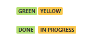
The contract ratio is too low. I even checked with whocanuse.com. The test fails for any type of color vision deficiency.
As a long time Atlassian user I know Atlassian puts some effort in the accessibility of their products. I hope this can be improved in the near future.
If anyone has a link to release notes or an item in JAC where there is a trace of this change that would be great.


