When creating/editing a Series in a Report, you get to choose a colour for the line on the chart.
There's 24 color options here, but a lot of them are very similar to each other.
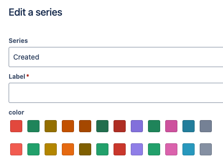
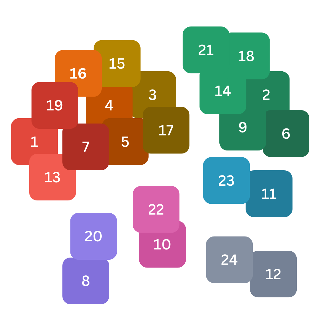
6 of these 24 options are effectively just 3 barely-distinguishable greens. The light/dark variants between the top and bottom rows aren't sufficiently different to tell apart on a chart.
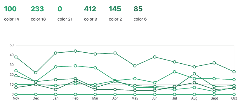
This chart is technically made with 6 different colors!
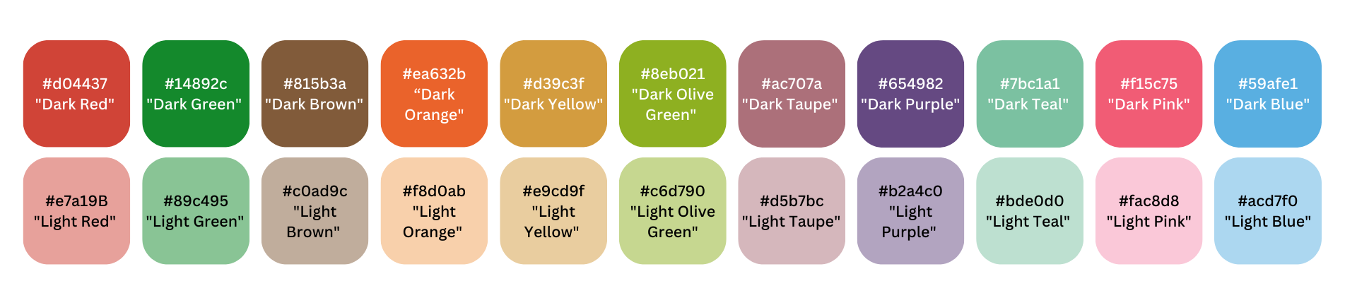
This range used to be better. (I think it changed ~Jan/2024.) An older set of colors is still visible in the HTML:
Will this colour palette be updated to the Atlassian Design System colours for charts?
Is there a method to request improvements for JSM Cloud?

