Hello,
I have the following table and I am using the "Table excerpt include" macro and pulling data from other pages and visualize them here:
| Page | project | key area | cluster |
|---|
| 01-50-73 | test | PUK | Security |
| 10-09-06 | test1 | PUK | Account |
| test2 | PUK | Account |
From this table I would like to create a chart by using "chart from table" macro and count the number of "key area" and "cluster" separately and to visualized it as a donut. I get the following results:
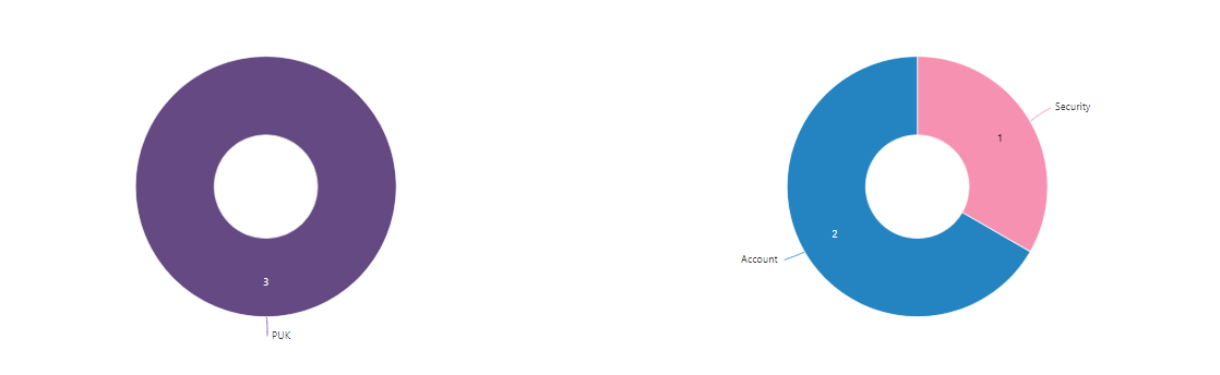
This is correct, but I would like based on page 10-09-06 if possible to exclude the duplicates if any. So the expected result on the chart should be:
PUK = 2 and Account = 1.
I try using the pivot table macro and try different variations, but without success. If someone has experience with this I would appreciate some help and if possible to show me example how to do it.
Thank you in advance!
Best Regards,
Vladimir Stankov


