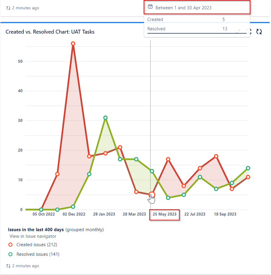
Even when I select 'Monthly' in the 'Period' field for the "Created vs. Resolved Chart," where we report the trend of UAT tasks as shown below, I still see the days on the x-axis of the chart. I believe it would be more understandable for reporting to our stakeholders if this could be displayed as months. Moreover, the relevant days do not seem to make any sense when we look at the general picture. In this example, instead of shown 25 May 2023 on the chart, shown May will be better.