Hi all,
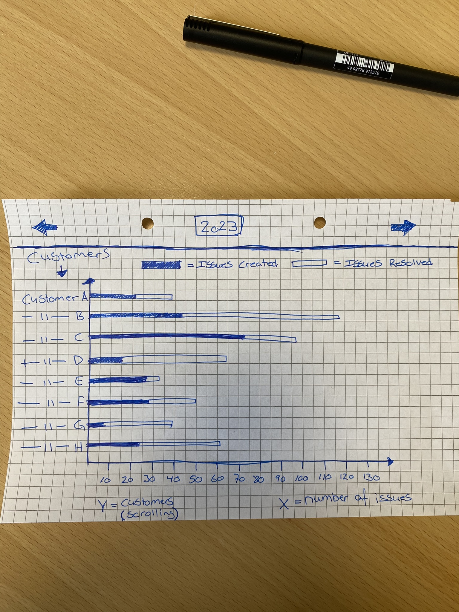
I need help finding or creating a graph like the one in the picture below.
On the Y-axis we would like to be able to scroll through our customers.
On the X-axis we would like to see the number of issues for 2023. The bars for each customer have to indicate how many issues have been created and resolved.
With the two arrows at the top, we would like to be able to flip through the years.
Also, it would be very nice if all the new customers we add to Jira would appear on this graph automatically, instead of us manually adding them to the graph.
I don't know if a graph like this exists and I can't find one like it for the dashboard.
It would be amazing if we could get all the features I described above or at least get as close as possible.
Hope that some of you are able to help me in one way or the other.